times have been rough over at the CAGW compound. mother nature just hasnt been co-operating like she did back in the good ol' days. the public has been hearing more and more conflicting results and disturbing reports of scientific impropriety in climate research.
what can CAGW luminary James Hansen do to bolster the rather limp data coming in? he has a brilliant idea! Muller's BEST project derived even higher temps than the other groups producing global temp data sets, and BEST was seen to be leaning towards the skeptical side. how did they do it? to make a long story short, the BEST algorithms chop up data histories and discard suspicious inputs. because there is a positive trend cooler data are much more likely to get discarded than warmer ones and the average goes up. just what Hansen needs!
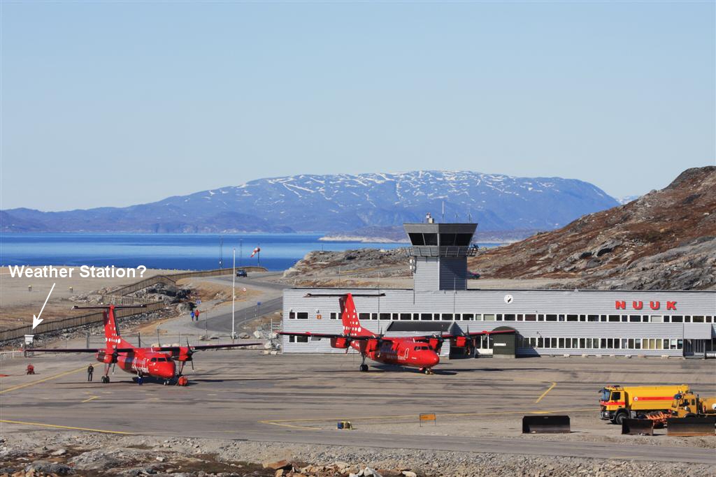
Greenland data are sparse, noisy and often incomplete. perfect to try out this new idea. but I guess it was too much work so he just took out the (suspicious) data from the early 80's and then subtracted 1C from all the pre-1980 numbers. voila! the Nuuk temperature chart looks much better now.

here is a look at the 'adjustments'.

funny how so many years need exactly 1C fixing, isnt it?
here is a graph from 2008 for those who think the comparator 'before' numbers might be wrong.

and the link to read the interesting article on how the AMO seems to affect arctic temps. Google Image Result for http://images.intellicast.com/App_Images/Article/128_1.gif
what can CAGW luminary James Hansen do to bolster the rather limp data coming in? he has a brilliant idea! Muller's BEST project derived even higher temps than the other groups producing global temp data sets, and BEST was seen to be leaning towards the skeptical side. how did they do it? to make a long story short, the BEST algorithms chop up data histories and discard suspicious inputs. because there is a positive trend cooler data are much more likely to get discarded than warmer ones and the average goes up. just what Hansen needs!
Greenland data are sparse, noisy and often incomplete. perfect to try out this new idea. but I guess it was too much work so he just took out the (suspicious) data from the early 80's and then subtracted 1C from all the pre-1980 numbers. voila! the Nuuk temperature chart looks much better now.
here is a look at the 'adjustments'.
funny how so many years need exactly 1C fixing, isnt it?
here is a graph from 2008 for those who think the comparator 'before' numbers might be wrong.
and the link to read the interesting article on how the AMO seems to affect arctic temps. Google Image Result for http://images.intellicast.com/App_Images/Article/128_1.gif