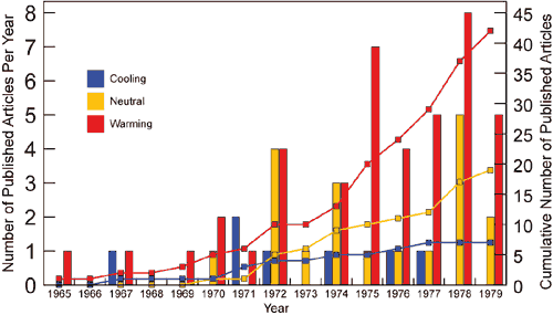
The "Hockey Stick" graph, a simple plot representing temperature over time, led to the center of the larger debate on climate change, and skewed the trajectory of at least one researcher, according to Michael Mann, Distinguished Professor of Meteorology, Penn State.
"The
"Hockey Stick" graph became a central icon in the climate wars," Mann told attendees today (Feb. 11) at the annual meeting of the American Association for the Advancement of Science. "The graph took on a life of its own."
Mann and his coauthors, Raymond S. Bradley and Malcolm K Hughes, created the graph for a paper, "Northern hemisphere temperatures during the past millennium: Inferences, uncertainties, and limitations" which appeared in
Geophysical Research Letters in 1999. In 2001, the Intergovernmental Panel on Climate Change published a version of the graph in its report, pushing the hockey stick depiction of temperature trends to the forefront of the climate change discussion.
"There have been dozens of other climate reconstructions, all very similar to ours," said Mann. "They are based on different data and different approaches, and of course everyone thinks their approach is best, but they all imply that the modern warming spike is unique. And still the Hockey Stick remains the iconic graph."
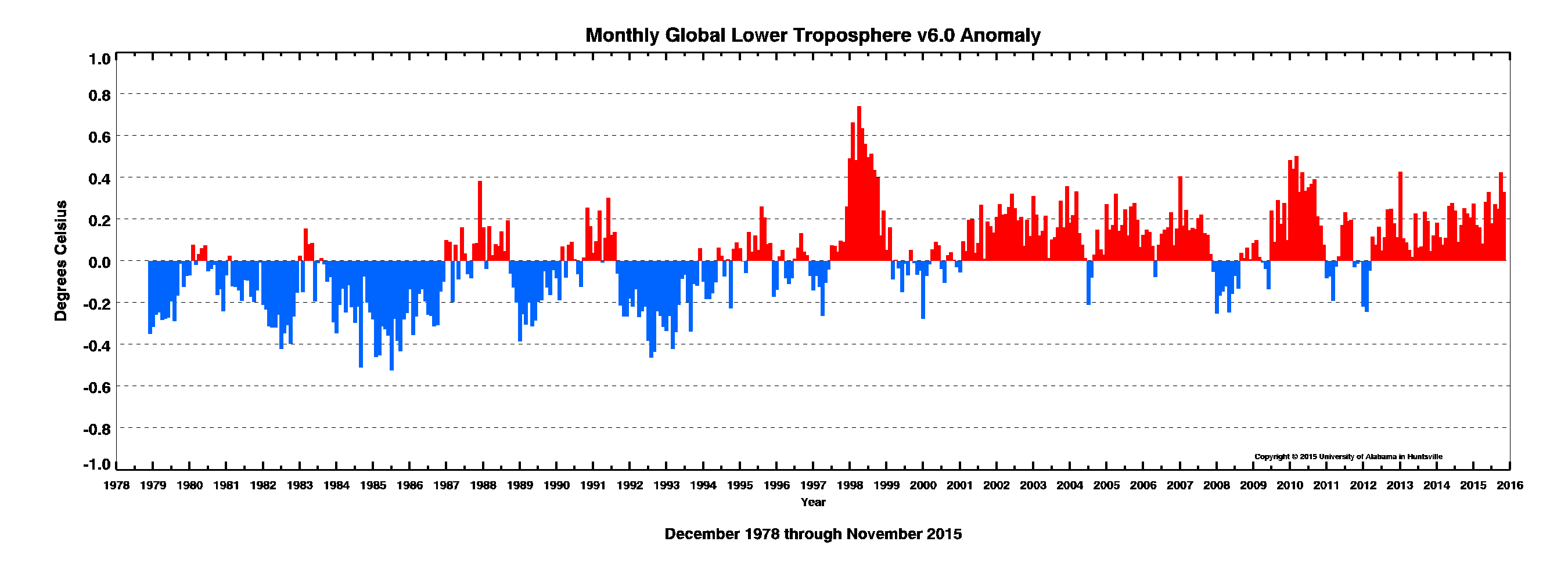
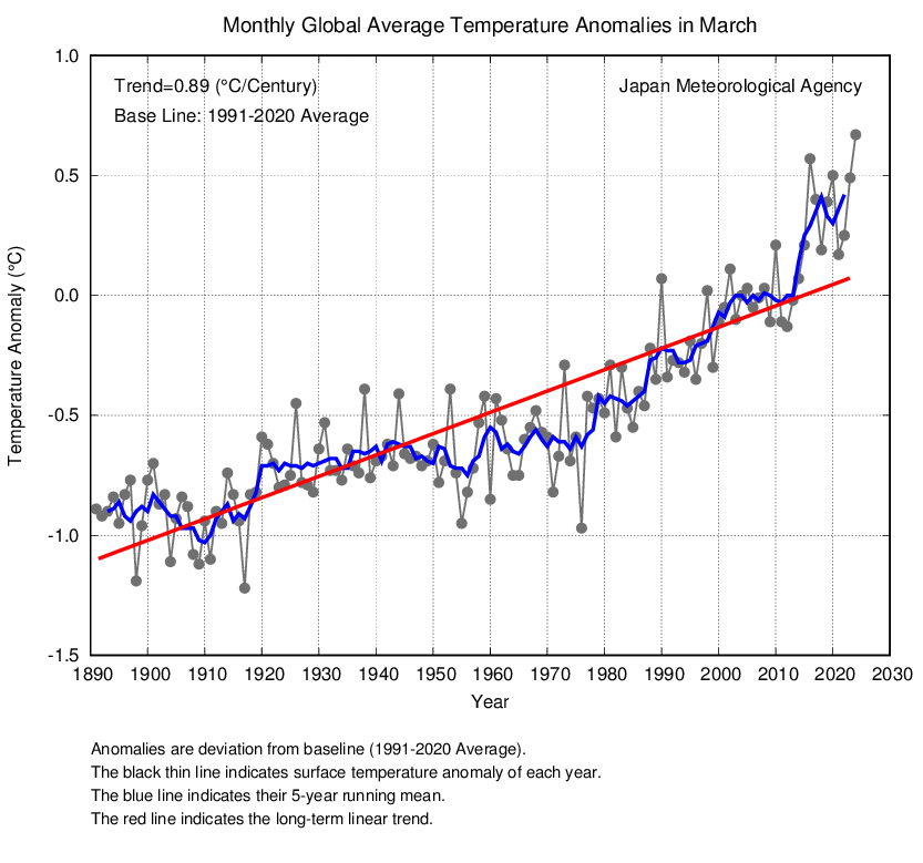
The original paper and the IPCC report demonstrated that temperature had risen with the increase in industrialization and use of fossil fuels. The researchers' conclusion was that worldwide human activity since the industrial age had raised carbon dioxide levels, trapping greenhouse gases in the atmosphere and warming the planet.
But the iconic graph engendered attacks, including calls for into the validity and veracity of the research. Subsequent investigations by the National Academy of Sciences, The National Science Foundation and Penn State all found the research both honest and solid.
Read more at:
Iconic graph at center of climate debate
What real scientists have to say.