protectionist
Diamond Member
- Oct 20, 2013
- 57,855
- 18,751
- 2,250
Looks like the answer to that may be YES, indeed. And how convenient just 2 weeks bfore the 2020 presidential election. It is readily apparent that the US media generally, is at the present little, little more than an arm of the Joe Biden presidential campaign. Can we trust what we are hearing from them about Covid ? What you read here may answer that.
This morning on Fox News Sunday with Chris Wallace, a graphic was posted up showing 85,085 "new cases" of coronavirus have shown up (I didn't catch what unit of time that is), with Wallace yammering that this is a bad number. The graphic also stated that hospitalizations are up in 38 states. The word "spiking" seems to be popular with media pundits right now. Sounds bad, huh ?
Right after this, I saw/heard these same figures being told on Meet the Press with Chuck Todd, and then on Face the Nation with Margaret Brennan. Well, this is what the anti-Trump media does so often. Let's take a closer look.
First of all, ALL ALONG over the past six months there have continually been some states where Covid was spiking (rising), other states level, and some other states diminishing. But to talk only about the ones where it is going up, gives the impression that this is some much worse condition than before.
One must be careful when viewing graphs. Here's is one that looks like it is the change in the number of US hospitalizations of Covid. >>

It looks like Covid cases are going up now , and have continually been going up since March. Now try treading the FINE PRINT. It states that the graph's figures are from 100 counties in the Emerging Infections Program states (10 states), + 4 Influenza Hospitalization Surveillance Project states.
So the graph covers 100 counties in 14 states (leaving 97% of US counties not included in this data).
So, now that you all have been thoroughly scared to death from the media reports (not having read the fine print), let's look at what the liberal OMISSION media is OMITTING, and NOT telling us.
First, I (not reading the fine print inititally) was puzzled by this graph (shown above) because of mistakenly thinking it applies to the whole country. I recently posted a US hospitalization graph from the CDC that showed hospitalizations were DOWN 37%. So how could they have always been going up ? Here is that graph >>

Well, the fine print explains why these 2 graphs are contradictory.
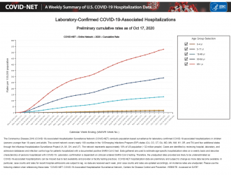
So this graph which I posted is from last month, and only up to September 19. So could there have been a sudden "spiking" in Covid cases during this month of October ? I went to the CDC website again, and checked their up-to-date information on US NATIONWIDE Covid cases, and guess what. The new graph hardly looks a bit different than the September one. Here is THAT graph which shows the hospitalization rate (the gray line) actually going DOWN over the last 2 weeks (up to October 17) >>

This morning on Fox News Sunday with Chris Wallace, a graphic was posted up showing 85,085 "new cases" of coronavirus have shown up (I didn't catch what unit of time that is), with Wallace yammering that this is a bad number. The graphic also stated that hospitalizations are up in 38 states. The word "spiking" seems to be popular with media pundits right now. Sounds bad, huh ?
Right after this, I saw/heard these same figures being told on Meet the Press with Chuck Todd, and then on Face the Nation with Margaret Brennan. Well, this is what the anti-Trump media does so often. Let's take a closer look.
First of all, ALL ALONG over the past six months there have continually been some states where Covid was spiking (rising), other states level, and some other states diminishing. But to talk only about the ones where it is going up, gives the impression that this is some much worse condition than before.
One must be careful when viewing graphs. Here's is one that looks like it is the change in the number of US hospitalizations of Covid. >>
It looks like Covid cases are going up now , and have continually been going up since March. Now try treading the FINE PRINT. It states that the graph's figures are from 100 counties in the Emerging Infections Program states (10 states), + 4 Influenza Hospitalization Surveillance Project states.
So the graph covers 100 counties in 14 states (leaving 97% of US counties not included in this data).
So, now that you all have been thoroughly scared to death from the media reports (not having read the fine print), let's look at what the liberal OMISSION media is OMITTING, and NOT telling us.
First, I (not reading the fine print inititally) was puzzled by this graph (shown above) because of mistakenly thinking it applies to the whole country. I recently posted a US hospitalization graph from the CDC that showed hospitalizations were DOWN 37%. So how could they have always been going up ? Here is that graph >>
Well, the fine print explains why these 2 graphs are contradictory.
So this graph which I posted is from last month, and only up to September 19. So could there have been a sudden "spiking" in Covid cases during this month of October ? I went to the CDC website again, and checked their up-to-date information on US NATIONWIDE Covid cases, and guess what. The new graph hardly looks a bit different than the September one. Here is THAT graph which shows the hospitalization rate (the gray line) actually going DOWN over the last 2 weeks (up to October 17) >>
Attachments
Last edited:

