Not at all.. The org that compiled it is mixing apples and oranges.. #deaths with death rates.. And a death rate for an epidemic virus is STATIC, not dynamic... So the chart is a useless fraud..
I told you -- EVEN CDC doesn't know a death rate yet...
It’s a simple curve comparison of deaths per week on a per capita basis.
The authors say;
Note that the data sets begin at different points in the year (as marked on the left). Also note that the figures shown here are for
new deaths each week, not for cumulative deaths.
There is no ‘death rate’ comparison at all.
Crashes, Not Like...
It’s about the spike.
Ari Schulman,
Brendan Foht,
Samuel Matlack
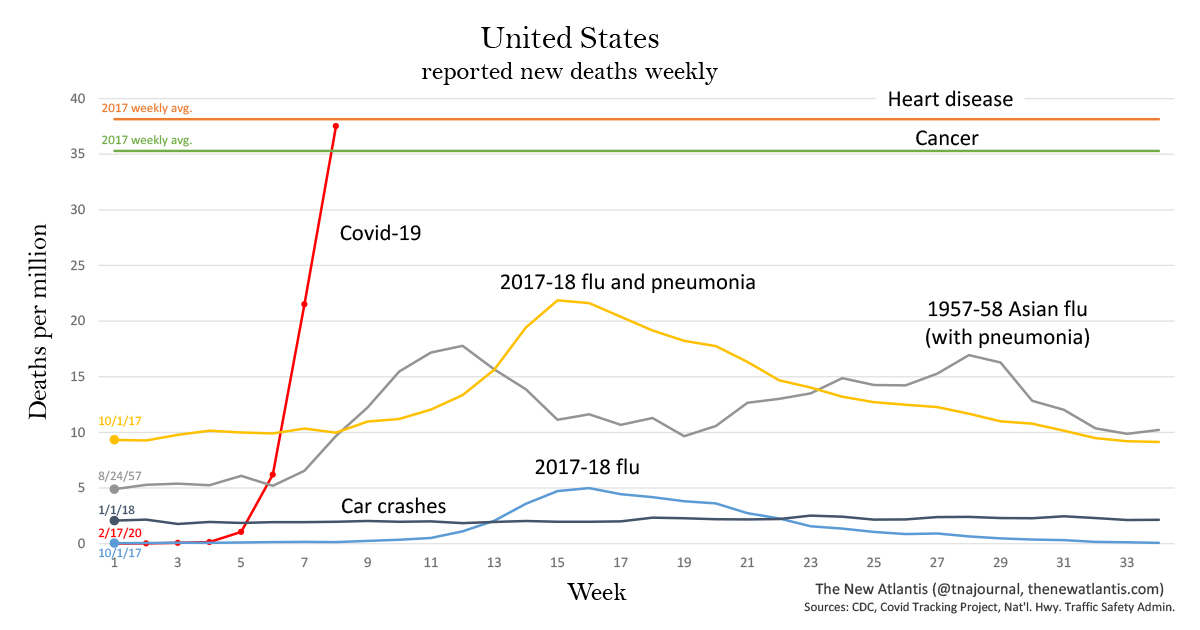
How deadly is Covid-19 compared to seasonal flu, past pandemics, or car crashes?
To offer context, we have produced two charts showing coronavirus deaths along with deaths from other common causes in the past to which the disease has recently been compared. One chart shows deaths for the United States, the other for New York, the state hardest hit.
Note that the data sets begin at different points in the year (as marked on the left). Also note that the figures shown here are for
new deaths each week, not for cumulative deaths.
United States
The chart shows deaths per capita to allow for comparison of data from different years. Deaths are shown from:
- Covid-19, starting from February 17. (Covid Tracking Project)
- The 2017-18 flu season: This was the deadliest recent flu season. The chart shows one line for deaths attributed directly to flu, and another for deaths attributed to either flu or pneumonia. The smaller line is an undercount of flu-caused deaths, the larger is an overcount, with the real number lying somewhere in between. (More on this below.) The data begin on October 1, 2017, which the CDC considered the first week of that flu season. (CDC)
- Heart disease and cancer: The first and second leading causes of death in the United States. The chart shows total 2017 deaths averaged per week. (CDC)
- Car crashes: Weekly deaths beginning from January 1, 2018. (National Highway Traffic Safety Administration)
- 1957-58 Asian flu pandemic: Weekly influenza and pneumonia deaths beginning from August 24, 1957. These data come from a contemporary CDC program that surveilled 108 American cities with a total population of about 50 million people. We have used that figure, rather than the total U.S. population at the time, to calculate deaths per million. (CDC)
New York State
Enlarge
Because the number of weekly Covid-19 deaths in New York is now larger than the typical number of weekly deaths from all causes, we are omitting most of the individual causes from the chart. And because the state’s population has been highly stable over the time periods considered — decreasing by just 0.7 percent since 2017, according to the latest Census Bureau estimates — we have chosen to show both absolute deaths and deaths per capita. The causes shown are:
- Covid-19 deaths, starting from March 2. (Covid Tracking Project)
- The 2017-18 flu season, with week 1 beginning on October 1, 2017. (CDC)
- All deaths from all causes for the same period as the 2017-18 flu season. (CDC)
Note the markedly larger scale of deaths per million on the New York chart as compared to the United States — indicating how much harder Covid-19 has hit that state than the country as a whole.


")