A CO2 Oddity

Sunsettommy

Diamond Member
Mar 19, 2018
14,931
12,562
2,400
Watts Up With That?

A CO2 Oddity

January 5, 2021

Guest Post by Willis Eschenbach.

Excerpt:

I saw an article’s headline the other day. It said “Is COVID Or Nature Slowing The Increase In CO2”.

So I thought I’d take a look. Here’s the Mauna Loa data. Top panel is the increase in CO2. Bottom panel is the month-over-month change in CO2.

LINK

=====

Be careful, it isn't that simple.......
 
COVID lockdowns were intended to control a virus ... not reduce CO2 output ... are you smoking ditchweed again? ...

Did you read the small article?

By the way don't forget Willis is the author of the article not me, and this is a science based blog. :cool:

He is responding to an article.

“Is COVID Or Nature Slowing The Increase In CO2”
 
Ah ... just grabbing random shit and posting it here again? ... [yawn] ... sorry I asked ...

Why are you acting like a jackass? no one including me made you come here and read or post. You could have stayed away completely which is very easy to do.

You could have easily done one of two ways, Read and comment about the post one article, or don't read the post one article and don't comment here at all.

I can post any article I want, you have the freedom to ignore them all you want, I never demand you to comment in any thread, thus your petulant reply was done all by yourself.

:rolleyes:
 
Continuing the topic is a follow up article. Hopefully people will comment on the CONTENT of the article, as I expect people to be doing here

Sins of Comission, Sins of Emission

Guest Post by Willis Eschenbach

Excerpt:


As a result of my last post looking at the question of CO2 and COVID, I came up with an interesting question, viz:

What is the lag time between changes in CO2 emissions and Mauna Loa measurements of background CO2?
I didn’t realize what a struggle it would be. I started out looking for weekly CO2 emissions data … ho, ho, ho. Now rightly or wrongly, I consider myself a reasonable searcher for data. But finding weekly emissions data turned out to be a dead end.

So I looked for weekly CO2 data. That took a while, but I finally got weekly Mauna Loa data from NOAA here. With that in hand, I went back to looking for the emissions data … still no joy.

I can’t tell you how many blind alleys I went down without finding sweet Fanny Adams. As a result, after giving vent to a cornucopia of bad words at a remarkable volume, I ended up having to digitize the data from this plot from Nature magazine …

LINK
 
There is a big surprise in the link, it is quite revealing, since most warmist/alarmist scientists doesn't know this.

Figure 2 is the surprise, figure 3 hurts the AGW conjecture.
 
Another in a series on CO2, a long time Meteorologist is the guest blogger:

Watts Up With That?

A Response To “A CO2 Oddity”

January 9, 2021

By Joe Bastardi

Excerpt:

I see that Willis has referenced an idea I posed on a blog from another source so I wanted to make sure for WUWT I am clear. The last person I want to pick a fight with is Willis (or anyone. I simply observe, but forth ideas, and then in what I do, make a forecast for people willing to look) You notice that while I am a WUWT groupie, rarely do I comment.

The. “Go to” site for me on co2 is the Keeling Curve Site. The Keeling Curve Its 2 year chart (you must click on it) does show some interesting things. Please excuse my lousy artwork, for along with being a lousy writer, I can’t draw to save my life. But you will get the point. (If you are wondering how I can write books, it is because I have a great editor, and he gets paid a % some other writers have told me is like he is getting combat pay. He is. He can translate Bastardiese, which is a level slightly below pig latin).

1610180849717.png


Link for the better 2 year chart

LINK
 
I am confused because the link says that CO2 has NOT changed due to or during the covid lock down.
And that does not surprise me since people are traveling more, using computers more, etc.
There is no reason to assume CO2 should reduce.
 
I am confused because the link says that CO2 has NOT changed due to or during the covid lock down.
And that does not surprise me since people are traveling more, using computers more, etc.
There is no reason to assume CO2 should reduce.

Your confusion is understandable, but the article made a point that many never figure out, human CO2 emission effect based on the COVID-19 impact is smaller than thought. Here is a comment that best explains it:


Dave Burton
January 5, 2021 8:11 pm

"reason there’s no apparent “Covid effect” on the CO2 trend is that the effect of Covid shutdowns on CO2 emissions is small compared to the usual variability. I’ve seen an estimate that Covid might lower 2020’s global anthropogenic CO2 emissions as much as 7%, but that’s not enough to notice.

Anthropogenic CO2 emissions in 2019 are estimated to have been around 10.3 PgC, which is about 4.7 ppmv CO2. That means 7% of that is only 0.33 ppmv.

That’s dwarfed by the usual seasonal cycles, ENSO variations, and other normal fluctuations. Some years average CO2 concentration rises less than 2 ppmv, other years it rises more than 3 ppmv. 0.33 ppmv is much smaller than that typical variation.

Here’s a graph:
CO2 since 1800

Here’s a little spreadsheet:
https://sealevel.info/co2_yearly_2000-2020.xlsx
https://sealevel.info/co2_yearly_2000-2020.txt

Let’s see if I can make it format in a PRE block:...."
 
Why are you (ReinyDays) acting like a jackass? no one including me made you come here and read or post. You could have stayed away completely which is very easy to do.

You could have easily done one of two ways, Read and comment about the post one article, or don't read the post one article and don't comment here at all.

I can post any article I want, you have the freedom to ignore them all you want, I never demand you to comment in any thread, thus your petulant reply was done all by yourself.

:rolleyes:

Dear Friend, that's all Leftists can DO is act like jackasses. They live lives of fiction, which is why they adore fiction writer Isaac Asimov. Reality stupifies them. They don't know which bathroom to use!
Men try to become women. They claim to be smarter than you, better than you, more moral than you, and in all ways your superior. The end result is their best and *brightist*, Traitor Joe Briben and Kamala Whoriss. This is the best they have! Briben's evil spawn, Hunter - what a prize. His nakedness with another whore (not the vice president) is all over the internet thanks to his brilliance and his father's upbringing and conspiracy to take Ukraine and Communist China for tens of millions.

“Valid criticism does you a favor.” – Carl Sagan, Demon Haunted World, p 32


From my website:


The basis of global warming/climate change/human Armageddon is, they claim, a “rapid increase” in the concentration of atmospheric carbon dioxide worldwide caused by humans burning fossil fuels. An annual increase of 1.3 parts per million, on the greenhouse gas base of 15,500 parts per million, is not a “rapid increase.” The Scary Graph below was drawn in this manner to evoke emotion, not reason, not fact. It shows only carbon dioxide.

The Scary Graph


390 ppm divided by 1,000,000 equals a carbon dioxide concentration of .000390.


Keeling intentionally misleads in at least THREE different ways:
1. The base is 310 instead of 0 which greatly skews the slope upward, misleading readers.
2. This is TOTAL atmospheric carbon dioxide, implying that it's all caused by humans. IN FACT over 96% of carbon dioxide is released by decaying plants and animals, not to mention other natural causes.
3. Water is THE dominant greenhouse gas at ~1.5% or 15,000 ppmv.

The knee-jerk reaction to the Scary Graph is, “We’ve got to do something!” The trouble is, that “something” will cost many trillions of dollars more than it has already cost the world. Not so fast. Science should not mislead, but mislead the Scary Graph (Keeling Curve) does, here and now, and very badly. Fraud is the criminal act of intentionally misleading others to take their money.
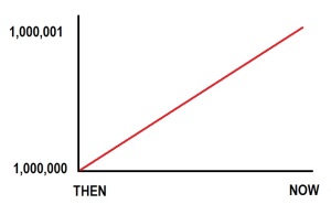
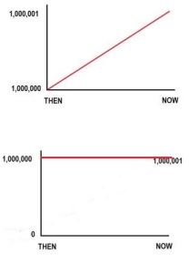
To clearly demonstrate why the Keeling Curve is fraudulent, consider this graph showing a population “explosion”:

It is not an “explosion” at all, this increase of 1/1,000,000. Here is the population “explosion” much more honestly presented, in comparison to the misleading graph:

population honest graph

The Scary Graph misleads and distorts, which science should never do. It misleads and distorts in more ways than just the scale of the graph.

Water is by far the dominant greenhouse gas, not carbon dioxide. Adding just the 1.5% water component (1.5% of 1,000,000 is 15,000) flattens the scary graph curve more than any of the other preceding factors.

carbon dioxide and water

Atmospheric water vapor + carbon dioxide total 15,400 parts per million, at the top of this graph. Total carbon dioxide, natural and anthropogenic, are the red line at bottom.


Can you imagine learned people demanding a worldwide economic depression on the basis of the fraudulent and grossly misleading Keeling Curve?

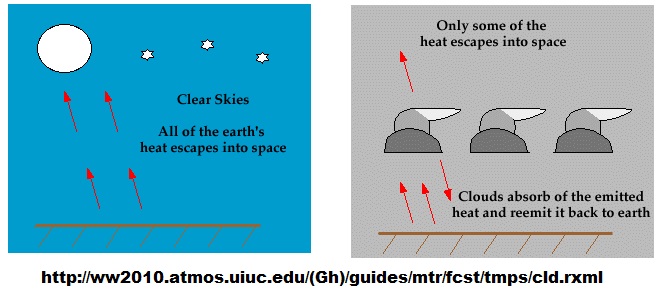
The greater warming power of water vapor and clouds (15,000 ppm) as compared with carbon dioxide (400 ppm) is experienced on a cloudy night, when temperatures are much warmer than on a cold, clear night.
`Water predominant greenhouse gas


Enjoy with some popcorn and a cherry Coke.

British environmental expert James Lovelock now admits he was an “alarmist” regarding global warming. Lovelock previously worked for NASA and became a guru to the environmental movement with his “Gaia” theory of the Earth as a single organism. In 2007, Time magazine named Lovelock one of its “Heroes of the Environment,” and he won the Geological Society of London’s Wollaston Medal in 2006 for his writings on the Gaia theory. That year he wrote an article in a British newspaper asserting that “before this century is over, billions of us will die and the few breeding pairs of people that survive will be in the Arctic where the climate remains tolerable.” (Independent.co.uk, 16 January 2006)

“We could use up all of the proven oil reserves of oil in the entire world by the end of the next decade.” – President Jimmy Carter, 1977

“If present trends continue, the world will be … eleven degrees colder by the year 2000. This is about twice what it would take to put us in an ice age.” Kenneth E.F. Watt, in “Earth Day,” 1970.
 
Last edited:

Forum List

Back
Top