2014 On Track To Be Hottest Year On Record

Denier cultists and their cherry-picked graphs and deranged pseudo-science are hilariously pathetic.

In the real world things look different...

had4_v2_giss.png

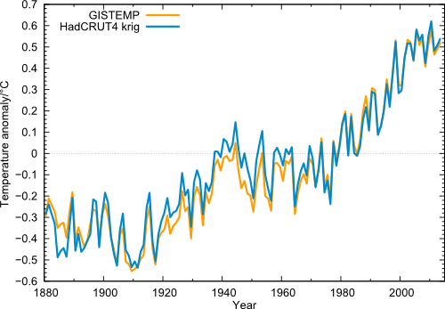
Every one of Criks graphs end in 2008... because then they dont show cooling..

IF we go out long enough we can show that it is a cyclical phase. Thus all the talk of the last 10 or so years would be normal and at the top of sine wave curve which would then turn downward into cooling.... Wait! that is why Crick refuses to show the last 5 years...
The graph ends in 2013, retard.

The reason none of the graphs show cooling is because there hasn't been any cooling , you poor delusional cretin.

The warmest years on record are going to be in this order after 2014 becomes the new 'hottest year'.

#1. 2014
#2. 2010
#3. 2005
#4. 2007
#5. 2009
#6. 2013
 
Regardless of how you order them, 9 of the ten warmest years have been since 2000. And the exception is 1998. Given the decrease in the Total Solar Irradiance, the increase in aerosols from India and China, and the fact that we have not had a strong El Nino since 1998, we really should be seeing a cooling. And now, for 2014, a year that has thus far been ENSO neutral, it looks like we are going to have the warmest year on record. Wonder what the next El Nino is going to bring?
 
Regardless of how you order them, 9 of the ten warmest years have been since 2000. And the exception is 1998. Given the decrease in the Total Solar Irradiance, the increase in aerosols from India and China, and the fact that we have not had a strong El Nino since 1998, we really should be seeing a cooling. And now, for 2014, a year that has thus far been ENSO neutral, it looks like we are going to have the warmest year on record. Wonder what the next El Nino is going to bring?

The top of a sine wave will always have double the normal amount of highs just as the bottom part of that same wave will double the amount of cold. Warmists really are clueless.
 
Post the actual temperatures,

Its just the temperature, idiot. We don't need no Scientist to tell us if its the hottest month ever, just let us see the temperatures, I don't need no scientist to pick the biggest number.

you need a scientist?


Here... let me help an old man set in his ways..

Hey Crick this post is for you!

View attachment 32366

Now that is the temperature plot since 1850. Do you see where we are today? The divergence to cooling is massive...

Very Very interesting chart. But it's not simple global temperature and it's not trend.
It shows the differential between adjacent years. # of degrees compared to "last year". There is a clear indication of a periodic cycle that is almost pure sinewave. What has a 60 year cycle --- eh?

And what would show as sinewave on a differentiated plot?? What would it look like INTEGRATED ?? Hmmmmmm.. And integrated by WHAT?? Tune in next week on
"As the World Burns"... :lol:
 
Last edited:
The top of a sine wave will always have double the normal amount of highs just as the bottom part of that same wave will double the amount of cold. Warmists really are clueless.
Pseudo-scientific jabber without meaning.

The rise in even just the near surface air temperatures, let alone the ocean temperatures, is NOT any kind of "sine wave", moron. It is a strongly rising trend, modulated by by both natural and artificial factors that either enhance or retard the warming.

had4_v2_giss.png
 
Still won't post the temperatures.

Sad
Eeekthetroll is still trolling.

Pathetic.
Asking how hot in a thread about the temperature is trolling?
In your case, yes.

The temperature data is publicly available. Nobody here wants to be your servant or fetch you any already available info you choose to demand. Screw you. You are pushing the incredibly idiotic denier propaganda meme of claiming that if someone posts every temp for every month of every year collected at every temperature station in the world, you can easily disprove AGW/CC and show that all of the world's scientists are wrong, and if nobody falls for that BS, you can claim that everyone is afraid to provide the data. LOLOLOL. You are a troll and your moronic drivel adds nothing but meaningless noise to the debates on this topic.

The only moronic drivel or meaningless noise allowed has to be on the side of the warmists!
 
Still won't post the temperatures.

Sad
Eeekthetroll is still trolling.

Pathetic.
Asking how hot in a thread about the temperature is trolling?
In your case, yes.

The temperature data is publicly available. Nobody here wants to be your servant or fetch you any already available info you choose to demand. Screw you. You are pushing the incredibly idiotic denier propaganda meme of claiming that if someone posts every temp for every month of every year collected at every temperature station in the world, you can easily disprove AGW/CC and show that all of the world's scientists are wrong, and if nobody falls for that BS, you can claim that everyone is afraid to provide the data. LOLOLOL. You are a troll and your moronic drivel adds nothing but meaningless noise to the debates on this topic.
I have challenged you in your thread, it is a thread about temperature. It is more relevant to post the temperature to links simply stating it was hot with a study to prove it.

You made a claim, it's mother me requesting you to be my servant, you started this thread, not me.

You have not proved your claim.

Don't answer is fine with me, others can read and see you dodge your own premise in your very own op.

You start an op, you are the servant to the op.

Find and post the temperature, quit hiding the trutb. It's your thread.
 
Post the actual temperatures,

Its just the temperature, idiot. We don't need no Scientist to tell us if its the hottest month ever, just let us see the temperatures, I don't need no scientist to pick the biggest number.

you need a scientist?


Here... let me help an old man set in his ways..

Hey Crick this post is for you!

View attachment 32366

Now that is the temperature plot since 1850. Do you see where we are today? The divergence to cooling is massive...

Very Very interesting chart. But it's not simple global temperature and it's not trend.
It shows the differential between adjacent years. # of degrees compared to "last year". There is a clear indication of a periodic cycle that is almost pure sinewave. What has a 60 year cycle --- eh?

And what would show as sinewave on a differentiated plot?? What would it look like INTEGRATED ?? Hmmmmmm.. And integrated by WHAT?? Tune in next week on
"As the World Burns"... :lol:

What happened at the points where the average temperature was close to zero divergence? Solar polarity flip or low solar output. There are two competing sign waves in that plot.

60 year solar phase.webp
(sorry for the mess but this was done without normal aids)

This plot has massive amounts of information. You will note the off setting sign waves that follow the suns magnetic signature. there is a 100% replication of the suns magnetic flux and pole reversal.
(red line)

You will note that there is a warming side of the wave and a cooling side. This too is very close in replication. The bottom side of the chart shows storm energy which bottoms out in the low part of the cycle. (where temperature differential is at its least).

I will do a much better graph when I get back to my computer.. You can see the ADO and PDO shifts as well as El Nino years.
 
Very Very interesting chart. But it's not simple global temperature and it's not trend.
It shows the differential between adjacent years. # of degrees compared to "last year". There is a clear indication of a periodic cycle that is almost pure sinewave. What has a 60 year cycle --- eh?

And what would show as sinewave on a differentiated plot?? What would it look like INTEGRATED ?? Hmmmmmm.. And integrated by WHAT?? Tune in next week on
"As the World Burns"... :lol:

What happened at the points where the average temperature was close to zero divergence? Solar polarity flip or low solar output. There are two competing sign waves in that plot.

View attachment 32402 (sorry for the mess but this was done without normal aids)

This plot has massive amounts of information. You will note the off setting sign waves that follow the suns magnetic signature. there is a 100% replication of the suns magnetic flux and pole reversal.
(red line)

You will note that there is a warming side of the wave and a cooling side. This too is very close in replication. The bottom side of the chart shows storm energy which bottoms out in the low part of the cycle. (where temperature differential is at its least).

I will do a much better graph when I get back to my computer.. You can see the ADO and PDO shifts as well as El Nino years.

There's something else that I see in that. The ENVELOPE of the temp response is as you describe, but the interannual variations have a natural ringing quality to them that I've not noticed before. It's a type of resonance that appears REGARDLESS of the envelope of the sine wave. High to lows in a period of about 1.5 to 2 years..

From a system response point of view, the envelope is due to the forcings but the "tuned natural frequency" is more likely the result of the system RESPONSE to the forcings. Many systems with storage and delays will ring like that.. Wonder how far back you could recreate that plot..
Sunspot numbers go back to the 1300's so I assume we could recreate it back to the beginning of the LIA.. The envelope that is. the internal workings would be lost with out actual observations.
 
Last edited:
Details like that might only show on a well sampled data like USHCN..
Could be why I've never seen anything like that before..

Events - in relation to temp differential.webp

The black lines are each time the PDO went cold. The last black line is the only time in recorded history that we have observed both the ADO and PDO go cold at the same time.


So, you keep asking for data. This report has all the data that was available.

Berkley's data is all ADJUSTED every single data point. I will use other unadjusted temps for my work. There are papers out today which show that 90% Of all warming post 1900 is adjustments. Given how stable the earth has been and the USCRN recent input to the game showing the amount of bias, I am of the opinion that Berkley's stuff is crap.

IF you remove the 0.8 to 1.2 deg C that is pointed out by several groups of scientists as being alteration crap the current cycles are of no statistical significance.
 
Back
Top Bottom