- Thread starter
- #21
Navigation
Install the app
How to install the app on iOS
Follow along with the video below to see how to install our site as a web app on your home screen.
Note: This feature may not be available in some browsers.
More options
You are using an out of date browser. It may not display this or other websites correctly.
You should upgrade or use an alternative browser.
You should upgrade or use an alternative browser.
Wow - "Hide the Decline" Fully Exposed
- Thread starter Sinatra
- Start date

edthecynic
Censored for Cynicism
- Oct 20, 2008
- 43,044
- 6,883
- 1,830
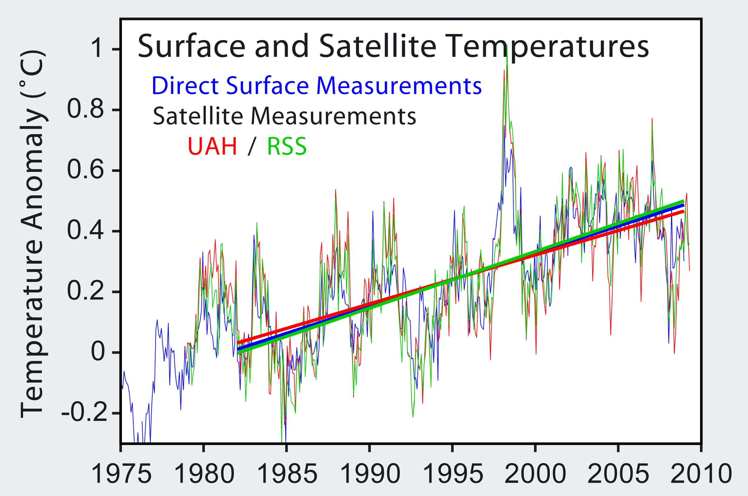
No, it's Christy and Spencer who got caught using the wrong sign for Diurnal Satellite Drift which is why your satellite temps are so out of line with real temp data. Using the correct sign the satellite data matches the surface data. Even Christy admitted the corrected Troposphere data matches the surface data.Give them time Sinatra, They'll recalibrate those pesky satellite numbers.
Interesting how those NASA surface temps are so out of line with the satellite data eh?
What is Hansen cooking over yonder?
Of course, deniers use only the erroneous Troposphere data that used the wrong sign to correct for Diurnal Drift.
Correcting for diurnal drift
Part of the discrepancy between UAH and RSS was the methods used to splice the data from different satellites together. However, the major source of discrepancy was the way they corrected for diurnal drift (Mears et al 2005). The satellites orbit the earth from pole to pole. The satellites possess no propulsion so slowly over time, the local equator crossing time (LECT) changes. This is exacerbated by decay of the satellites orbital height, dragged down by the thin atmosphere. As a satellite's LECT changes, it takes readings at changing local times, allowing local diurnal cycle variations to appear as spurious trends (Christy et al 2000).
An "Executive Summary" by the U.S. Climate Change Science Program, co-authored by John Christy of UAH concludes:
"Previously reported discrepancies between the amount of warming near the surface and higher in the atmosphere have been used to challenge the reliability of climate models and the reality of human induced global warming. This significant discrepancy no longer exists because errors in the satellite and radiosonde data have been identified and corrected.
Last edited:
saveliberty
Diamond Member
- Oct 12, 2009
- 58,756
- 10,843
- 2,030
Here's the raw data, now you show the data that you say was manipulated.☭proletarian☭;1805694 said:then post the 'real' raw data supporting your assertions or shut the fuck up already
It was your claim the numbers were instrument readings, you prove it. I'd try NASA, they have one of two sets still available. I actually feel for you Ed. It really sucks when the scientists do stuff like that and then don't tell us huh?
I won't hold my breath.
ftp://ftp.ncdc.noaa.gov/pub/data/anomalies/annual.land_ocean.90S.90N.df_1901-2000mean.dat
That is not raw data. It could be anything, as there is no accompanying Heading, measurement scale or other reference made. Assuming your source is NASA (actually it looks like NOAA) and it is related to climate, I'd guess it would be refined data of some type relating to anomalies .
The data you were going to provide me was actual instrument temperature readings. This is not it. It is an example of manipulated data however, so thanks for making my job easy.
Please note your chart shows the temps cooling from 2000 to 2006 and still offpeak since. They just used a long enough rolling average to trend your cute lines upward.
Last edited:

edthecynic
Censored for Cynicism
- Oct 20, 2008
- 43,044
- 6,883
- 1,830
Cynics art not so easily deceived as you gullible CON$.
That is the Stratosphere, not the lower Troposphere.
You, in typical CON$ervative fashion, dishonestly left out this caption that was under your chart:
"Figure 6. Color coded map of decadal trends in MSU/AMSU channel TLS (1979 - 2008). Data poleward of 82.5° are not available and are shown in white. This channel is dominated by stratospheric cooling."
Here's the lower Troposphere

Figure 3. Color coded map of decadal trends in MSU channel TLT (1979 - 2008). Data poleward of 82.5° North and 70° South, as well as areas with land or ice elevations above 3000 meters, are not available and are shown in white.
- Thread starter
- #26
Looks damn cold!!!
edthecynic
Censored for Cynicism
- Oct 20, 2008
- 43,044
- 6,883
- 1,830
Well, there you go again. In typical CON$ervative fashion, after being caught using the lower Stratosphere instead of the lower Troposphere, you just repeat the same deception.
Looks damn cold!!!
And CON$ wonder why they have no credibility.

RetiredGySgt
Diamond Member
Probably one of the best discussions I have run across on this subject of global warming:
SPECIAL INVESTIGATION: Climate change emails row deepens - and Russians admit they DID send them | Mail Online
Over the next few days, Briffa, Jones, Folland and Mann emailed each other furiously. Mann was fearful that if Briffas trees made the IPCC diagram, the sceptics [would] have a field day casting doubt on our ability to understand the factors that influence these estimates and, thus, can undermine faith [in them] - I dont think that doubt is scientifically justified, and Id hate to be the one to have to give it fodder!
Finally, Briffa changed the way he computed his data and submitted a revised version. This brought his work into line for earlier centuries, and cooled them significantly. But alas, it created another, potentially even more serious, problem.
According to his tree rings, the period since 1960 had not seen a steep rise in temperature, as actual temperature readings showed - but a large and steady decline, so calling into question the accuracy of the earlier data derived from tree rings.
This is the context in which, seven
weeks later, Jones presented his trick - as simple as it was deceptive.
All he had to do was cut off Briffas inconvenient data at the point where the decline started, in 1961, and replace it with actual temperature readings, which showed an increase.
On the hockey stick graph, his line is abruptly terminated - but the end of the line is obscured by the other lines.
Any scientist ought to know that you just cant mix and match proxy and actual data, said Philip Stott, emeritus professor of biogeography at Londons School of Oriental and African Studies.
Theyre apples and oranges. Yet thats exactly what he did.
Junk science by global warmers.
Read more: SPECIAL INVESTIGATION: Climate change emails row deepens - and Russians admit they DID send them | Mail Online
Gee, your graph is NOT actual temp readings!!!
Only CON$ would consider ACTUAL REAL data "deceptive."
Whenever proxy data does not match direct instrument data, it's the PROXY data that is suspect, not the directly measured data!!!
Nice to see you IGNORED the fact the DATA did not support itself and so had to be cut off at 1961 and replaced by reality.
- Thread starter
- #29
British report rips into the now infamous "hide the decline" at the center of the climategate storm.
Check out that graph comparison - my-oh-my.
And as you look at the graph showing the steep decline in temperatures by the 1960s, don't forget that was when the scientific community started to ramp up the "Global Cooling" due to mankind's pollution rhetoric. Those of us who went to school in the 1970's remember those days well.
Such deception...
Daily Mail: Special Investigation « Climate Audit [Welcome to our new home!]
---
edthecynic
Censored for Cynicism
- Oct 20, 2008
- 43,044
- 6,883
- 1,830
How dare I allow myself to be persuaded by "REALITY."Probably one of the best discussions I have run across on this subject of global warming:
SPECIAL INVESTIGATION: Climate change emails row deepens - and Russians admit they DID send them | Mail Online
Over the next few days, Briffa, Jones, Folland and Mann emailed each other furiously. Mann was fearful that if Briffas trees made the IPCC diagram, the sceptics [would] have a field day casting doubt on our ability to understand the factors that influence these estimates and, thus, can undermine faith [in them] - I dont think that doubt is scientifically justified, and Id hate to be the one to have to give it fodder!
Finally, Briffa changed the way he computed his data and submitted a revised version. This brought his work into line for earlier centuries, and cooled them significantly. But alas, it created another, potentially even more serious, problem.
According to his tree rings, the period since 1960 had not seen a steep rise in temperature, as actual temperature readings showed - but a large and steady decline, so calling into question the accuracy of the earlier data derived from tree rings.
This is the context in which, seven
weeks later, Jones presented his trick - as simple as it was deceptive.
All he had to do was cut off Briffas inconvenient data at the point where the decline started, in 1961, and replace it with actual temperature readings, which showed an increase.
On the hockey stick graph, his line is abruptly terminated - but the end of the line is obscured by the other lines.
Any scientist ought to know that you just cant mix and match proxy and actual data, said Philip Stott, emeritus professor of biogeography at Londons School of Oriental and African Studies.
Theyre apples and oranges. Yet thats exactly what he did.
Junk science by global warmers.
Read more: SPECIAL INVESTIGATION: Climate change emails row deepens - and Russians admit they DID send them | Mail Online
Gee, your graph is NOT actual temp readings!!!
Only CON$ would consider ACTUAL REAL data "deceptive."
Whenever proxy data does not match direct instrument data, it's the PROXY data that is suspect, not the directly measured data!!!
Nice to see you IGNORED the fact the DATA did not support itself and so had to be cut off at 1961 and replaced by reality.
PatekPhilippe
Senior Member
BALONEY!!!So it was okay to use the proxy data for the earlier years to show lower temperatures, and thus boulster the dramatic increase so desired by climatologists? You also miss the point that proxy data actually showed a decrease in temps and that was left off the graph entirely, so as to not raise questions about the process. A clear move to deceive that is even mentioned in the emails.
And let us use the real data shall we? Youwant to use it so bad right? Okay, then let's look at 1999 to present direct instrument data. The data that shows temperatures have been DECREASING.
The decade of 1999 to 2008 was the WARMEST in the history of direct instrument measurement.

Earth to Ed, come in Ed. That is not actual instrument readings. You got duped by the manipulated data again.
ed duped? and posting bullshit?
never happen...
- Thread starter
- #32
British report rips into the now infamous "hide the decline" at the center of the climategate storm.
Check out that graph comparison - my-oh-my.
And as you look at the graph showing the steep decline in temperatures by the 1960s, don't forget that was when the scientific community started to ramp up the "Global Cooling" due to mankind's pollution rhetoric. Those of us who went to school in the 1970's remember those days well.
Such deception...
Daily Mail: Special Investigation « Climate Audit [Welcome to our new home!]
---
---
edthecynic
Censored for Cynicism
- Oct 20, 2008
- 43,044
- 6,883
- 1,830
Cynics art not so easily deceived as you gullible CON$.
That is the Stratosphere, not the lower Troposphere.
You, in typical CON$ervative fashion, dishonestly left out this caption that was under your chart:
"Figure 6. Color coded map of decadal trends in MSU/AMSU channel TLS (1979 - 2008). Data poleward of 82.5° are not available and are shown in white. This channel is dominated by stratospheric cooling."
Here's the lower Troposphere
Figure 3. Color coded map of decadal trends in MSU channel TLT (1979 - 2008). Data poleward of 82.5° North and 70° South, as well as areas with land or ice elevations above 3000 meters, are not available and are shown in white.
Hey, you gotta admit I wasn't fooled by the Stratosphere chart BS!!!BALONEY!!!
The decade of 1999 to 2008 was the WARMEST in the history of direct instrument measurement.
Earth to Ed, come in Ed. That is not actual instrument readings. You got duped by the manipulated data again.
ed duped? and posting bullshit?
How many people would have recognized that that chart wasn't the Troposphere?
Xenophon
Gone and forgotten
Battle of the giant graphs!
PatekPhilippe
Senior Member
Cynics art not so easily deceived as you gullible CON$.
That is the Stratosphere, not the lower Troposphere.
You, in typical CON$ervative fashion, dishonestly left out this caption that was under your chart:
Here's the lower Troposphere
Figure 3. Color coded map of decadal trends in MSU channel TLT (1979 - 2008). Data poleward of 82.5° North and 70° South, as well as areas with land or ice elevations above 3000 meters, are not available and are shown in white.
Hey, you gotta admit I wasn't fooled by the Stratosphere chart BS!!!Earth to Ed, come in Ed. That is not actual instrument readings. You got duped by the manipulated data again.
ed duped? and posting bullshit?
How many people would have recognized that that chart wasn't the Troposphere?
no one's perfect ed....at some point we all get duped...it's the smart ones who allow it to happen only ONCE.

CrusaderFrank
Diamond Member
- May 20, 2009
- 148,629
- 71,938
- 2,330
Which would explain NASA's refusal to comply with a FOIA request these past 2 years...they're probably hiding the decline as well
Why else would NASA refuse to releases the data?
saveliberty
Diamond Member
- Oct 12, 2009
- 58,756
- 10,843
- 2,030
I give Ed credit for at least discussing the subject. It is a little more technical than our normal chats on USMB too. Can scientists label the x and y axis?
DiamondDave
Army Vet
Warmers...Birthers... Truthers...
what's the differences.
Vapor.. Paper.. and Inside Caper
BALONEY!!!Gee, your graph is NOT actual temp readings!!!
Only CON$ would consider ACTUAL REAL data "deceptive."
Whenever proxy data does not match direct instrument data, it's the PROXY data that is suspect, not the directly measured data!!!
So it was okay to use the proxy data for the earlier years to show lower temperatures, and thus boulster the dramatic increase so desired by climatologists? You also miss the point that proxy data actually showed a decrease in temps and that was left off the graph entirely, so as to not raise questions about the process. A clear move to deceive that is even mentioned in the emails.
And let us use the real data shall we? Youwant to use it so bad right? Okay, then let's look at 1999 to present direct instrument data. The data that shows temperatures have been DECREASING.
The decade of 1999 to 2008 was the WARMEST in the history of direct instrument measurement.
So the land station data shows an increas of about .6 degrees across the time from 1880 to 2008.
Check this link of the original data vs, the data now being used to find that with the adjustment alone, we have accounted for about .5 degrees.
http://zapruder.nl/images/uploads/screenhunter3qk7.gif
Still awake? Here's the article that it came from:
The Devil's Kitchen: Lies, damn lies, and...
The source above is obviously biased. Try this one instead:
GISS “raw” station data – before and after « Watts Up With That?
The problem with data records is that there is always a copy of the original unless the original was destroyed before copies were made. Kudos to Had Cru for their predictive prowess in at least this.
Similar threads
- Replies
- 518
- Views
- 12K
- Replies
- 2
- Views
- 190
- Replies
- 333
- Views
- 10K
Latest Discussions
- Replies
- 41
- Views
- 173
- Replies
- 8
- Views
- 27
- Replies
- 457
- Views
- 3K
Forum List
-
-
-
-
-
Political Satire 8872
-
-
-
-
-
-
-
-
-
-
-
-
-
-
-
-
-
-
-
ObamaCare 781
-
-
-
-
-
-
-
-
-
-
-
Member Usernotes 492
-
-
-
-
-
-
-
-
-
-