- Apr 12, 2011
- 3,821
- 761
- 130
Huh.
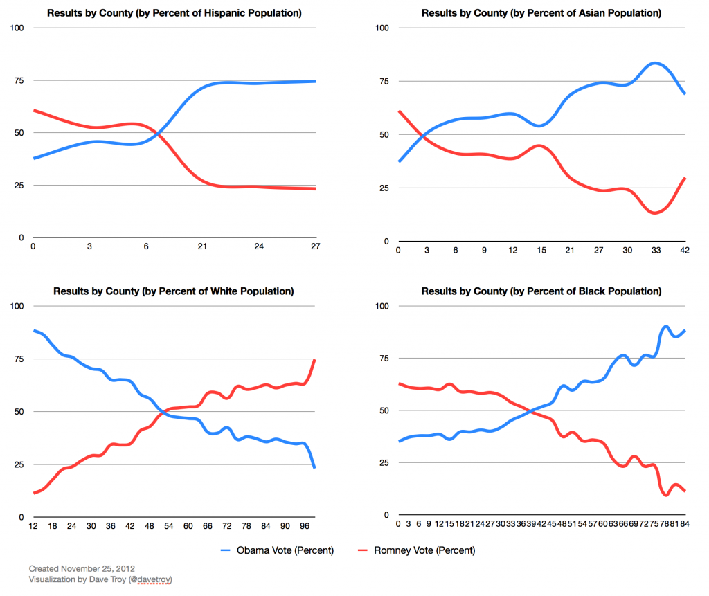
...Takers - Blue 11 Red 18 Givers - Blue 9 Red 3 Still, I have this hypothesis that, in fact, Republican economic concepts cause the depressed economy that fuels a high rate of federal assistance...... on what information do we conclude; "Apparently not only is the aid going to those who are not in need, it's going to areas where the populations do not want the aid."? If it is means tested and applied for then it is both needed and desired. So who doesn't want it based on what info?...federal aid does not necessarily prove there is economic hardship; a better indicator of economic pain is the unemployment rate. Compare the above blue/red state map to this one that shows unemployment rates:
Here are the average unemployment rates with how states voted in the 2012 election: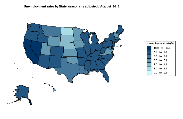
Combining our two maps shows three things:Average unemployment rate in red states: 6.9%
Average unemployment rate in blue states: 7.8%
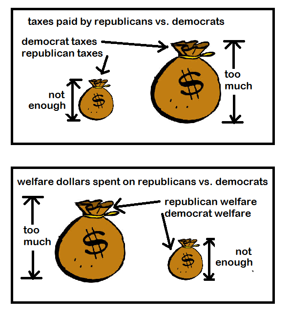
- Federal money does not help the poor.
- People don't want federal money coming to their states and they vote to stop it.
- Small gov't policies let people get jobs and big gov't policies make people poor.
Here is a list of data that will be needed to nail down the idea...

The Mother Jones map & the giver/taker thing was fine w/o those data. Now that we've found the 'economic concepts' hypothesis lacking, the situation's evolved to where there's a data list could be useful now even though it wasn't needed then.
My take is we're grasping at straws to shore up a failing belief.