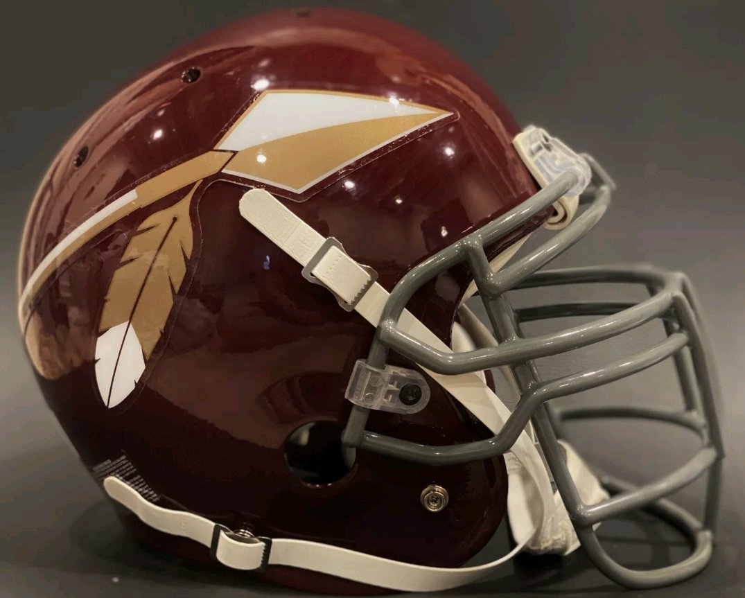
It's the burgundy and gold that looks good though, better than the black, which won't be worn much probably.
They need to get back to their roots, and that color combo is one of the best in the NFL
"I'm sure there will be some that are always looking for a full reversal," Clouse said regarding the old name and logo, "and that's not the path we're on, but I think this is a great way to continue to celebrate that.
"We've been very purposeful in trying to bring back the celebration and integration of our heritage while continuing to move forward to build the Commander brand. It's extremely important that the elements of those things are brought together."
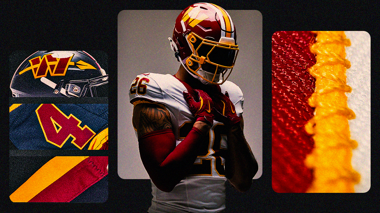
There's also a basic explanation for the return to a familiar look.
"We wanted to bring back all the traditional elements," Commanders chief marketing officer Patrick Arthur said, "so when people come to Northwest Stadium next year and they're watching the game, they see their team that they grew up rooting for on the field."

")