This is a real telling thread. A left winger posts charts that he doesn't understand, makes broad and misguided conclusions based on that misunderstanding, and then the other left wingers jump on the bandwagon spewing their ignorant hate for the residents of a large section of the country they claim to love.
When posters seek out reasons to hate an entire segment of society, they already have a mental problem, and that seems to fit a large share of left wing posters.
Why do these mental midgets hate the Southern states? Because they vote Republican. Grow up assholes!
Oh unlike you who laid out the reasons why the article and chart are both wrong and presented evidence to back it up. Save your righteous indignation for another thread cry baby
The charts are probably accurate, although they provide little if any useful information, and what information they do provide was obviously misunderstood by both the Huffington Post, and you left wing parrots of propaganda.
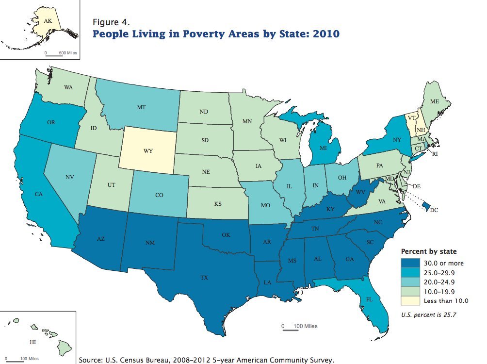
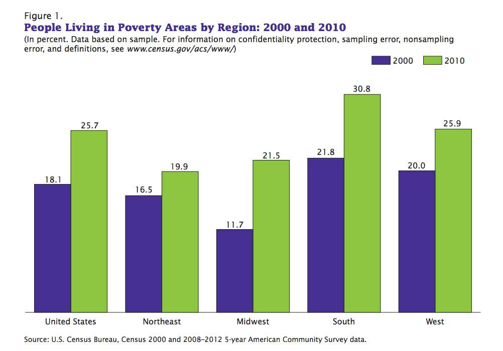
The charts don't indicate that the South is a solid block of poverty. They indicate that there is more poverty in the South, based on a false premise, than there is anywhere else. A family of four living in the South, and earning $23,850 per year, is not in poverty. The charts are based on the federal poverty line, and not the real poverty line of the individual area. In addition, the dark blue color begins at 30% or more, and that distorts the picture since the only figure above that is the 30.8% for the South.
If 20% of the population in the "area" are below the poverty line, then you live in a "poverty area". The charts also indicate that 30.8% of the South live in "poverty areas" (in 2010). That is not a solid block of poverty in any way, shape, or form. Therefore, the Huffington Post article, and your comments are nothing more than propaganda feeding your hate for anything Republican.
In addition, the Southern border naturally borders the Southern states, and we have had, and still have, a massive flow of poverty stricken, illegal immigrants flowing into the Southern states, and that inflates the figures even more.
A virtually useless chart, based on bad data, and misunderstood by the people who are relying on it, and you have pure propaganda fueling the irrational hatred of left wing loons.