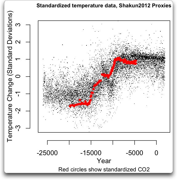
On that scale, the most surprising behaviour is NOT the "which comes first" proposition which I've weakly seen sometimes on other timescales. But more consistently -- it's the "which goes last" proposition that seems to suggest some darn thing. On almost every major FALL in temp -- the temp precedes the "supposed" forcing function. Kinda violates the concept of a forcing function on that principle alone doesn't it?
Either the lags in the proxies are wrong and some axis diddling is required or the current CO2 theory would have to say that the feedbacks somehow go mostly negative at some point in the CO2 rise..
<edited for a 3rd possibility> OR the CO2 ice proxies are somehow "filtered" themselves to add delay. Perhaps liquid mixing? Or limits on the dating resolution when the cores are taken.
Forcing functions should predict BOTH the positive AND negative slopes of temperature.. Eh?
So -- back to the graph.. If CO2 DRIVES the temperature... How come almost all the major temperature DECLINES in that graph start BEFORE the CO2 level starts to drop???
Curiousity like that just might hold the key to understanding HOW (and if) we could do anything to LOWER the surface temperature.. If the temperature can drop during a relatively high concentration of CO2 -- we need to explain that -- don't we?
Fathead got some 'splainin' to do!

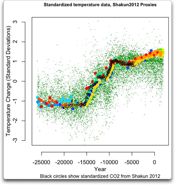
Fatski, this graph isn't in your native Russian, or something. In plain English-US,
the red line starts up, the blue line follows, on all major upswings.
 The red line starts down, the blue line follows,
 on all major downswings.

But we aren't seeing exactly
that, at the end of the graph, do we, fat as **** dildina, when the plot ends at present.

What we see is a radical shoot, over about 150 years, to 400 ppm CO2, which is best explained, by simultaneous human defoliation and CO2 emissions. Do you want to offer any more chickenshit, bullshit, wingpunk circle-jerks, spam-pictures, gay porn, or any other diversion media, which would explain why you think warming is not going to follow the dramatic rise, of the shooting, red line? Repetitious, ain't it, Fathead. Move to Russia, next, sell us some oil, and call yourself 'Flacaltennbuttski.'

Gay as hell Crapforbrains hasn't caught on, to 'liar, liar, pants on fire.' Yeah, Crapforbrains, I know the red line is for CO2, the blue line is temperature. And your head is for up your own asshole, since Fathead is finally figuring out he pitard-hoisted you and his stupid self, with a graph which clearly shows not only global warming correlates to rise in CO2, but AGW is strongly indicated, by the way the red line jumps, at the end of the plot.

Got the picture? With your heads up each others' assholes, one of you farted, and you both blew up! Dumbshits!