Get ready to kiss you a** goodbye

Have you been to Denali or up the Alaskan coast, there is a lot of melting going on..

Also I grew up in northern Minnesota with deep cold winters, they haven't had a huge cold winter storm in several years.

The problem is, we humans have a very short life span as compared to the cyclical climate of our earth. Thus we do not live long enough to see the cycles start to finish. This makes us easily duped by those who would want to control us and use this as a weapon to deprive us of our freedoms and rights.

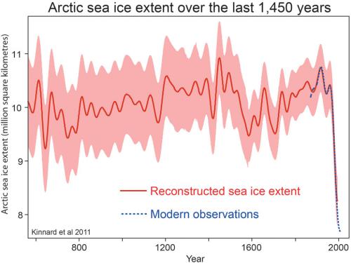
Just in the current interglacial we have seen 5 cycles of ice free and a return to partial glaciation. A fact the alarmists don't want you to see or understand.

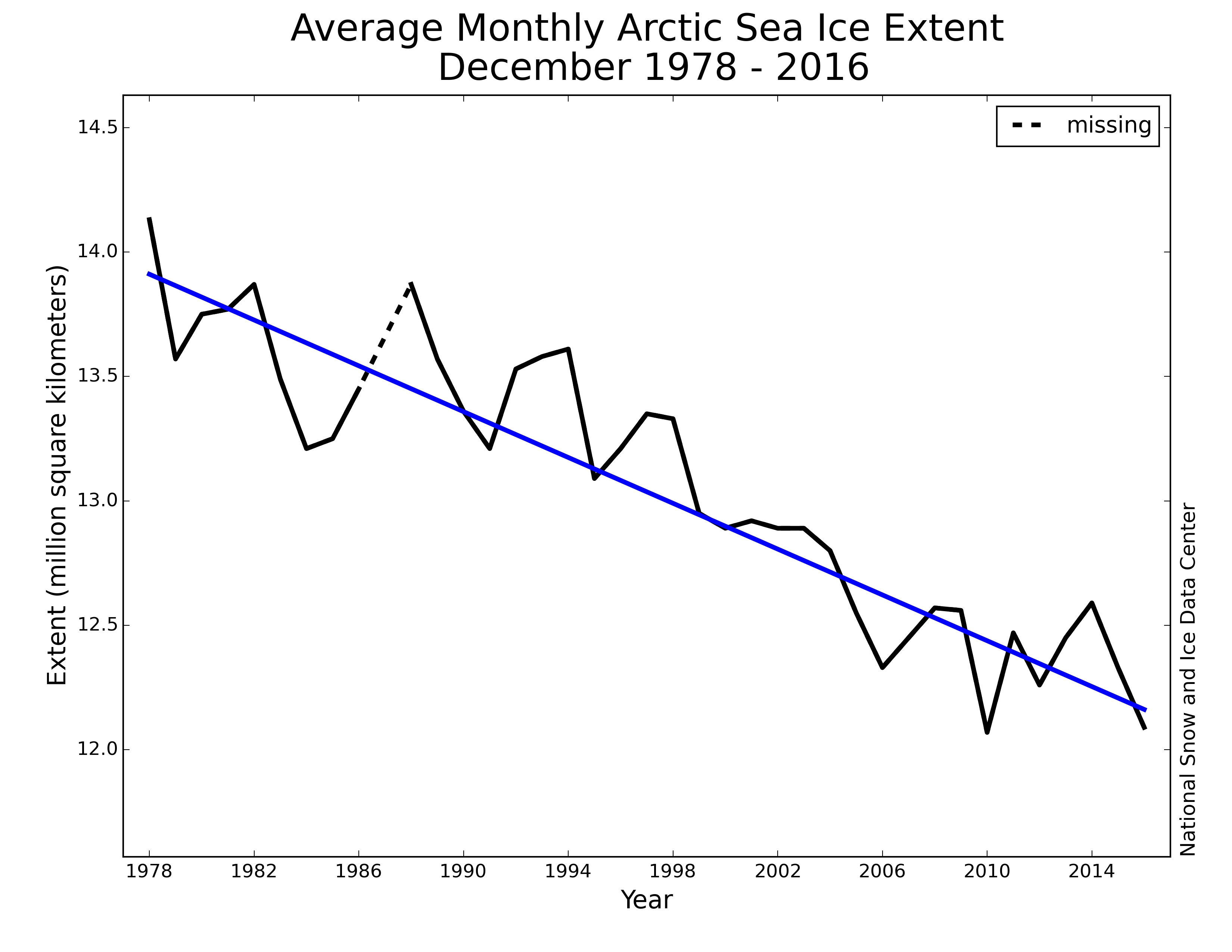
View attachment 107567

Interglacial's last about 14,000 years on average. Were at 14,600 years at present. We are over due for our next 90,000 year glacial cycle. Pray that our current interglacial last a while longer. The death that will happen when we fall into the next glacial cycle will thin the herd massively.

I don't know enough to get into the science of things, but why is there such and opposition from the party who supports people like the Koch brothers to blow all of their chemicals into the air and water?

We have a cancer epidemic in America , so our bodies are warning us of what we are doing to our world.

Anyway, I do not want to hi-jack the thread, I find it interesting.
WE do not blow chemicals into the air etc... we want reasonable regulations based on science, not left wing fear mongering and hype. Another left wing lie that needs to die as well..

Take it easy on EagleWings. Poster is probably still under the impression that CO2 is a pollutant and a chemical. Not their fault they've been propagandized.

I have heard that the epidemic of breast cancer on the Northern California coast is from the crap coming over from China and Japan when it had a radiation problem after the earthquake they had about 5 or 6 years ago.

Wish these things were fake, but it is well known and documented that chemical plants have poisoned many in their communities with pools of cancer causing crap in their air and water.


Here are a few links

5 years later, Fukushima radiation continues to seep into the Pacific Ocean

Five years after an accident at the Fukushima nuclear plant in Japan, some scientists continue to find found small amounts of radioactive material along the West Coast of North America. And some of them say we should expect to see this in the ocean for decades to come. Elevated levels found off the coast of Japan show that the situation is not yet under control, and that the facility is still leaking radiation.
West Coast watches as Fukushima leaks radiation

Fukushima Radiation Leak: 5 Things You Should Know


Measurable amounts are not neccessarily a health hazard. It's a concept of zero risk that just doesn't fit in a dirty world.. Like "pure" water vs "clean" water. I've drunk $30/gal "pure" water used in labs/fabs. It's not good.

And you ARE aware that HOSPITALS and med facilities are the largest generators of "low level" nuclear waste correct? If you took the nuclear med injection I once did and crapped it out into Lake Michigan, it MIGHT equal the radiation coming from Fukishima and hitting the West Coast.
 
The fact that their "consistent time series" doesn't SHOW the dip and build in the Early 70s just verifies that ACTUAL DATA is always better than models or reconstructions from nearly NO actual data..

Clinging to obsolete data when much better newer data is available is a standard tactic of pseudoscience fanatics in every field. And you just used it.

You just jerking off avoiding the real evidence.

That's your usual projection of your own favorite tactic.

Tell me Mammy, How many sample points are in the sketchy "ground" data that makes up their "data" and by what MEANS were they obtained?
What is this "ground" "data" you speak of? Why the funny use of quotes? You seem to be waving your hands around wildly, in an attempt to distract people. I gave you the links. Maybe you could, you know, read them.

We can go further back than 1935. The Walsh paper here starts it in 1850, are shows sea ice levels are pretty constant until 1970, at which point the drop begins. It creeps down a bit from 1900-1935, and up a bit from 1935-1970, but that's all insignificant compared to the current collapse.

A database for depicting Arctic sea ice variations back to 1850

gere12195-fig-0008.png

full

Well Bullwinkle the "ground" data would be those sketchy and unprecise and highly IRREGULAR ship data logs that your REFERENCES are basing their guesstimates on. Along with a few Military recon flights that never made it to the middle of the arctic ocean.. Simply can't compete with a single picture from 180 miles up. Can it ?

And I'm not trying to "distract" anyone. I'm again wasting my time SOLELY with you. And the " " are appropriately used in the last instance to mark a comment that YOU made.

You got anything else to whine about poopy pants?
 
The ice caps are the planet's heat sink. When they fall apart, all kinds of feedbacks kick in and the climate goes to hell in short order. Here's a graph that shows planetary ice extent. Notice anything frightening about 2016?

View attachment 107464

More troublesome yet, there are gigatons worth of methane clathrates ready to melt and contribute more greenhouse gasses than the planet has seen in millions of years.

I'm not advocating action. We're past all that now.


as of today a chart that will not be on the whitehouse website

--LOL
 
One thing the fervent warmers are sketchy on is that we've only had the TOOLS to precisely measure most of this from space for about 35 years at the most. And to them, ANYONE that shows a graph has EQUAL PRECISION and EQUAL temporal and spatial coverage of the variable in question. It's kinda like an actor putting on a lab coat for a commercial on TV. If they SEE a graph --- it MUST BE sciency and brilliant.
 
Well Bullwinkle the "ground" data would be those sketchy and unprecise and highly IRREGULAR ship data logs that your REFERENCES are basing their guesstimates on.
So you started out saying how awful it is, that only satellite data was used.

Now you're saying how awful it is, that data besides satellite data is used.

Fascinating, how quickly you can do these one-eighties, and how it doesn't seem to bother you at all.

Or maybe you just hate all data, period. That would keep you logically consistent.

I NEVER EVER said that it was awful that ONLY satellite data was used. What I scolded on was the fact that satellite data EXISTED prior to 1979, but it displays a tale that shan't be told. And thus after the 1990 publication by the IPCC of the ENTIRE satellite record (albeit it was processed differently and the satellites were different) --- it became MANDATORY to start the "satellite sea ice record" from 1979 instead of 1972 or so..

That's more than just dishonest to hide that knowledge to make scarier looking graphs. AND unethical in ANY sense of science norms..


Barrow -26F
Kotelnly -4F
Golomjannayj 9F
Alert -4F

Very cool
LOL Not going to post your link this time, Comrade Frankie boi? Because there are other places in the arctic that are way above what they should be in mid-January.

Arctic Weather Map

Show us one (1)
Tostuya 0
Cape Cheluskin 5
Golomjannyj 14
Vize Island 12

Arctic Weather Map

And there are at least seven more on that map that are very warm for this time of year.

December 2016 compared to previous years

Figure 3. Monthly December ice extent for 1979 to 2016 shows a decline of 3.4 percent per decade.

Credit: National Snow and Ice Data Center

Global sea ice tracking far below average

Figure 6a. This time series of daily global sea ice extent (Arctic plus Antarctic) shows global extent tracking below the 1981 to 2010 average. The X axis shows the month of the year, aligned with the first day of the month. Sea Ice Index data.

Credit: NSIDC
High-resolution image


Figure 6b. This graph shows daily global sea ice difference from average, relative to the 1981 to 2010 reference period in square kilometers for the satellite record from 1979 through 2016

Credit: National Snow and Ice Data Center
High-resolution image


Figure 6c. This graph shows daily sea ice difference from average in units of the standard deviation (based on 1981-2010 variation from the average) for this period.

Credit: National Snow and Ice Data Center
High-resolution image


Image 2 of 4 (play slideshow) Download

N_stddev_timeseries.png


Got to remind you here OldieRocks, everyone likes to PRETEND there was no satellite tally of Arctic Sea Ice before 1979.. But that's not true at all. Might have been more done by hand from fewer pictures, but it was there. The 1979 date was only the introduction of better satellites. But it's just photos. Maybe multi-band stuff that can estimate "age" of the ice.

Where does this pic below come from - you ask? (Like you've never seen this before. :lmao: :lmao: :lmao:)
It comes from the 1990 IPCC report of course... We don't forget a lot. Unlike the warmers who conveniently forget shit that contradicts their confirmation biases..


screenhunter_170-jun-15-11-10.jpg


It's kinda WILLFULLY dishonest to start data from relative PEAKS, when you have this in your back pocket. Isn't it???? Need an answer to that question bud..
Arctic sea ice extent over 1,450 years

Arctic sea ice extent over 1,450 years

Kinnard_2011_sea_ice_med.jpg


Late-summer Arctic sea ice extent in million square kilometers over the last 1450 years (red line), reconstructed from a combination of Arctic ice core, tree ring, and lake sediment data by Kinnard et al. (2011). A 40-year low-pass filter was applied to the data. The shaded area shows the uncertainty (95% confidence interval), and the blue dashed line shows modern observations. Arctic sea ice extent is currently lower than at any time in the last 1450 years. Unfortunately, sea ice is now melting even faster than predicted.

No, Mr. Flacaltenn, you need to answer why you cherry picked a graph that only went to 1990, when it is obvious that the extreme melt has occurred since that year.

Global sea ice records broken (again)

6a0133f03a1e37970b01b7c8c7f9f4970b-800wi


This graph is reason for alarm.
 
Well Bullwinkle the "ground" data would be those sketchy and unprecise and highly IRREGULAR ship data logs that your REFERENCES are basing their guesstimates on.
So you started out saying how awful it is, that only satellite data was used.

Now you're saying how awful it is, that data besides satellite data is used.

Fascinating, how quickly you can do these one-eighties, and how it doesn't seem to bother you at all.

Or maybe you just hate all data, period. That would keep you logically consistent.

I NEVER EVER said that it was awful that ONLY satellite data was used. What I scolded on was the fact that satellite data EXISTED prior to 1979, but it displays a tale that shan't be told. And thus after the 1990 publication by the IPCC of the ENTIRE satellite record (albeit it was processed differently and the satellites were different) --- it became MANDATORY to start the "satellite sea ice record" from 1979 instead of 1972 or so..

That's more than just dishonest to hide that knowledge to make scarier looking graphs. AND unethical in ANY sense of science norms..
That is not at all what you did. You picked a graph that did not show the extreme melt that occurred after 1990. A melt shown clearly by the satellite data. A way of lying about what is happening right now.
 
Barrow -26F
Kotelnly -4F
Golomjannayj 9F
Alert -4F

Very cool
LOL Not going to post your link this time, Comrade Frankie boi? Because there are other places in the arctic that are way above what they should be in mid-January.

Arctic Weather Map

Show us one (1)
Tostuya 0
Cape Cheluskin 5
Golomjannyj 14
Vize Island 12

Arctic Weather Map

And there are at least seven more on that map that are very warm for this time of year.

December 2016 compared to previous years

Figure 3. Monthly December ice extent for 1979 to 2016 shows a decline of 3.4 percent per decade.

Credit: National Snow and Ice Data Center

Global sea ice tracking far below average

Figure 6a. This time series of daily global sea ice extent (Arctic plus Antarctic) shows global extent tracking below the 1981 to 2010 average. The X axis shows the month of the year, aligned with the first day of the month. Sea Ice Index data.

Credit: NSIDC
High-resolution image


Figure 6b. This graph shows daily global sea ice difference from average, relative to the 1981 to 2010 reference period in square kilometers for the satellite record from 1979 through 2016

Credit: National Snow and Ice Data Center
High-resolution image


Figure 6c. This graph shows daily sea ice difference from average in units of the standard deviation (based on 1981-2010 variation from the average) for this period.

Credit: National Snow and Ice Data Center
High-resolution image


Image 2 of 4 (play slideshow) Download

N_stddev_timeseries.png


Got to remind you here OldieRocks, everyone likes to PRETEND there was no satellite tally of Arctic Sea Ice before 1979.. But that's not true at all. Might have been more done by hand from fewer pictures, but it was there. The 1979 date was only the introduction of better satellites. But it's just photos. Maybe multi-band stuff that can estimate "age" of the ice.

Where does this pic below come from - you ask? (Like you've never seen this before. :lmao: :lmao: :lmao:)
It comes from the 1990 IPCC report of course... We don't forget a lot. Unlike the warmers who conveniently forget shit that contradicts their confirmation biases..


screenhunter_170-jun-15-11-10.jpg


It's kinda WILLFULLY dishonest to start data from relative PEAKS, when you have this in your back pocket. Isn't it???? Need an answer to that question bud..
Arctic sea ice extent over 1,450 years

Arctic sea ice extent over 1,450 years

Kinnard_2011_sea_ice_med.jpg


Late-summer Arctic sea ice extent in million square kilometers over the last 1450 years (red line), reconstructed from a combination of Arctic ice core, tree ring, and lake sediment data by Kinnard et al. (2011). A 40-year low-pass filter was applied to the data. The shaded area shows the uncertainty (95% confidence interval), and the blue dashed line shows modern observations. Arctic sea ice extent is currently lower than at any time in the last 1450 years. Unfortunately, sea ice is now melting even faster than predicted.

No, Mr. Flacaltenn, you need to answer why you cherry picked a graph that only went to 1990, when it is obvious that the extreme melt has occurred since that year.

Global sea ice records broken (again)

6a0133f03a1e37970b01b7c8c7f9f4970b-800wi


This graph is reason for alarm.


Damn GoldieRocks -- I explained all that. The IPCC graph STOPS at 1990 -- because it was PREPARED for their fucking 1990 conference you dolt. DO -- ATTEMPT to follow along.

That "Global" Sea Ice chart has your goat doesn't it? You DO realize that it does not represent POLAR sea ice. It doesn't represent the state of Antarctic SIE for SURE.. And it BARELY reflects the minor loses at the North Pole. So what it is??? My guess is that represents the warm N. Hemi conditions for the past couple years. From the massive El Nino we just walked thru. And the long DELAYS in redistributing that heat up to the NEAR polar regions.

When you play the game of defining Sea Ice as "any patch containing 15% or more" and measure GLOBALLY, you are adding MILLIONS of square Km with just a couple icebergs floating in the middle of blue water.

Grown up -- Use your head. ASK --- wtf you're looking at before you panic..

It's a shame that this GW movement has just perfected the art of scaring people shitless. They know how to instill panic and fear. And it's sad, because all of that is likely change back now to just plain old fashioned boring science.
What the fuck? I thought that kind of lie was reserved for Mr. Westwall. Global sea represents all the ice on the sea around the globe.
N_stddev_timeseries_thumb.png


S_stddev_timeseries_thumb.png


Arctic Sea Ice News and Analysis | Sea ice data updated daily with one-day lag
 
BTW -- back in the 80s when I worked for a company that made the imaging processing equipment for Earth resource satellite data -- I put together a demo for the salesforce comparing the OLD manual reading of sat photos compared to doing it with Computer Aided tools and analysis. And PART of that demo used OLD Arctic Sea Ice sat photos from the 1970s (many we had to digitize from photo proofs) and newer sat SIE data. So I REMEMBER having chats with folks who DID the pre-79 analysis of that data and their process.
 
BTW -- back in the 80s when I worked for a company that made the imaging processing equipment for Earth resource satellite data -- I put together a demo for the salesforce comparing the OLD manual reading of sat photos compared to doing it with Computer Aided tools and analysis. And PART of that demo used OLD Arctic Sea Ice sat photos from the 1970s (many we had to digitize from photo proofs) and newer sat SIE data. So I REMEMBER having chats with folks who DID the pre-79 analysis of that data and their process.
Arctic sea ice extent over 1,450 years
Kinnard_2011_sea_ice_med.jpg


Late-summer Arctic sea ice extent in million square kilometers over the last 1450 years (red line), reconstructed from a combination of Arctic ice core, tree ring, and lake sediment data by Kinnard et al. (2011). A 40-year low-pass filter was applied to the data. The shaded area shows the uncertainty (95% confidence interval), and the blue dashed line shows modern observations. Arctic sea ice extent is currently lower than at any time in the last 1450 years. Unfortunately, sea ice is now melting even faster than predicted.

Arctic sea ice extent over 1,450 years

Really. And that has to do with this, how? Most of the melt has occurred since 2000.
 
Tostuya 0
Cape Cheluskin 5
Golomjannyj 14
Vize Island 12

Arctic Weather Map

And there are at least seven more on that map that are very warm for this time of year.

December 2016 compared to previous years

Figure 3. Monthly December ice extent for 1979 to 2016 shows a decline of 3.4 percent per decade.

Credit: National Snow and Ice Data Center

Global sea ice tracking far below average

Figure 6a. This time series of daily global sea ice extent (Arctic plus Antarctic) shows global extent tracking below the 1981 to 2010 average. The X axis shows the month of the year, aligned with the first day of the month. Sea Ice Index data.

Credit: NSIDC
High-resolution image


Figure 6b. This graph shows daily global sea ice difference from average, relative to the 1981 to 2010 reference period in square kilometers for the satellite record from 1979 through 2016

Credit: National Snow and Ice Data Center
High-resolution image


Figure 6c. This graph shows daily sea ice difference from average in units of the standard deviation (based on 1981-2010 variation from the average) for this period.

Credit: National Snow and Ice Data Center
High-resolution image


Image 2 of 4 (play slideshow) Download

N_stddev_timeseries.png


Got to remind you here OldieRocks, everyone likes to PRETEND there was no satellite tally of Arctic Sea Ice before 1979.. But that's not true at all. Might have been more done by hand from fewer pictures, but it was there. The 1979 date was only the introduction of better satellites. But it's just photos. Maybe multi-band stuff that can estimate "age" of the ice.

Where does this pic below come from - you ask? (Like you've never seen this before. :lmao: :lmao: :lmao:)
It comes from the 1990 IPCC report of course... We don't forget a lot. Unlike the warmers who conveniently forget shit that contradicts their confirmation biases..


screenhunter_170-jun-15-11-10.jpg


It's kinda WILLFULLY dishonest to start data from relative PEAKS, when you have this in your back pocket. Isn't it???? Need an answer to that question bud..
Arctic sea ice extent over 1,450 years

Arctic sea ice extent over 1,450 years

Kinnard_2011_sea_ice_med.jpg


Late-summer Arctic sea ice extent in million square kilometers over the last 1450 years (red line), reconstructed from a combination of Arctic ice core, tree ring, and lake sediment data by Kinnard et al. (2011). A 40-year low-pass filter was applied to the data. The shaded area shows the uncertainty (95% confidence interval), and the blue dashed line shows modern observations. Arctic sea ice extent is currently lower than at any time in the last 1450 years. Unfortunately, sea ice is now melting even faster than predicted.

No, Mr. Flacaltenn, you need to answer why you cherry picked a graph that only went to 1990, when it is obvious that the extreme melt has occurred since that year.

Global sea ice records broken (again)

6a0133f03a1e37970b01b7c8c7f9f4970b-800wi


This graph is reason for alarm.


Damn GoldieRocks -- I explained all that. The IPCC graph STOPS at 1990 -- because it was PREPARED for their fucking 1990 conference you dolt. DO -- ATTEMPT to follow along.

That "Global" Sea Ice chart has your goat doesn't it? You DO realize that it does not represent POLAR sea ice. It doesn't represent the state of Antarctic SIE for SURE.. And it BARELY reflects the minor loses at the North Pole. So what it is??? My guess is that represents the warm N. Hemi conditions for the past couple years. From the massive El Nino we just walked thru. And the long DELAYS in redistributing that heat up to the NEAR polar regions.

When you play the game of defining Sea Ice as "any patch containing 15% or more" and measure GLOBALLY, you are adding MILLIONS of square Km with just a couple icebergs floating in the middle of blue water.

Grown up -- Use your head. ASK --- wtf you're looking at before you panic..

It's a shame that this GW movement has just perfected the art of scaring people shitless. They know how to instill panic and fear. And it's sad, because all of that is likely change back now to just plain old fashioned boring science.
What the fuck? I thought that kind of lie was reserved for Mr. Westwall. Global sea represents all the ice on the sea around the globe.
N_stddev_timeseries_thumb.png


S_stddev_timeseries_thumb.png


Arctic Sea Ice News and Analysis | Sea ice data updated daily with one-day lag

Don't think you understood my last post. That GLOBAL plot has a scary deviance that is NOT DUE to Polar Ice in any great measure. It includes MILLIONS of KM of NON Polar sea that has a few icebergs floating in them. It will therefore show MUCH more variance than either of the Polar plots you just posted.

Not trying to start a feud here. Settle down and we'll resolve all of "MY lying". Cause I never do that.
 
BTW -- back in the 80s when I worked for a company that made the imaging processing equipment for Earth resource satellite data -- I put together a demo for the salesforce comparing the OLD manual reading of sat photos compared to doing it with Computer Aided tools and analysis. And PART of that demo used OLD Arctic Sea Ice sat photos from the 1970s (many we had to digitize from photo proofs) and newer sat SIE data. So I REMEMBER having chats with folks who DID the pre-79 analysis of that data and their process.
Arctic sea ice extent over 1,450 years
Kinnard_2011_sea_ice_med.jpg


Late-summer Arctic sea ice extent in million square kilometers over the last 1450 years (red line), reconstructed from a combination of Arctic ice core, tree ring, and lake sediment data by Kinnard et al. (2011). A 40-year low-pass filter was applied to the data. The shaded area shows the uncertainty (95% confidence interval), and the blue dashed line shows modern observations. Arctic sea ice extent is currently lower than at any time in the last 1450 years. Unfortunately, sea ice is now melting even faster than predicted.

Arctic sea ice extent over 1,450 years

Really. And that has to do with this, how? Most of the melt has occurred since 2000.
 
I NEVER EVER said that it was awful that ONLY satellite data was used. What I scolded on was the fact that satellite data EXISTED prior to 1979, but it displays a tale that shan't be told.

Which is why those 3 papers, among others, studied it in detail, published about it, and why all the scientists knew about it how ice levels were higher pre-1979. It's only in your conspiracy theory that data is being hidden.

And thus after the 1990 publication by the IPCC of the ENTIRE satellite record (albeit it was processed differently and the satellites were different) --- it became MANDATORY to start the "satellite sea ice record" from 1979 instead of 1972 or so.

The modern papers use that 1972-1978 satellite data. Hence, nothing is being "hidden", and your conspiracy theory crashes.

http://citeseerx.ist.psu.edu/viewdo...09A9C6D?doi=10.1.1.423.1769&rep=rep1&type=pdf
---
The homogenized combined time series is created from three individual products: a consistent passive microwave record
using multiple channels (frequencies and polarizations), an extended passive microwave record that also incorporates
an early 1970s single-channel passive microwave radiometer, and the pre-1979 part of the Hadley Centre climatology.
Each dataset is summarized below with references for details of the processing methods.

2.2 Extended passive microwave (XPM)
The sensors used in the consistent, long-term passive microwave sea ice time series, SMMR-SSM/I-SSMIS, are
multi-channel (five frequencies, four with dual polarization).Preceding this multichannel passive microwave era, a single-
channel sensor, the Electrically Scanning Microwave Radiometer (ESMR) on the NASA Nimbus-5 platform operated
from late 1972 through early 1977. Because it was only a single channel instrument, the NT algorithm is not applicable
and a single-channel algorithm was used. There were several quality control issues with ESMR, limiting data collec-
tion. Nonetheless, daily and monthly sea ice concentration and extent estimates have been produced for most months
between January 1973 and December 1977 (Parkinson et al., 1987a, b, 1999;
| National Snow and Ice Data Center).

These fields were produced on the same 25 km x 25 km polar stereographic grid as the data for the SII estimates.
The different algorithms, limited data quality, and the lack of an overlap between the ESMR and SMMR complicate
merging of the ESMR extents with the SII values in a consistent manner. However, Cavalieri et al. (2003) combined
the two passive microwave time series by using operational ice charts from the US National Ice Center (Dedrick et al.,
2001) to cross-calibrate between the SMMR-SSM/I record and ESMR and bridge the gaps within ESMR and between
ESMR and the multi-channel passive microwave record, creating a 30-yr time series spanning January 1972 through
December 2002 (Data Set Not Found | National Snow and Ice Data Center), denoted here as the “XPM” time
series. In the process, adjustments were made to both passive microwave records and this XPM time series is not entirely
consistent with the SII time series.
---
 
BTW -- back in the 80s when I worked for a company that made the imaging processing equipment for Earth resource satellite data -- I put together a demo for the salesforce comparing the OLD manual reading of sat photos compared to doing it with Computer Aided tools and analysis. And PART of that demo used OLD Arctic Sea Ice sat photos from the 1970s (many we had to digitize from photo proofs) and newer sat SIE data. So I REMEMBER having chats with folks who DID the pre-79 analysis of that data and their process.
Arctic sea ice extent over 1,450 years
Kinnard_2011_sea_ice_med.jpg


Late-summer Arctic sea ice extent in million square kilometers over the last 1450 years (red line), reconstructed from a combination of Arctic ice core, tree ring, and lake sediment data by Kinnard et al. (2011). A 40-year low-pass filter was applied to the data. The shaded area shows the uncertainty (95% confidence interval), and the blue dashed line shows modern observations. Arctic sea ice extent is currently lower than at any time in the last 1450 years. Unfortunately, sea ice is now melting even faster than predicted.

Arctic sea ice extent over 1,450 years

Really. And that has to do with this, how? Most of the melt has occurred since 2000.

What? You want me to compare the accuracy and resolution of a 1450 year proxy study to the DAILY readings we get from satellites for the past few decades? Because that's what;s in your perty color graph. It's another hockey stick. Created by very LOW temporal/spatial inaccurate proxies, and then TACKING ON in black the modern instrumentation record. Ain't no different than the false conclusions from temperature hockey sticks of Mann or Marcott. It's a Frankenstein creation made out of spare parts from the salvage yard.

It's like comparing the publishing frequency of a particular topic based on pulling a just a few cards from an old library card file for 299 years and then tacking on Google search data for the last 30 years.

In the end -- it's entirely dishonest and unethical to MAKE those comparisons.

Clear enough???
 
It's a shame that this GW movement has just perfected the art of scaring people shitless. They know how to instill panic and fear. And it's sad, because all of that is likely change back now to just plain old fashioned boring science.

It's interesting, how you think the data will change just because your political cult is in power. Very Lysenkoist of you.

Don't count on being able to erase and burn all the data. We know you are, being how using only the little bits of data that you approve of is your favorite tactic. The scientists saw you coming, and everything has been backed up on to private data storage. You won't be able to burn the library at Alexandria again.
 
Last edited:

Forum List

Back
Top