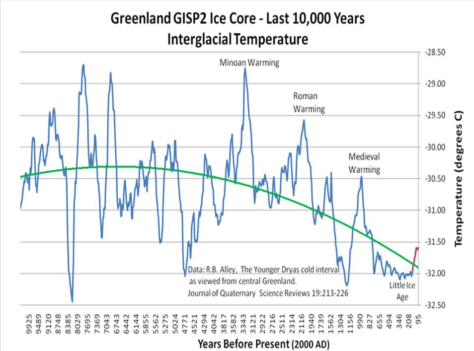
Seeing as your graph ends at 95 years before 2000, or 1905, it's kind of tough to see where we are today. Your data pre-dates the titanic. Why do you need to hide that and try to make it seem like it is showing current dates?
The claim is that temperatures have risen 1.2 degrees in the past 150 years...even if that were true, which it isn't, go ahead and add 1.2 degrees to the end of the map...now were does the present temperature stand relative to most of the past 10,000 years? Hint, still cooler than most of the past 10,00 years.
But interesting way of using a graph that conveniently forgets to show the man made global warming years to disprove man made global warming.
Guess you are unaware that most of the 1.2 degrees of temperature increase claimed over the past 150 years happened before the mid 20th century...so the graph covers a good deal of the so called manmade warming. Aside from that, the claims are simply untrue. Most of the claimed temperature increase is the result of ,warm bias in the temperature gathering network, urban heat island effect, and plain old data manipulation. Here is some peer reviewed science looking at the problems with the global temperature record.
Remote sensing of the urban heat island effect across biomes in the continental USA - ScienceDirect
On a yearly average, urban areas are substantially warmer than the non-urban fringe by 2.9°C
Mapping urban heat islands of arctic cities using combined data on field measurements and satellite images based on the example of the city of Apatity (Murmansk Oblast)
This article presents the results of a study of the urban heat island (UHI) in the city of Apatity [Russian Arctic] during winter that were obtained according to the data of field meteorological measurements and satellite images. Calculations of the surface layer temperature have been made based on the surface temperature data obtained from satellite images. … As a result of the analysis of temperature fields, an intensive heat island (up to 3.2°C) has been identified
http://www.tandfonline.com/doi/abs/10.1080/01431169208904271
The results indicate that urban heating is attributable to a large excess in heat from the rapidly heating urban surfaces consisting of buildings, asphalt, bare-soil and short grasses. In summer, the symptoms of diurnal heating begin to appear by mid-morning and can be about 10°C warmer than nearby woodlands.
Climate change in fact and in theory: Are we collecting the facts?
(Karl et al., 1988) has shown that at some ‘sun belt’ cities in the West, the rise of temperature that can be attributed to the urban heat island is as much as 0.3 to 0.4°C per decade. In the East, the rise is over 0.1°C per decade. … The artificial warming in the primary station network, relative to the climate division data, is nearly 0.17°C over the past 34 years [1950s]. Such trends are at least as large as any of the observed trends over the United States (Karl, 1988) or the globe (Jones and Wigley, 1987).
http://journals.ametsoc.org/doi/pdf/10.1175/1520-0477(1989)070<0265:UBIAAS>2.0.CO;2
Results indicate that in the United States the two global land-based temperature data sets have an urban bias between +0.1°C and +0.4°C over the twentieth century (1901-84). … The magnitude of this urban bias in two global, land-based data sets was found to be a substantial portion of the overall trend of global and regional temperatures.
Estimated influence of urbanization on surface warming in Eastern China using time‐varying land use data
We examine the urban effect on surface warming in Eastern China, where a substantial portion of the land area has undergone rapid urbanization in the last few decades. Daily surface air temperature records during the period 1971–2010 at 277 meteorological stations are used to investigate temperature changes. Owing to urban expansion, some of the stations formerly located in rural areas are becoming increasingly influenced by urban environments. To estimate the effect of this urbanization on observed surface warming, the stations are dynamically classified into urban and rural types based on the land use data for four periods, i.e. 1980, 1990, 2000 and 2010. After eliminating the temperature trend bias induced by time-varying latitudinal distributions of urban and rural stations, the estimated urban-induced trends in the daily minimum and mean temperature are 0.167 and 0.085 °C decade−1, accounting for 33.6 and 22.4% of total surface warming, respectively. The temperature difference between urban and rural stations indicates that urban heat island intensity has dramatically increased owing to rapid urbanization, and is highly correlated with the difference in fractional coverage of artificial surfaces between these two types of stations. This study highlights the importance of dynamic station classification in estimating the contribution of urbanization to long-term surface warming over large areas.
https://www.degruyter.com/downloadpdf/j/quageo.2017.36.issue-1/quageo-2017-0006/quageo-2017-0006.pdf
The global reconstructions as GISS (Hansen et al. 2010, GISTEMP Team 2017) are artificially biased upwards to reproduce the carbon dioxide emission trend, but the strong natural oscillation signal prevails. The very likely overrated warming rate since 1880 is 0.00654°C/year or 0.654°C/century. This rate increases to 0.00851°C/year or 0.851°C/century by considering the data only since 1910. The warming rate cleared of the oscillations is about constant since the 1940s.
As there is no way to perform a better measurement going back in the past, there is no legitimate way to correct recorded data of the past. Therefore, we should stick to the raw data.
Removing the relocation bias from the 155‐year Haparanda temperature record in Northern Europe
We here assess these influences and demonstrate that even in villages urban heat island biases might affect the temperature readings. … Due to the station movement from the village centre to the outskirts, the net correction results in an additional warming trend over the past 155 years. The trend increase is most substantial for minimum temperatures (+0.03 °C /10 years−1) [+0.47°C over 155 years] . … An increase in trend is even more severe if the 20th century is regarded exclusively, displaying a rise in annual mean temperature trend by +0.03 °C /10 years−1 and +0.07 °C /10 years−1 in annual minimum temperatures, respectively. … The adjustment of the Haparanda station record results in an increased warming trend.
The increasing trend of the urban heat island intensity - ScienceDirect
The urban heat island intensity in Manchester has a highly significant rising trend which by the end of the century could add 2.4 K to the average annual urban temperature, on top of the predicted climate change increase. An analysis of the urban morphology showed that the urban site had indeed become more urban over 9 years of the study, losing green spaces which mitigate against the UHII [urban heat island intensity].
http://onlinelibrary.wiley.com/stor...zu&s=b57486fda9766b98d75e3980e046e1810d971f2c
[E]xtraneous (nonclimatic) signals contaminate gridded climate data. The patterns of contamination are detectable in both rich and poor countries and are relatively stronger in countries where real income is growing. We apply a battery of model specification tests to rule out spurious correlations and endogeneity bias. We conclude that the data contamination likely leads to an overstatement of actual trends over land. Using the regression model to filter the extraneous, nonclimatic effects reduces the estimated 1980–2002 global average temperature trend over land by about half.
Implications of temporal change in urban heat island intensity observed at Beijing and Wuhan stations
The annual urban warming at the city stations can account for about 65∼80% of the overall warming in 1961∼2000, and about 40∼61% of the overall warming in 1981∼2000.
http://www.sciencedirect.com/science/article/pii/S0169809515000988
UHI [the Urban Heat Island effect] accounts for almost half of Athens’ warming.
The study explores the interdecadal and seasonal variability of the urban heat island (UHI) intensity in the city of Athens. Daily air temperature data from a set of urban and surrounding non urban stations over the period 1970–2004 were used. Nighttime and daytime heat island revealed different characteristics as regards the mean amplitude, seasonal variability and temporal variation and trends. The difference of the annual mean air temperature between urban and rural stations exhibited a progressive statistically significant increase over the studied period, with rates equal to +0.2 °C/decade. A gradual and constant increase of the daytime UHI intensity was detected, in contrast to the nighttime UHI intensity which increases only in summer, after the mid 1980s
http://onlinelibrary.wiley.com/doi/10.1002/2014GL062803/abstract
Artificial Amplification of Warming Trends …Western United States Observations from the main mountain climate station network in the western United States (US) suggest that higher elevations are warming faster than lower elevations. This has led to the assumption that elevation-dependent warming is prevalent throughout the region with impacts to water resources and ecosystem services. Here, we critically evaluate this network’s temperature observations and show that extreme warming observed at higher elevations is the result of systematic artifacts and not climatic conditions. With artifacts removed, the network’s 1991–2012 minimum temperature trend decreases from +1.16 °C decade−1 to +0.106 °C decade−1 and is statistically indistinguishable from lower elevation trends. Moreover, longer-term widely used gridded climate products propagate the spurious temperature trend, thereby amplifying 1981–2012 western US elevation-dependent warming by +217 to +562%. In the context of a warming climate, this artificial amplification of mountain climate trends has likely compromised our ability to accurately attribute climate change impacts across the mountainous western US.
http://onlinelibrary.wiley.com/doi/...99608)16:8<935::AID-JOC64>3.0.CO;2-V/abstract
The long-term mean annual temperature record (1885 –1993) shows warming over the past century, with much of the warming occurring in the most recent three decades. However, our analyses show that half or more of this recent warming may be related to urban growth, and not to any widespread regional temperature increase.
http://onlinelibrary.wiley.com/doi/10.1029/2010JD015452/abstract
[R]apid urbanization has a significant influence on surface warming over east China. Overall, UHI [urban heat island] effects contribute 24.2% to regional average warming trends. The strongest effect of urbanization on annual mean surface air temperature trends occurs over the metropolis and large city stations, with corresponding contributions of about 44% and 35% to total warming, respectively. The UHI trends are 0.398°C and 0.26°C decade−1. The most substantial UHI effect occurred after the early 2000s, implying a significant effect of rapid urbanization on surface air temperature change during this period.
https://link.springer.com/article/10.1007/s10666-014-9429-z
New Zealand’s national record for the period 1909 to 2009 is analysed and the data homogenized. Current New Zealand century-long climatology based on 1981 methods produces a trend of 0.91 °C per century. Our analysis, which uses updated measurement techniques and corrects for shelter-contaminated data, produces a trend of 0.28 °C per century.
Also. That graph came from someone who's stage name is Joanne Nova. She has a bachelors in Microbiology and worked in DNA. Then she got a job as a TV personality for the Shell Questacon Science Circus (As in Shell oil). Now granted she used to say CO2 had no impact on temperatures, and also that the temperatures haven't changed. Since Shell oil changed it's corporate stance on that, she's softened to CO2 has a limited impact on the temperatures and the temperature increases we have had due to CO2 are likely all that we will get.
Actually the graph "came from" The Journal of Quarternary Science Reviews. Joanne Nova simply provided the graphic I used....and the graph resulting from the GISP2 Ice Core is considered one of the "gold standard" temperature reconstructions.
It was obliging of you to demonstrate how shallow your knowledge on the topic actually is....as is the case with most warmers. Most of you lack the education to even begin to understand the topic so you simply parrot what your political peers tell you to say. Those who are educated tend to be political activists who are pursuing a political agenda where the climate change scare is simply a means to an end.
But back to the graph and your lack of knowledge on the topic. If you had ever done even the most cursory actual research on the topic, you would have found that the Vostok ice core studies, also considered gold standard ice core studies done at the south pole show the same temperature fingerprint as those reflected in the graph above from the Greenland GISP2 ice core.
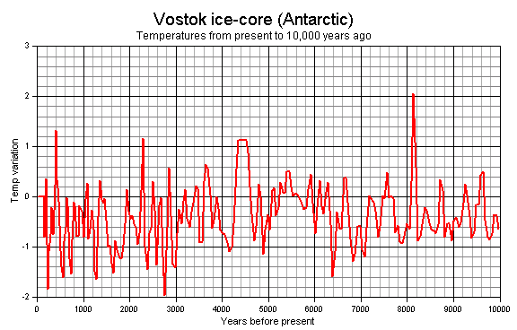
Now perhaps you might like to try to explain how it is that gold standard ice core studies from both poles would show the same temperature signatures but leave out the rest of the world? Don't bother, here is a link to a world map showing proxy studies from all over the world that have found the same sort of temperature fingerprint as shown in the two ice core studies...demonstrating that the warm periods that came before today were warmer than the present without the benefit of the internal combustion engine. If you want to know what makes the climate change, you need to look somewhere besides CO2 because the climate has been changing all along with warmer temperatures and more rapid changes when CO2 levels were lower.
https://www.google.com/maps/d/viewe...=-3.81666561775622e-14,38.038184000000115&z=1
A degree in biology huh...biology is one of the hard sciences as opposed to climate science which is a soft science. Here degree in biology means that she has far more education in chemistry, math, and physics than most of the climate scientists working out there. Climate science is where people go who wish they could be scientists but can't cut it in the hard science programs.
And of course you are showing ONE location. They've taken core samples all over the world and put together composite graphs... Why not combine them all to get a representative sample?
Look above... I have provided you with locations, and studies worldwide...all supporting the two graphs I have provided you from opposite poles. Sorry guy, actual science does't support your belief.
We know temperatures can be higher in one place, but lower in another. Oh that's right. That Medieval Warm Period was not a time of globally uniform change. Temperatures in some regions matched or exceeded recent temperatures in certain regions, like Greenland, but globally the Medieval Warm Period was cooler than recent global temperatures. That peak on the Minoan period... That's when temperatures were about where they are today.
Take a look at the map...it provides locations, studies, authors and findings. It clearly demonstrates that the medieval warm period was both warmer than the present and global in nature. Note how few blue flags there are on the world map indicating temperatures that are lower than the present. The red flags represent studies that found that the period was warmer than the present...blue flags represent findings of cooler temperatures...yellow represents findings of drier climate which tends to be the case with warmer temperatures...the green and grey represent no trend, or an unclear trend.
Those findings pretty much mirror the present. I started a thread titled "if the globe isn't warming, why is it called global warming" It provides temperature records from individual regions of the earth. A couple of places show some small bit of warming...the rest either show little change if any, or cooling. Warming on a "global" scale only shows up in the heavily manipulated, and homogenized global record....meaning it is an artifact of the methods used....not real....fabricated.
When you have to omit major facts, take a sharpie and cross out 90% of the information and just find the one little location that sells the story you want to see, when you have to lie and pretend that 1905 is recent especially when talking about climate change that humans effect. When you have to find the person who was on Shell Oil's payroll to make your point... It really just takes away anything you are trying to say.
Alas, that is precisely what warmers do in an attempt to make the present appear to be warming at an unprecedented rate...and appear to be warmer than it has ever been...and make it appear as if we have anything whatsoever to do with it. You are just one more top shelf, first class dupe playing the part of useful idiot arguing in favor of pseudoscience that you simply aren't equipped to understand. Your position is based on your politics, not actual science...but just to prove my claim I will ask you, as I ask all warmers to please provide a single piece...that is just one....a single shred of observed, measured, quantified evidence that supports the man made climate change hypothesis over natural variability....just one...and will you be able to provide it?...of course not because no such evidence exists.