Personally, I am not so much interested in how the 16 to 19 year old employment levels are doing. I am more interested in the trend for 20 years and older. So the data and graphs are for just the 20 plus years of age crowd.
So, this is the trend
That is actually nice. The employment level for 20+ is continuing to increase, and has been since 2010.
Like I said, the reason that the rate is flat is because the population is rising underneath the employment level.
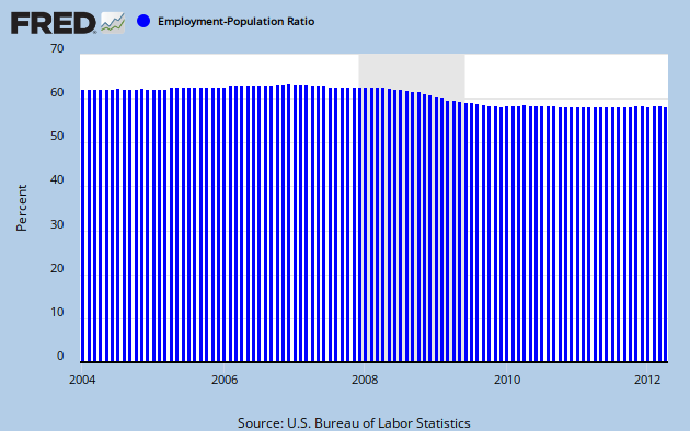
The rate for 20 years and older is
And it is pretty clear, from the two, that the employment level is just keeping up with population growth.
The percentage change for population and for employment level look like this
Those jumps in the %ChgPop are recalibration of the CPS CNIP.
The trend lines for each are shown.
Overall, the rate of change for the CPOP is fairly flat at 0.100% per month over the 2010 through 2-2012 period. EmpLevel20+ is about 0.115% per month. So, over that entire period, Emplevel just a tad bit ahead of population growth.
So, jobs are being added to the economy. Employment is going up for the over 20 crowd. It is as good as I would like? No. Is it bad? No.
I didn't include March or April because I already downloaded the data in March and really don't feel like doing it all again. I'm still working on how to download from the ftp site.
The trend is pretty obvious and March/April aren't going to be particularly off of the obvious trend. The upward trend is just apparent, buried beneath the seasonal variation. And all in all, the point is that employment has been moving upward, not a lot, but upward.
Maybe, after I figure out the ftp site, and link Access into it, I'll run it again.