Exxon makes 8% profit about every year
How is it they can do that with the price of oil at a level that is driven by pure speculation?
and
Who is it that ends up with these speculated cost?
The Saudis?
The driller?
Lets start there
Well, nothing is a "stupid question" when prefaced with "another stupid question."
The simple answer is that the market forces of supply and demand divide up the profits all up the vertical supply chain and across the horizontal markets that compete for the consumer's wallet. How those profits are divided depends on the balance of market forces. We can pretty much conclude that the DVD market does not get as much profit as the energy, medical, and food product markets.
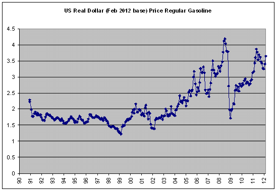
Estimated 2012 Gasoline Price Breakdown & Margins Details has a list, with prices, of the vertical supply chain for gasoline.
I cannot find "speculators" in that list, though they are surely in there somewhere. They are in "crude oil cost", if I am to understand things correctly. Speculated oil sits in tankers off the coast, waiting for prices to rise.
All that said, I got more interested in the supply and demand diagram when it comes to market inefficiencies. Profits are the indication of market inefficiency and market leverage.
Typically, if a vertical market, like petroleum, has high market leverage, the entire vertical market shares in those profits. The consumer, balancing their needs between products, pays at their willingness to pay. We need food to survive, we need gasoline to get to work to buy food. What we are willing to pay for each is a bit of a tug of war between the gasoline market and the food market.
So, here is my contribution.
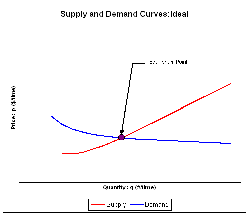
The Not So Perfect Market, Supply and Demand Diagram.
Micro economics fundamentals is based on the concept of perfectly competitive markets with perfect information and no barriers to entry. In micro economics, a generalized supply and demand diagram is presented with generalized supply and demand curves. Where the curves intersect defines the market equilibrium point, the market price and quantities for both the suppliers and consumers.
This concept of supply and demand for perfectly competitive markets gives us some idea of how markets function. It provides us with a basis for some greater intuitive understanding of the markets.
For those not familiar, the typical supply and demand curve is shown here.
For a description of this diagram, readers might wish to examine
this article on supply and demand.
Supply and demand - Wikipedia, the free encyclopedia
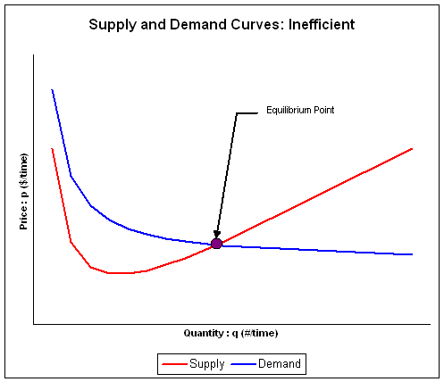
Unfortunately, there are few ideal markets. In fact, all markets are not perfectly competitive as all markets are not perfectly efficient. Many markets have inefficiencies that are minor. Even the price of bread at the grocery store is not based on a perfectly efficient market. Generally, we are unconcerned with markets that are nearly perfect. We are typically concerned with markets that are very inefficient, for whatever reasons.
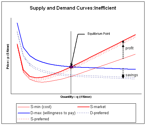
To get a better understanding of how a real market functions, it might help to have a supply and demand diagram that highlights the significant features of market inefficiencies. The diagram below captures the effects of market inefficiencies.
We want a picture that is worth as many words as possible, without being overwhelming. So the graph above has been crafted to capture as much of what really happens in the market. I have added a bit more information, a bit more context, then the typical S-D presentation. Where the typical S-D presentation is based on "all other things considered equal", a perfectly competitive market with perfect information and no barriers to entry.
I am taking a couple of those things and presenting how the curves are if they are not equal. I am expanding this a bit, to allow for some consideration of how the real markets perform because real markets are not perfectly competitive with perfect information and no barriers to entry. In real markets, there are inefficiencies that make some things not exactly equal.
These things are a few details that we do typically consider. We do consider supplier costs and profits. Supplier costs are a real constraint on the supply curve but the supply curve is not always just costs. The difference is profit. For the sake of some symmetry, as we are considering supplier profit, we might just as well consider consumer "savings".
The actual market supply and demand curves are presented in a thick solid line. Thick and solid was chosen to emphasize that these are the final resting points of the market, after all is considered and has settled out.
"
D-max (willingness to pay)" is the absolute maximum that the consumer can possibly pay, given all needs. We should keep in mind this is the market aggregate (average). Some individual consumers will have a higher income, drive an efficient car, and would be willing to pay more, but they simply don't have to because prices are marked. Some individual consumers are barely scrapping by and are at the very edge of their willingness to pay. There are other factors that affect how this curve comes to realization. There are consumers that simply cannot afford to purchase at that particular price, given the quantity, so at any particular quantity-price, the actual number of consumers is not necessarily the same. Combined, the aggregate of all the consumers sets the aggregate demand curve. All things being considered, this thick solid line represents the upper boundary of price given that the consumer simply will not and cannot pay more. If the price were any higher, the consumer would simply walk away and find something else to do with their money.
"
S-min (cost)" is the absolute minimum that the supplier can possibly sell for, given all manufacturing costs. We should keep in mind this is also a market aggregate (average). Some suppliers will have lower costs, like the service station that is located further away from the freeway has lower cost of rent. We can consider many factors that will affect individual supplier costs. There are many factors that affect how this curve comes to realization. In the aggregate, the supply curve represents the absolute minimum for the average price in the market. All things considered, this thin solid like represents a lower boundary of price, given that the supplier simply will not and cannot sell for less. Below it, the supplier would simply shut down because they would be losing money. We know, without any reason to consider otherwise, that there is a definable minimal cost curve for the supplier.
"
S-market" is the actual price that the supplier can command in the market given the consumers willingness to pay. This becomes a significant difference between the simpler (and still correct) S-D presentation. S-D curves are typically presented as being entirely independent. We know, of course, that this isn't absolutely correct. There is some interaction between the supplier and the buyer, the price being a bit of a negotiation. We know that, clearly, the market supply curve is not necessarily the same as the supplier cost curve.
"
D-market" is "
D-max (willingness to pay)". The market demand curve is always ways the consumers willingness to pay.
"
S-preferred" and "
D-preferred" represent what the curves might be if all other things were not equal, if the suppler or the consumer curves were not at their absolute lower and upper boundaries. This range, the movement that the S and D curves might make, is constrained by the upper and lower boundaries and by the actual market curves. Clearly, if willingness to pay were less, then the market curve for the supplier would be lower. The suppliers "preferred" range would be less. If the supplier cost curve were higher, then the range of for the consumers demand curve would be less. "S-preferred" and "D-preferred" represent a family of curves that range from the upper and lower boundaries. These do not really exist. They give us some context for for the boundaries and market curves.
In a perfectly competitive market with perfect information and no barriers to entry, the range is zero. In a perfectly competitive market, the supplier market curve collapses to the cost curve and the consumers demand curve collapses with it.
In the not so perfect markets, there is a definitive symmetry to the supply and demand curves. Each has a boundary, one upper and one lower. There is savings and profit, symmetrical concepts, on each side. There is an absolute market curve for each.
There is also some lack of symmetry. The lower boundary for each is defined by the supplier's cost curve. The upper boundary is defined by the consumers willingness to pay. The actual market curves are both at the upper boundary, not at the lower boundary. It is not the supplier's cost curve that defines the market price, it is the consumer's willingness to pay.
As the market becomes more efficient, closer to perfectly competitive, with better information and no barriers to entry, then the range shrinks. With this, the suppler curve collapses to the cost curve and the demand curve collapses to intersect with suppler cost curve.
This is the supply and demand curve that we are use to. For a perfect market, the suppliers cost curve and the consumers willingness to pay defines the equilibrium point. This does not describe the typical market, but gives us an ideal with which to compare the real world markets.
In real markets, there are profits and inefficiencies. Every market has, to some small degree, inefficiencies. Consider just a local business doing landscaping. The local market will have a few contractors. They have a reputation and that reputation affords them preference over anyone that might wish to enter the market.
On a larger national scale, market inefficiencies become more apparent. The most most powerful form of market inefficiency are economies of scale and barriers to entry. Economies of scale become a barrier to entry when the market becomes dominated by a monopoly. Monopolies wields the greatest market leverage of all market inefficiencies, able to control market supply and maximize prices and profits.
In fact, it is profits that identify that a market is not efficient. The petroleum and gasoline markets proved those in the supply chain with considerable market leverage simply because the product is so important. Consumers and businesses alike are dependent upon energy. Every supplier, all the way up the supply chain, from the service station to Canada and Mexican crude oil suppliers. (Service stations, themselves, make very little, compared to other supplies in the vertical supply chain. Within the market, service stations do not have much leverage.)
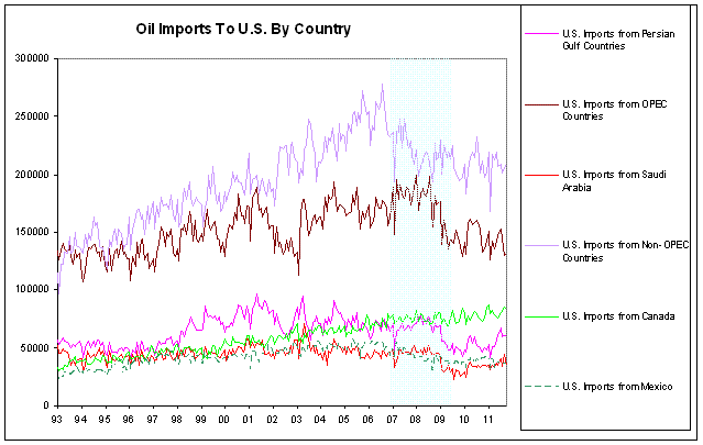
Because the OP referred to "the Saudis", I present the data for crude oil suppliers to the US. Saudi Arabia is but a smaller part of the US total imports.