AmericanFirst
Gold Member
- Dec 17, 2009
- 12,204
- 1,062
- 175
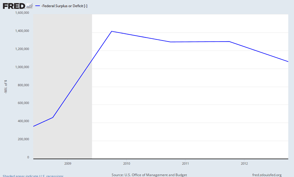
Wrong, clinton benefited from a republican controlled congress and took the credit.I mean look at that graph. From around 92-2000 things were pretty damn good. Then, 2000-2008, it was mostly really bad. Then, around 2010-2011, it picked back upwards.
Why is that?
Because the Republicans had the most congresscritters in the good years?
No. Because we had Bill Clinton in the WH standing in the way of the Republicans doing what they really wanted to do...
...which starting in 2001 we got to find out.