Although this could use much more contrast, it synergies well with this painting...
...despite the things about them that I feel you can improve upon.
Other than that, its an improvement from your other pieces.
Follow along with the video below to see how to install our site as a web app on your home screen.
Note: This feature may not be available in some browsers.
Key West, Florida 36X36
If I may offer a bit of constructive criticism. There is a problem with perspective. I have the same problem so I sympathize. The fence is correctly getting smaller as it goes into the distance, but it appears to levitate as it goes. The shorter the fence posts the higher it is off the ground. It might be a problem with the angle making it look like the fence is going up instead of going further away. The fence isn't grounded at all giving the appearance of floating just above the surface.
Also, you have a shadow cast by the big tree indicating a light source coming from the right. But, it's the only shadow in the whole picture. The trees on the left, the car and even the fence would also be casting shadows to the left.
I only recognize these because I've made the same mistakes myself.
I made the same mistake here. The shadows cast by the plants over the walk way are correct, but I should have had a shadow cast by the boat too and completely missed it. The picture has already been sold so I can't fix it now and recognized the error too late.
Couldn't believe snow in the woods after Sandy...a quick execution with acrylics...almost watercolor like.
View attachment 22591
Key West, Florida 36X36
A real quick sketch/ wash of my daughter Alice...View attachment 28395
black and white rendition of my sicilian beauty bella, will post painting of her...View attachment 30259
View attachment 31077
Honk!!! feed my Family!!!
A little surreal...
I'm not insulted by criticism, however to lecture people on a fun amature board in 18 or so posts sounds like you're a Looney Tune, besides you refuse to post any of your-own work to explain or illustrate is telling of your lack of credentials to give advice especially in Modern Art...Overall, here is my "assessment" of your work-
-What you need to improve on the most is your knowledge of contrast and value. It would greatly improve your paintings.
-Improve your ability to portray reflections.
-Improve your ability to portray perspective.
-Improve your ability to harmonize your
pieces through a better selection of colors, colors that synergize well together. A better application of color theory would also make your pieces look better when they are brought next to each other. The colors affect the mood of your artwork far more than whatever it is that you are drawing.
-Learn to use a mirror with your artwork to recognize flaws and weaknesses that you may not have noticed before.
-Don't stop so soon after beginning your paintings. You consider some paintings "finished" yet there is so much more you can do to improve upon them.
-Learn to not view constructive criticism as a bad thing, and don't let yourself feel insulted by it.
That's just my opinion. Do what you Will.
Peace
Ash
Hold this painting up to a mirror and behold the horror.
Honestly, the mirror is your best friend when working with portraits.
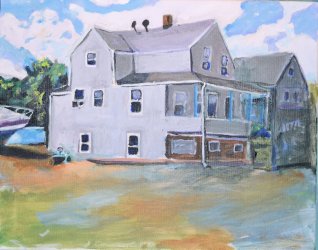
House portrait...
Of course there's distortion on her face. The weight of her body is leaning on it...There were some valid points but not enough of a gain to matter, besides Bold Expressionism does not follow the rules of classical theories.
Hold this painting up to a mirror and behold the horror.
Honestly, the mirror is your best friend when working with portraits.
You could have said this with less joyous bile. Be nice.
And if you are going to be this harsh, you ought to put up something for others to crit.
Like I said goddess Ashtara, post some of your work so that I might respect your opinion more or go to the flame board.House portrait...
In my opinion, this picture has a more decent use of color than your other works. I like the color scheme, which is pretty much a tetrad of blue, orange, yellow, and purple.
You made a somewhat boring scene/ subject look more interesting through your use of color.
Still, the edges of the building could be much more defined, and the perspective could be improved, particularly on the right side.
Like I said earlier, making a quest of monitoring an armature painter's work on a message board really sounds like you're lonely and off your rocker.Like I said goddess Ashtara, post some of your work so that I might respect your opinion more or go to the flame board.House portrait...
In my opinion, this picture has a more decent use of color than your other works. I like the color scheme, which is pretty much a tetrad of blue, orange, yellow, and purple.
You made a somewhat boring scene/ subject look more interesting through your use of color.
Still, the edges of the building could be much more defined, and the perspective could be improved, particularly on the right side.
No offense, but I do not require you to respect my opinion in order for me to post it here.
I'm being real with you. Straight up. You don't have to like me or even respect me in order to learn something from my criticism about how you might improve your work.