Navigation
Install the app
How to install the app on iOS
Follow along with the video below to see how to install our site as a web app on your home screen.

Note: This feature currently requires accessing the site using the built-in Safari browser.
More options
You are using an out of date browser. It may not display this or other websites correctly.
You should upgrade or use an alternative browser.
You should upgrade or use an alternative browser.
My Paintings
- Thread starter pbel
- Start date


BriannaMichele
Active Member
You are very talented! I was an artist myself. Can never find the time anymore. 11 month old son and 2 stepsons ages 2 and 4.
Pinky
 3.jpg")
pbel
Gold Member
- Feb 26, 2012
- 5,653
- 449
- 130
- Thread starter
- #125
black and white rendition of my sicilian beauty bella, will post painting of her...View attachment 30259

pbel
Gold Member
- Feb 26, 2012
- 5,653
- 449
- 130
- Thread starter
- #130
What I have learned about all theories in art is that they are all useless or we would not have had a Van Gogh or Grandma Moses...Paint who you are and feel is the best method.You should learn some color theory...
You can maybe do without an improved
level of knowlege about perspective, however, as such perspective imperfections have the potential to strengthen one's "style".
Last edited:
jon_berzerk
Platinum Member
- Mar 5, 2013
- 31,401
- 7,368
- 1,130
What I have learned about all theories in art is that they are all useless or we would not have had a Van Gogh or Grandma Moses...Paint who you are and feel is the best method.You should learn some color theory...
You can maybe do without an improved
level of knowlege about perspective, however, as such perspective imperfections have the potential to strengthen one's "style".
they all are very nice
What I have learned about all theories in art is that they are all useless...You should learn some color theory...
You can maybe do without an improved
level of knowlege about perspective, however, as such perspective imperfections have the potential to strengthen one's "style".
That belief is always going to hold you back.
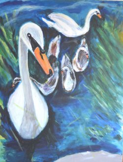
In my personal opinion, the painting above of the dog, and the other of the swans, would look far better with a blue and orange color scheme, as they are already fairly close to it, and would only need little alteration. Try it out if you do not believe me. You can even make greenish and brownish colors by mixing orange and blue. You can also still use black and white too without betraying the color scheme.
But just so you know...
None of the people who only tell you that they "like your art" are helping you. Not in the slightest.
Only those who offer constructive criticism will offer insight on how you may improve your work.
So if I sound like a bitch when I talk about your work... don't trip out.
I will critique more of your work later on.
Last edited:
pbel
Gold Member
- Feb 26, 2012
- 5,653
- 449
- 130
- Thread starter
- #133
One of my teacher friends would ask his critics to answer with a painting of their-own as an answer. I'd love to see your work pertaining to your advice.What I have learned about all theories in art is that they are all useless...You should learn some color theory...
You can maybe do without an improved
level of knowlege about perspective, however, as such perspective imperfections have the potential to strengthen one's "style".
That belief is always going to hold you back.
In my personal opinion, the painting above of the dog, and the other of the swans, would look far better with a blue and orange color scheme, as they are already fairly close to it, and would only need little alteration. Try it out if you do not believe me. You can even make greenish and brownish colors by mixing orange and blue. You can also still use black and white too without betraying the color scheme.
But just so you know...
None of the people who only tell you that they "like your art" are helping you. Not in the slightest.
Only those who offer constructive criticism will offer insight on how you may improve your work.
So if I sound like a bitch when I talk about your work... don't trip out.
I will critique more of your work later on.
Last edited:
These colors are extremely dull and boring. Do you ever consider what kind of mood the painting brings to the room it hangs in, and/or the synergy it creates when gathered with other paintings?
View attachment 22454A quick commission acrylic portrait...I love working fast to capture energy...16X20...
"Capturing energy" sounds like an excuse to rush a painting, and a commission really should not be rushed at all.
You should try holding your artwork to a mirror, which will reveal mistakes you may not have noticed before.
It could help you avoid painting a deformed head, but if that's the "style" you accept for yourself...
This would have made a very decent underpainting for something far better. There is just so much more you can do with it. Why did you stop? It was actually beginning to look alright.
Study reflections...
This is also a decent start, but there should be more contrast. Everywhere, but particularly the trees.
Reminds me of Phoenix ^_^
Last edited:
Learn to portray perspective with value...
The colors you use are very dull and aren't vivid enough. This painting would look better if the purple areas were red/ crimson, if the yellow areas were more of a bright yellow orange, and the leaves were a more vivid green.
And it would be nice if your black areas were actually black and not dark gray. Study value.
Similar threads
- Replies
- 4
- Views
- 100
- Replies
- 47
- Views
- 886
- Replies
- 82
- Views
- 1K
- Replies
- 3
- Views
- 286
- Replies
- 3
- Views
- 150
Latest Discussions
- Replies
- 32
- Views
- 193
- Replies
- 53
- Views
- 404
- Replies
- 1K
- Views
- 14K
Forum List
-
-
-
-
-
Political Satire 8032
-
-
-
-
-
-
-
-
-
-
-
-
-
-
-
-
-
-
-
ObamaCare 781
-
-
-
-
-
-
-
-
-
-
-
Member Usernotes 468
-
-
-
-
-
-
-
-
-
-