SSDD
Gold Member
- Nov 6, 2012
- 16,672
- 1,966
- 280
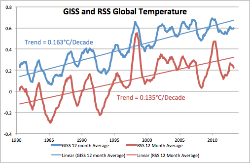
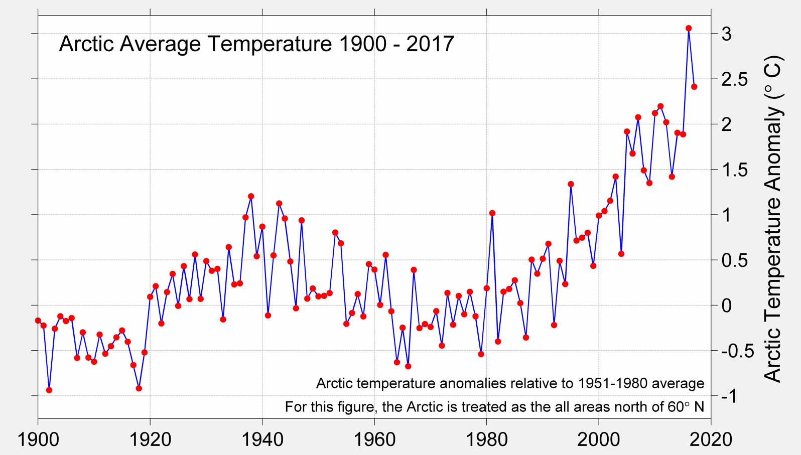
His second chart shows massive red at the North Pole region, where there are NO stable temperature stations in most of the region.
It is largely made up.
Look at those graphs over time...the warmest places on earth are INVARIABLY the very places with the least data coverage. That fact, in and of itself should tell any thinking person that there is something terribly wrong with climate pseudoscience.