Global Warming Actually Still Accelerating - no "lull"

Yeah, you not wasting my money is an entitlement. LOL!

No. You thinking that you can live off of the work and responsibility and contributions of others is an entitlement.

If I believed that, I'd be a liberal like you.

At least that's what your cult instructs you to say.

My experience however is just the opposite. Without liberals we'd be going backwards. Liberals look forward to better, not backwards to safety. Conservatives avoid investing in the future and involvement with others towards common goals. All in all, a predominantly conservative world would be a pretty awful place. Probably Afghanistan is as close as we have here and now.
 
Why are you avoiding my references that have a different interpretation?

I'm not.

The hard data is compiled and trended from 1857 to 2012. There's no need for interpretation. The interpretation is necessary when you take the long term trending out of the distribution and extrapolate a small data upward trend that doesn't show in the long term trending.

:)

This is my response. Your data is a subset of the full set and extrapolates a curve that is not shown in the long term trending.

I'm not discounting your information. It discounts itself as a simple snapshot that's been taken out of the full data set in order to extrapolate a sequence in the future.

Thank you for your inexpert opinion, but I'm going with the big picture from real climate experts. The IPCC. I believe that the odds of insight from the man on the street compared to the most qualified in the world are miniscule.

:rofl:

It's not my opinion, it's hard data being misused for short term use in long term scientific extrapolations.

Sure it's OK if you don't want to see the entire set of your subset.
 
I'm not.


This is my response. Your data is a subset of the full set and extrapolates a curve that is not shown in the long term trending.

I'm not discounting your information. It discounts itself as a simple snapshot that's been taken out of the full data set in order to extrapolate a sequence in the future.

Thank you for your inexpert opinion, but I'm going with the big picture from real climate experts. The IPCC. I believe that the odds of insight from the man on the street compared to the most qualified in the world are miniscule.

:rofl:

It's not my opinion, it's hard data being misused for short term use in long term scientific extrapolations.

Sure it's OK if you don't want to see the entire set of your subset.

You keep insisting that data speaks for itself. It does not. It needs to be interpreted in the context of all of the data. That, by one person, is bound to reflect their limited objectivity. That’s why the IPCC is a large international group.
 
CLUE.GIF
 
No. You thinking that you can live off of the work and responsibility and contributions of others is an entitlement.

If I believed that, I'd be a liberal like you.

At least that's what your cult instructs you to say.

My experience however is just the opposite. Without liberals we'd be going backwards. Liberals look forward to better, not backwards to safety. Conservatives avoid investing in the future and involvement with others towards common goals. All in all, a predominantly conservative world would be a pretty awful place. Probably Afghanistan is as close as we have here and now.

My cult? LOL!

Without liberals we'd be going backwards.

Spending tens of trillions to not solve a nonexistent problem might be progress to a liberal......
 
Ropey said:
There is a slow steady increase that sure doesn't presuppose influence by man. If there were influences then the slow steady trend would be disrupted because since 1857 population growth and use of natural resources and industrial mechanization has sky-rocketed.

The relevant data does not exist to support these nonsensical and whimsical sky-is-falling conjectures.

Sea Level Trends

That's hard data. :)

Hard data is merely a pile of numbers. It's how it's interpreted that's meaningful. You want to believe that this data interprets in a way that makes what you want, true.

I like objective, thorough interpretation better. It's much more likely to be correct.

That's why I posted those references yesterday.

The hard data is compiled and trended from 1857 to 2012. There's no need for interpretation. The interpretation is necessary when you take the long term trending out of the distribution and extrapolate a small data upward trend that doesn't show in the long term trending.

:)

Why are you avoiding my references that have a different interpretation?


Because your references are PROPAGANDA! There's a HUGE difference between RAW DATA and the massaged BS your propagandists are foisting off to the world.
 
Why are you avoiding my references that have a different interpretation?

I'm not.

The hard data is compiled and trended from 1857 to 2012. There's no need for interpretation. The interpretation is necessary when you take the long term trending out of the distribution and extrapolate a small data upward trend that doesn't show in the long term trending.

:)

This is my response. Your data is a subset of the full set and extrapolates a curve that is not shown in the long term trending.

I'm not discounting your information. It discounts itself as a simple snapshot that's been taken out of the full data set in order to extrapolate a sequence in the future.

Thank you for your inexpert opinion, but I'm going with the big picture from real climate experts. The IPCC. I believe that the odds of insight from the man on the street compared to the most qualified in the world are miniscule.


What? You mean your "real" experts who peer reviewed and passed a paper that was destroyed in 10 hours by a mere statistician? Yeah, I would really pay attention to those clowns....

They, like you, are idiots who can't be trusted to do simple math...
 
Because we didn't build today's civilization around 1800 levels or 8000 BC levels.

Why do I need to look it up?
We're talking about Arctic Sea ice levels.......
:lol:

Tripe

Climate change: Sea ice, global cooling, and other nonsense

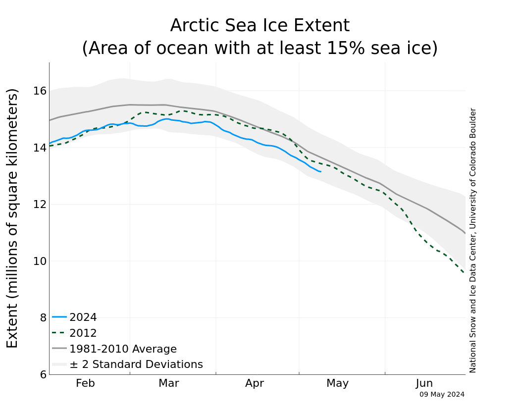
N_stddev_timeseries.png


Given just how extreme it was, it’s not too surprising that it would not be as extreme this year.


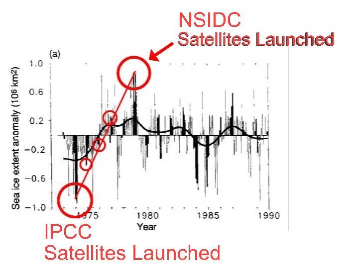
The reality.... The satellite record is far longer than the graph that is used. I wonder why they started the graph when they did? I woooonder why????

Could it possibly be that the actual historical record doesn't support their BS? Here's the real graph....you tell us...

screenhunter_707-apr-25-06-06.jpg
 
Just out of curiosity, why did your graphic end at 1990, 23 years ago. Was there something someone didn't want us to see?
 
I'm not.


This is my response. Your data is a subset of the full set and extrapolates a curve that is not shown in the long term trending.

I'm not discounting your information. It discounts itself as a simple snapshot that's been taken out of the full data set in order to extrapolate a sequence in the future.

Thank you for your inexpert opinion, but I'm going with the big picture from real climate experts. The IPCC. I believe that the odds of insight from the man on the street compared to the most qualified in the world are miniscule.


What? You mean your "real" experts who peer reviewed and passed a paper that was destroyed in 10 hours by a mere statistician? Yeah, I would really pay attention to those clowns....

They, like you, are idiots who can't be trusted to do simple math...


''What? You mean your "real" experts who peer reviewed and passed a paper that was destroyed in 10 hours by a mere statistician? Yeah, I would really pay attention to those clowns....''

Another conservative myth designed to silence science so conservative ignorance prevails.
 
Last edited:
It's amazing the energy that conservatives invest in dragging the conversation away from the basic physics of AGW. They know that it is indisputable science. That’s standing in the way of imposing their will on the rest of the world. They were raised on dirty politics. It's all that they know.
 
Why do I need to look it up?
We're talking about Arctic Sea ice levels.......
:lol:

Tripe

Climate change: Sea ice, global cooling, and other nonsense

N_stddev_timeseries.png


Given just how extreme it was, it’s not too surprising that it would not be as extreme this year.


The reality.... The satellite record is far longer than the graph that is used. I wonder why they started the graph when they did? I woooonder why????

Could it possibly be that the actual historical record doesn't support their BS? Here's the real graph....you tell us...

screenhunter_707-apr-25-06-06.jpg

THe IPCC has launched SATELLITES ???? Say WHAT???? I thought they barely had the technology to call out for Dim Sum...

Although I'm confused by the IPCC launching satellites, I'm shocked that Abraham not's following along on the discussion..
The point WAS ------ Why did they take the average and 2 STD envelope from 1981 on? WestWall merely provided the answer to that with a chart showing what occurred JUST PRIOR to 1981.. That's the germane point. NOT why that chart doesn't go further into the present era..
 
Last edited:
There's an explanation on NSIDC's web page as to why they changed the span they were using for a baseline. Have you not read it?

Updating the sea ice baseline

This July, NSIDC plans to change the baseline climatological period for Arctic Sea Ice News and Analysis and the Sea Ice Index, the data set we use for our sea ice analysis. We are making this change to match the comparison time frames used by other climate research.

Until now, we have used the 22-year period 1979 to 2000 when comparing current sea ice extent to past conditions. When NSIDC first began to monitor and analyze sea ice extent, a longer period was not available. Since the satellite record is now extended, we are choosing to move to a more standard 30-year reference period, from 1981 to 2010.

A 30-year period typically defines a climatology (comparsion period) and is the standard used by organizations such as the World Meteorological Organization (WMO) and the U.S. National Oceanic and Atmospheric Administration (NOAA). Thirty years is considered long enough to average out most variability from year to year, but short enough so that longer-term climate trends are not obscured.

These maxims about climate averages come from the world of weather and climate. Sea ice responds to changes in energy or heat differently from other systems on Earth. So the assumptions behind the use of 30-year averages for weather may not hold true for sea ice, particularly in light of the rapid decrease and repeated record low minimum extents in the Arctic during the past decade. However, matching the 1981 to 2010 period brings us in line with other climate research.

The monthly and daily sea ice extent images and data values will not change, but data and images that are based on the average or median will change. For example, the trend plot for sea ice extent will have a different scale, and the value of the slope, expressed as change in percent per decade, will change, because this value is relative to the average period. On the the monthly and daily extent images, the position of the average extent lines will change.

In our July analysis, we will provide more information to help readers put these changes into the larger context of changing climate and changing ice.

This entry was posted in Analysis by Jane Beitler. Bookmark the permalink.


Yes, we know that they stopped their graphs 30 years ago. If they had included the older data they wouldn't have a tall tale to tell.
 
Last edited:

Forum List

Back
Top