ConservaDerrps
Rookie
- Thread starter
- Banned
- #201
the LINK dipwad is IN this thread. I told you...go fish.
Yeah, buy where is the link?

Is that the link?
Follow along with the video below to see how to install our site as a web app on your home screen.

Note: This feature currently requires accessing the site using the built-in Safari browser.
the LINK dipwad is IN this thread. I told you...go fish.
Yeah, buy where is the link?

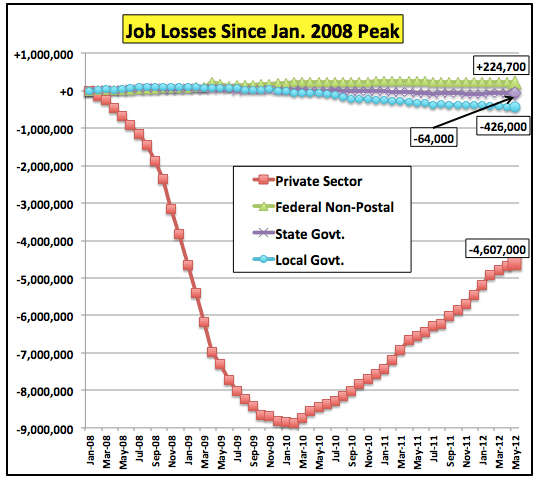
Well, yeah. the original OP chart is void of federal employees vs. private employees. I wonder why that is? Could it be because the federal government employs more people than the private sector, which would make the entire argument that Obama has not increased the size of government void and therefore a lie?
That's what i see here. The federal govt. has steadily grown while the states/locals are forced the slash spending due to budget shortfalls.
That graph was the only one I could find on it because it seems people want to talk about the pay between private/public more than the figures on how many people the federal govt. employs. Which by the way, is sad. The federal workers make almost double that of the private workers that pay the public workers salaries. That's not sustainable. Especially if federal payroll head counts continue to increase.
Private Sector Is Not Fine Public Sector Is Still Fat
Can't rep you again so soon but thanks for the additional info that completely debunks the OPs statement.
Can't rep you again so soon but thanks for the additional info that completely debunks the OPs statement.
So I read your opinion piece that you linked to. I smell a lot of bullshit. Your article completely discounts the loss of Postal jobs after he makes some bullshit equivocation in his mind to allow him to do so. So he cherry-picked the data, you see, which is what you all have been doing. I report on raw data, you cherry pick.
So you're graph is bullshit. Pure.unmitigated.bullshit. Why don't you write the conservative mouth piece that wrote the article and ask him to re-run those numbers with the Postal Service data in there, since you know, they're public sector jobs that should have been counted.
Wow. What a fucking disingenuous scumbag you really are, fucko!


Only response required.
You mean a COP OUT?

Seriously, I'm not wasting my effort on people like you.
Is that the link?
Can't rep you again so soon but thanks for the additional info that completely debunks the OPs statement.
So I read your opinion piece that you linked to. I smell a lot of bullshit. Your article completely discounts the loss of Postal jobs after he makes some bullshit equivocation in his mind to allow him to do so. So he cherry-picked the data, you see, which is what you all have been doing. I report on raw data, you cherry pick.
So you're graph is bullshit. Pure.unmitigated.bullshit. Why don't you write the conservative mouth piece that wrote the article and ask him to re-run those numbers with the Postal Service data in there, since you know, they're public sector jobs that should have been counted.
Wow. What a fucking disingenuous scumbag you really are, fucko!
You mean a COP OUT?
Seriously, I'm not wasting my effort on people like you.
Read the data that populates the chart... federal government jobs HAVE INCREASED... even without a huge spike (which appears to be the only thing you are looking for in defense of your stand)
Can't rep you again so soon but thanks for the additional info that completely debunks the OPs statement.
So I read your opinion piece that you linked to. I smell a lot of bullshit. Your article completely discounts the loss of Postal jobs after he makes some bullshit equivocation in his mind to allow him to do so. So he cherry-picked the data, you see, which is what you all have been doing. I report on raw data, you cherry pick.
So you're graph is bullshit. Pure.unmitigated.bullshit. Why don't you write the conservative mouth piece that wrote the article and ask him to re-run those numbers with the Postal Service data in there, since you know, they're public sector jobs that should have been counted.
Wow. What a fucking disingenuous scumbag you really are, fucko!
As stated.. the data that populates YOUR OWN GRAPH shows a federal jobs INCREASE... you fucking idiot....
UPDATE: Jobs Under The First Bush Term Vs. Jobs Under The First Obama Term - Business Insider
Original Story:The latest version of this chart showing Obama's first term (on the right) with Bush's first term (on the left).
In each one, the red line is private sector jobs. The green line is local government jobs. The blue line is state jobs
Austerity At Work | The Big Picture
Obama Jobs Record Lie #1: "Obama's unemployment numbers would look a lot worse if he didn't create a bunch of government jobs!"
DEBUNKED: The lines on the right, Obama's first term, show local AND state jobs plummeting downward. While, mysteriously, on the left, in Bush's first term, both shoot way up. Hmm. Weird.
Obama Jobs Record Lie #2: "Obama has killed the private sector!!!!"
DEBUNKED: Quite to the contrary, you can see from his red line compared to Bush's he actually added enough jobs in his first term to put his tally up above Bush's. So, yeah. There's some bullshit.
Obama Jobs Record Lie #3: "We'd have a lot better outlook if Obama wasn't spending us into a oblivion!!!"
DEBUNKED: As the last chart shows, Obama's spending has tipped drastically downward over his first term. Bush's climbed up and up and up his entire two terms.
Lefties newest thing is putting up bullshit charts from Lefty websites - without making any sort of their own statement - and expecting us to take the time to deconstruct the falsified data behind it.
F them.
Yes, bullshit charts made from real world data as opposed to righties claims pulled straight out of their asses and based on what they wish was true.
Did Somone say GRAPH?
Here one for ya Pink Pony idiot:
Completely addresses and DEBUNKS the OP. Ride that into the sun you DERP.
Yes, bullshit charts made from real world data as opposed to righties claims pulled straight out of their asses and based on what they wish was true.
Did Somone say GRAPH?
Here one for ya Pink Pony idiot:
Completely addresses and DEBUNKS the OP. Ride that into the sun you DERP.
You mean the chart which shows the freefall in job losses bush left us in and how obama turned it around so that the private sector is actually hiring again? In case you did not notice your graph actually shows the stimulus turning the economy around. Oddly enough we can also notice that with the looming election and the possibility of returning to a republican president private companies have begun to slow down hiring.
Thanks for showing us how good obama really is.
More workers joined the federal government's disability program in June than got new jobs, according to two new government reports, a clear indicator of how bleak the nation's jobs picture is after three full years of economic recovery.
The economy created just 80,000 jobs in June, the Bureau of Labor Statistics reported Friday. But that same month, 85,000 workers left the workforce entirely to enroll in the Social Security Disability Insurance program, according to the Social Security Administration.
The disability ranks have outpaced job growth throughout President Obama's recovery. While the economy has created 2.6 million jobs since June 2009, fully 3.1 million workers signed up for disability benefits.

Yes, bullshit charts made from real world data as opposed to righties claims pulled straight out of their asses and based on what they wish was true.
Did Somone say GRAPH?
Here one for ya Pink Pony idiot:
Completely addresses and DEBUNKS the OP. Ride that into the sun you DERP.
You mean the chart which shows the freefall in job losses bush left us in and how obama turned it around so that the private sector is actually hiring again? In case you did not notice your graph actually shows the stimulus turning the economy around. Oddly enough we can also notice that with the looming election and the possibility of returning to a republican president private companies have begun to slow down hiring.
Thanks for showing us how good obama really is.
So I read your opinion piece that you linked to. I smell a lot of bullshit. Your article completely discounts the loss of Postal jobs after he makes some bullshit equivocation in his mind to allow him to do so. So he cherry-picked the data, you see, which is what you all have been doing. I report on raw data, you cherry pick.
So you're graph is bullshit. Pure.unmitigated.bullshit. Why don't you write the conservative mouth piece that wrote the article and ask him to re-run those numbers with the Postal Service data in there, since you know, they're public sector jobs that should have been counted.
Wow. What a fucking disingenuous scumbag you really are, fucko!
As stated.. the data that populates YOUR OWN GRAPH shows a federal jobs INCREASE... you fucking idiot....
Meh. I'll take my graph's word for it, but thanks anyway. KIT, SSS! C U L8R, BRO!!!!!!!!!!!!!!!!!!!!!!!!
As stated.. the data that populates YOUR OWN GRAPH shows a federal jobs INCREASE... you fucking idiot....
Meh. I'll take my graph's word for it, but thanks anyway. KIT, SSS! C U L8R, BRO!!!!!!!!!!!!!!!!!!!!!!!!
The data OF YOUR CHART SHOWS THE INCREASE>>.. you know there are little things called numbers and data points that make the little squiggly lines on your chart, right???
Meh. I'll take my graph's word for it, but thanks anyway. KIT, SSS! C U L8R, BRO!!!!!!!!!!!!!!!!!!!!!!!!
The data OF YOUR CHART SHOWS THE INCREASE>>.. you know there are little things called numbers and data points that make the little squiggly lines on your chart, right???
Oh so you're freaking out about a 2% increase then? Think that "owns" me? It doesn't. But if that helps you sleep at night go ahead. In the world of fluid labor statistics, a 2% increase is flat as fuck.
So we went from , "govt jobs decreased under obama" to "Oh, who fucking cares that federal jobs increased?" to "2% is a small increase."
A few yoga masters called to congratulate you on this profound twist n stretch you've done. They also wan tto be sure you didn't pull muscles.
