know the difference between precise and accurate? find out first.
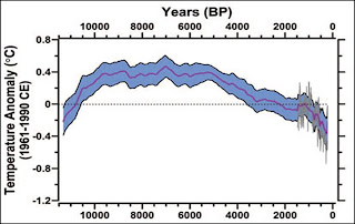
many recontructions use multiple proxies, presumably to give as accurate a value as possible working under the assumption that the errors in each proxy will cancel out when you use a bunch of them. you end up with highly averaged values that show very little variance. eg Mann and Marcott. the error bars are mathematically small, probably unreasonably so.

if you want to see the variance you have to go with one proxy at a time. eg. the Greenland ice core.

this shows various stages of warming and cooling but it only for one part of the world. and polar regions 'amplify' the variability even though they are a pretty good stand in for global temps in general just not in absolute terms because it is of course much cooler up there.
the above graph was made using 18O isotope measurements. another way is to use Nitrogen and Argon isotopes.

and here is a graph of both methods plotted together. unfortunately there is no 'average' of the two methods.

there is a reasonable general agreement between the two methods but if you averaged the two then the variance would decrease and the shape would slightly change. remember, this is for the same sample but two different methods. (a modern instrumental temperature series was added for context)
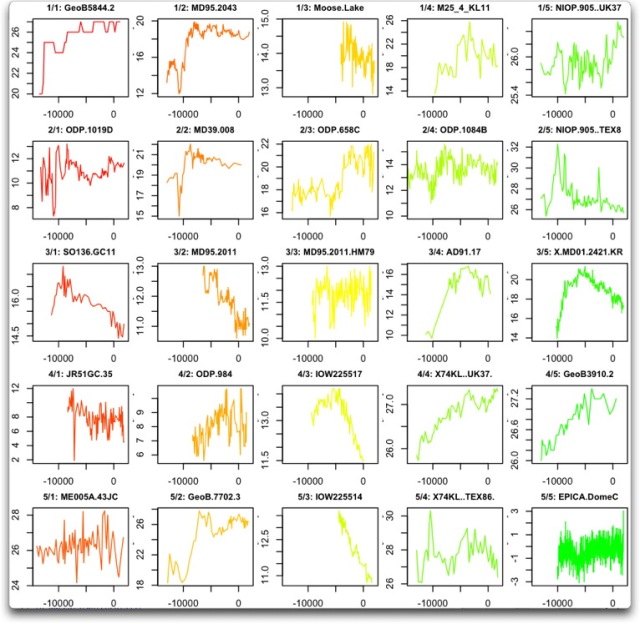
here are the first 25 proxies used in Marcott

can you see how combining these wildly different proxies would absolutely trash any temperature spikes in the past? perhaps the average is accurate, albeit highly smoothed, but to say that you can pick out temperature swings in this dog's breakfast of proxies is ridiculous.
many recontructions use multiple proxies, presumably to give as accurate a value as possible working under the assumption that the errors in each proxy will cancel out when you use a bunch of them. you end up with highly averaged values that show very little variance. eg Mann and Marcott. the error bars are mathematically small, probably unreasonably so.

if you want to see the variance you have to go with one proxy at a time. eg. the Greenland ice core.

this shows various stages of warming and cooling but it only for one part of the world. and polar regions 'amplify' the variability even though they are a pretty good stand in for global temps in general just not in absolute terms because it is of course much cooler up there.
the above graph was made using 18O isotope measurements. another way is to use Nitrogen and Argon isotopes.

and here is a graph of both methods plotted together. unfortunately there is no 'average' of the two methods.

there is a reasonable general agreement between the two methods but if you averaged the two then the variance would decrease and the shape would slightly change. remember, this is for the same sample but two different methods. (a modern instrumental temperature series was added for context)
here are the first 25 proxies used in Marcott

can you see how combining these wildly different proxies would absolutely trash any temperature spikes in the past? perhaps the average is accurate, albeit highly smoothed, but to say that you can pick out temperature swings in this dog's breakfast of proxies is ridiculous.
 Why do you think that in years, this forum has drawn zero regular posters to the AGW side. There are like 4 regular guys..............still.........
 wtf
wtf