eagle1462010
Diamond Member
- May 17, 2013
- 78,303
- 43,212
- 2,605
Follow along with the video below to see how to install our site as a web app on your home screen.
Note: This feature may not be available in some browsers.

Check out the UAH data.
Though the president is on the right track regarding 2014’s temperatures, the addition of “most likely” to this talking point would put him on stronger ground.
Editor’s Note: SciCheck is made possible by a grant from the Stanton Foundation.
– Dave Levitan
Obama and the Warmest Year on Record
A more credible graph.
Crick predicts an ice free Arctic this summer. I hope I remember to bump this in September.
Check out the UAH data.
Though the president is on the right track regarding 2014’s temperatures, the addition of “most likely” to this talking point would put him on stronger ground.
Editor’s Note: SciCheck is made possible by a grant from the Stanton Foundation.
– Dave Levitan
Obama and the Warmest Year on Record
A more credible graph.

CRICK SAID: ↑
If you're looking at Arctic ice extents, why are you looking at all these graphs that dilute that value with other snow and ice data? Why not look at the direct measurements, like these:
Once again you put up global ice when Arctic ice is the topic.
You put up area graphs in response to a volume graph.
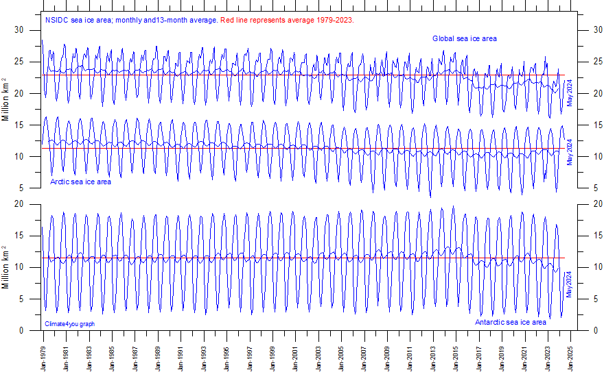
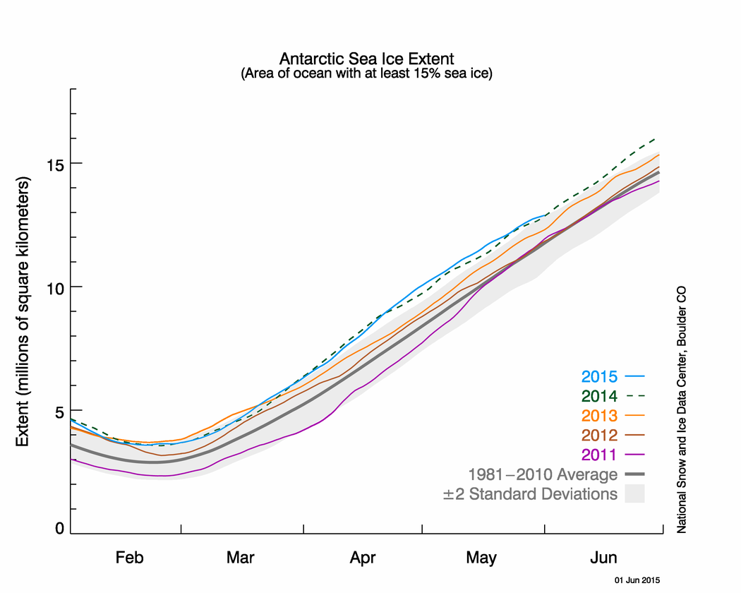
Your graphs are plotted on scales that make them absolutely unreadable. However, look at this graphic, just pulled from nsidc.org:
These data clearly show, year round, more than a million square kilometer difference between current extent values and the 1981-2010 mean - the same mean your graphic uses. Yet on your first graphic, you can see NO movement away from the mean. You know what might be a good idea? Why don't you tell us where you got your graph from? You know, like you should have done in the first place. Then you might explain why there's such a large difference between your first graph and your second graph that purport to show the same data.
Are you really this stupid?
I put up graphs showing the full cycle of melt and refreeze to point out the context, the overview of what happens in the Arctic.
You counter with a failed ice free Arctic by 2015 graph from Piomas and have the nerve to call it 'direct measurements' even though it is yet another climate model that goes through periodical version changes that 'prove' things are worse than we thought.
Then you complain that my graph is diluted with non Arctic Ocean ice.
So I show you an Arctic Basin Sea Ice Extent graph. Did you notice the yearly max is always the same (except 87, satellite error I presume). Can you figure out why it is always the same? The min has been lower lately so what? There is no death spiral there.
I really don't see you giving any thought to these things. You just see a scary graph and want with all your heart to believe. It's pathetic really that a sixty year old man should be so gullible after all the other false alarms you've lived through.
Explain why Arctic Ice Area in your second graph (the NSIDC data) drops a couple million square kilometers while Arctic Ice Area in your first (unidentified) graph doesn't budge from zeo anomaly.


Explain why Arctic Ice Area in your second graph (the NSIDC data) drops a couple million square kilometers while Arctic Ice Area in your first (unidentified) graph doesn't budge from zeo anomaly.
how interesting. DMI is showing an exceptionally weak and late start to the Greenland summer melt.
Left: Maps showing areas where melting has taken place within the last two days. Right: The percentage of the total area of the ice where the melting occurred from January 1 until today (in blue). For comparison the average for the period 1990-2011 is shown in the dark grey curve. The variation from year to year for each of the days during the melt season are shown as the gray shaded area
if this keeps up they will have to go offline for a while and come back with a new and improved reanalysis to show the 'real' results. hahahahaha
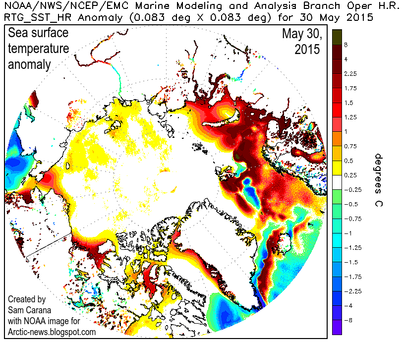
What does the cryosphere at U of I say?Arctic News
The image below shows sea surface temperature anomalies in the Arctic on May 30, 2015.
Sure, Billy ol' Boob. Anything else for us out of your ass today?
Why don't you tell us with a link included?What does the cryosphere at U of I say?Arctic News
The image below shows sea surface temperature anomalies in the Arctic on May 30, 2015.
Sure, Billy ol' Boob. Anything else for us out of your ass today?
Because you can't? hahahahahaha, I was on a mobile and it is much too hard with a mobile phone. But you could have, but didn't. hmmmm, any special reason?Why don't you tell us with a link included?What does the cryosphere at U of I say?Arctic News
The image below shows sea surface temperature anomalies in the Arctic on May 30, 2015.
Sure, Billy ol' Boob. Anything else for us out of your ass today?
The warm water in the pacific is no longer being pushed up over the continental shelf which was the reason for Greenland warming. The flow has now changed and cold water is now circulating Greenland. The slow start to melt season is not unexpected due to this change. Were about to see rapid ice growth in that region. I expect this fall to be one very cold, snow and ice producing year for that region. We are about to sea Arctic ice rebound with a vengeance.
So dude where's that cryosphere U of I link? Come now what are you afraid of?Why don't you tell us with a link included?What does the cryosphere at U of I say?Arctic News
The image below shows sea surface temperature anomalies in the Arctic on May 30, 2015.
Sure, Billy ol' Boob. Anything else for us out of your ass today?
