itfitzme
VIP Member
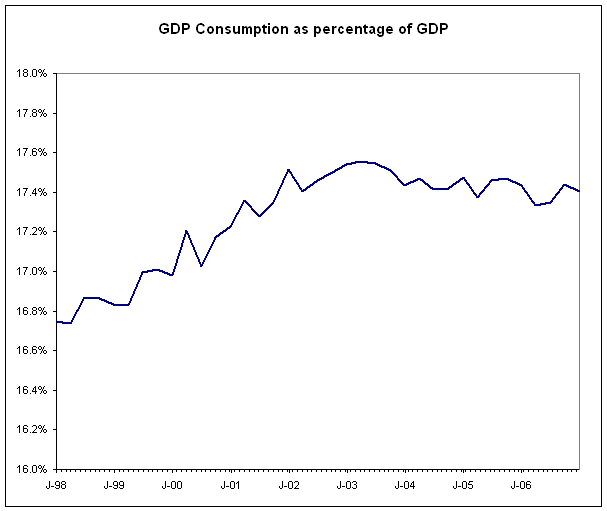
Since 2003, consumption has fallen.
You might need a different chart to show that's the case.
Yeah, that one doesn't really do the trick.
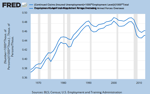
i was going with this one.
% GDP is a good proxy for real dollars per capita. GDP increases with population so it takes that out. And $/$ gets rid of the nominal dollar issue.
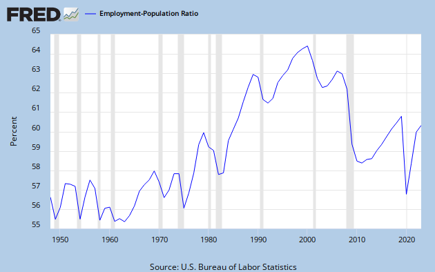
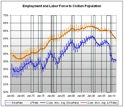
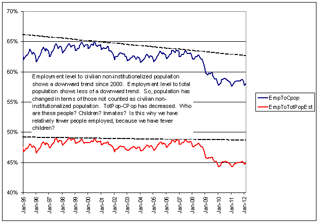
The fact that employment and the labor force has trended down since about 2000 is the underlying issue. Not only has real income declined, but even more so, employment has declined as well. It suggests there was a serious change in about 2000.
So far as I can tell, the major fundamental change is apparent in gasoline prices which went from flat to trending upward in about 2000.
Do you have a source for those numbers?
I've always heard consumption was at least 70% of GDP.
You are right. I didn't like it either. And, I don't like the the %GDP approach anyways. It could be simply that other components went up. It's a ratio issue. So I went after it as straight up GDP(2005) per capita.
The decline in consumer spending isn't as drastic as the %GDP suggests. There is another reason that %GDP can decline, because something else went up.
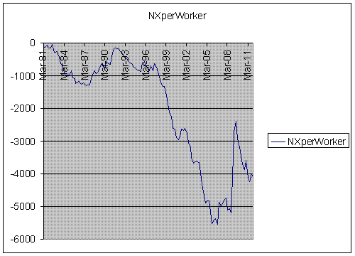
When we look at GDP(2005)-Consumption on a per capita, per civilian population, and per worker basis, it looks like this;
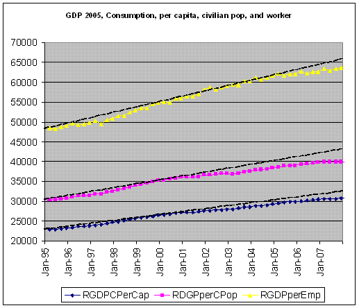
Consumption did begin to decelerate in the 2001 time frame, for per worker and civilian population. Curiously, for per capita, it didn't begin to decelerate until 2005. That deserves some explaination.
So, at least, the deceleration in the 2001 time frame is consistent with the declining real income across all quintiles.
And, I suppose, that's okay. It's not important that real incomes had declined across the board and per worker consumption has only slowed down.