kiwiman127
Comfortably Moderate
Charts, charts, charts.
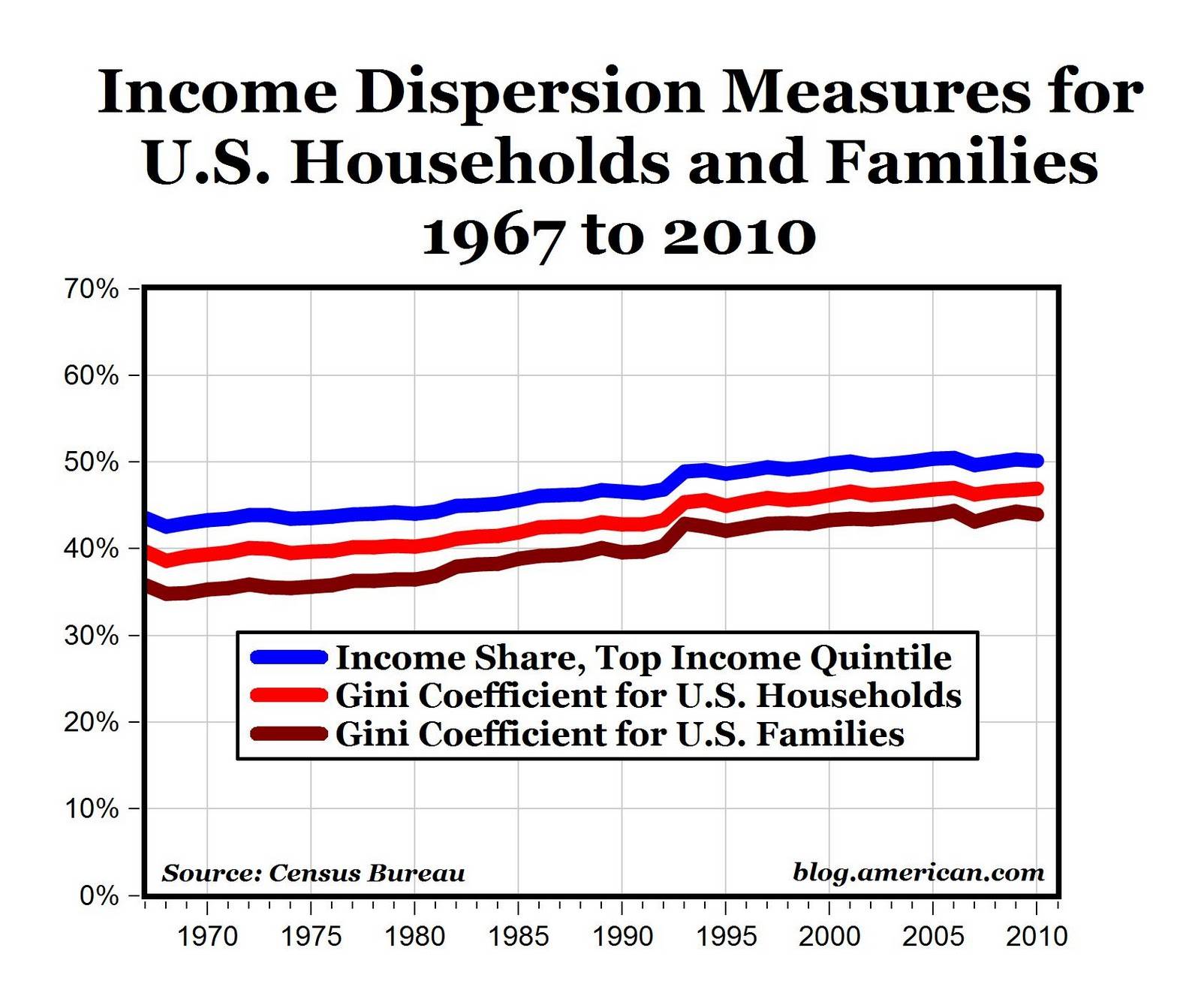
With the first chart we see the growth of income inequality.
With the second chart, we see the income growth of the top percentile versus the household median income. Please note the tremendous growth of income after the Bush tax cuts and the Capital Gains reduction versus the flat trend of median income.
With the third chart we see the percentage of the National Income for working Americans (non-farm wage earners). Notice it's trend and the beginning longterm downwards trend starting in 1980 and the acceleration downwards after 2000.
Why is this happening?
Last edited: