Income Inequality Rose Most Under President Clinton

...I hadn't realized how good wages were before the 08 election and how bad after--
PAY01.png
....
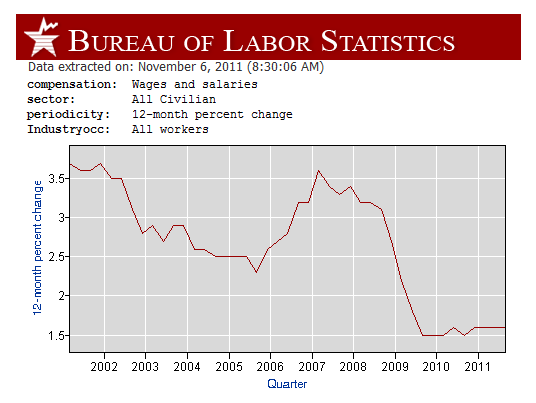
...Do you even know how to read this? Wages go down after Bush assumes office...
laughing.GIF

OK, I've finished cleaning the coffee I splattered all over my monitor.

First, the graph doesn't show wages going up and down, it's showing wages continuously increasing but at rates that go up and down. Second, the data start with 2001 with GW Bush in office. The graph doesn't show whether that's better or worse than before.

Okay.

When I speak of wages, I mean total compensation. Do I really have to qualify that shit for you?

Secondly..raises go DOWN initially..then come back up.

That work?
 
By JOHN MERLINE, INVESTOR'S BUSINESS DAILY

In his weekend radio address, President Obama decried that "over the past three decades, the middle class has lost ground while the wealthiest few have become even wealthier." Although he was trying to leverage the Occupy Wall Street movement, the income gap has been a longstanding concern of his.

During the 2008 campaign, Obama said, "The project of the next president is figuring out how do you create bottom-up economic growth, as opposed to the trickle-down economic growth that George Bush has been so enamored with."

But it turns out that the rich actually got poorer under President Bush, and the income gap has been climbing under Obama.

What's more, the biggest increase in income inequality over the past three decades took place when Democrat Bill Clinton was in the White House.

The wealthiest 5% of U.S. households saw incomes fall 7% after inflation in Bush's eight years in office, according to an IBD analysis of Census Bureau data. A widely used household income inequality measure, the Gini index, was essentially flat over that span. Another inequality gauge, the Theil index, showed a decline.

In contrast, the Gini index rose — slightly — in Obama's first two years. Another Census measure of inequality shows it's climbed 5.7% since he took office.

Meanwhile, during Clinton's eight years, the wealthiest 5% of American households saw their incomes jump 45% vs. 26% under Reagan. The Gini index shot up 6.7% under Clinton, more than any other president since 1980.

To the extent that income inequality is a problem, it's not clear what can be done to resolve it. Among the contributing factors:

Economic growth. Strong economic growth, rising stock prices and household income inequality tend to go hand in hand.

Technology. Tech advances have put a premium on skilled labor, according to a Congressional Budget Office report . Because the pool of skilled workers hasn't grown as much as demand, their wages have climbed faster.

Free trade and immigration. Cheap labor abroad and an influx in low-skilled immigrants can depress wages at the bottom, according to the CBO.

Women in the workforce. As the CBO put it, "an increase in the earnings of women could boost inequality by raising the income of couples relative to that of households headed by single people."

Tax policy changes don't explain the widening income gap. The CBO found that, by one measure, "the federal tax system as a whole is about as progressive in 2007 as it was in 1979."
WEBrich110311.jpg.cms


Read more at Business News - Financial News, Stock Market & Investing News - IBD - Investors.com .

That's because Clinton signed every free trade agreement that crossed his desk. Every president since the 70's has been working towards the wealth of the many in the hands of the few. America will soon cease to exist. That's what the bailout was all about. It wasn't about making jobs, or getting the economy back on track, it was just another means to rob from our treasury and give to the rich.
 
...the rich actually got poorer under President Bush, and the income gap has been climbing under Obama. What's more, the biggest increase in income inequality over the past three decades took place when Democrat Bill Clinton was in the White House...
That's because Clinton signed every free trade agreement that crossed his desk...
Wait a second, Clinton's free trade makes inequality and the same with Bush makes less and the same with Obama makes more?
 
Clinton was a DINO.
Of course the income disparity rose under his rule.

There is some validity in this claim only if you aggregate the entirety of the labor market. But remember a couple of things..more people entered the workforce, which would skew wages downward..and wages for people already employed went up a great deal. By the end of the Clinton administration we were at near full employment. We had a very tight labor market. And if that trajectory continued, you would have seen something that mirrored what happened under Eisenhower..which was growth in the middle class. Unfortunately, Bush lead the way to erode labor rights, and off shore new jobs. That heralded what we are seeing today.

Clinton signed NAFTA, GATT and Permanent Normal Trade Relations with China.
 
...the rich actually got poorer under President Bush, and the income gap has been climbing under Obama. What's more, the biggest increase in income inequality over the past three decades took place when Democrat Bill Clinton was in the White House...
That's because Clinton signed every free trade agreement that crossed his desk...
Wait a second, Clinton's free trade makes inequality and the same with Bush makes less and the same with Obama makes more?

If I understood that question, I'd probably answer it.

Here's an attempt....

Bush Sr started with the free trade agreements....Clinton continued, but most were signed while he was president..Bush and Obama continued with free trade.

None of them have done anything in the interest of the American people, they've been too concerned with the interests of corporations and the super wealthy to consider us peasants.

One time, for a very short second, I thought Obama might actually do some good and bring our jobs home when he talked about adding a 25 cent fee to service calls overseas. Unfortunately that talk didn't even last a day before someone silenced him on it.

I doubt any of our presidents has actually been in control for a long time. Both the dems and the reps have been bought off. That's why we need a 3rd party in power. At least until they become corrupt, things will start to change for the better. Then again, it's probably too late. Americans have already shown they are apathetic. I can't believe we allowed our own national guard to march through the streets of New Orleans and take people's guns from them. We did NOTHING!!! I guess we deserve what's coming.
 
Clinton stupidly bought into religious economics. He and his advisors misconstrued the millennium spending and internet growth as consequences rather than temporary developments. Remember when 'content' was king. His regulatory changes and NAFTA helped lead to the mess of today. It is an irony of contemporary thought that Nixon Ford and Carter failed, when it is Reagan Clinton and Bush who made the mess that is today. The latter three oddly were worse than the former in the end. But Reagan and Clinton raised taxes which is another puzzle.

Statistics and graphs are like magic, phantoms that are often meaningless in the real world. Here are a few more for the interested.

Who Rules America: Wealth, Income, and Power
Economic Performance of Presidential Administrations

.
 
...Statistics and graphs are like magic, phantoms that are often meaningless in the real world. Here are a few more...
What, your favorite meaningless phantoms?

Numbers are like brains, eyes, and ears. Successful and happy people use them. Complainers are unhappy and don't succeed. We can work together her if we both want the same things. I like peace, prosperity, and a respect for human worth. If we're still together we can get somewhere.
 
...in 2006-2007 when the inflation was this high it was mostly if not completely offset by wage gains for the most part.
Thanks for the tip; I hadn't realized how good wages were before the 08 election and how bad after--
PAY01.png

btw, the numbers/graphs are super easy to get out these days. It's just a matter of starting with Databases, Tables & Calculators by Subject . I like to click 'Top Picks' for the topic, then a check in the box with a click for 'Retrieve Data' and then I check 'Include graphs' and 'GO'.

It's even possible to right click on the graph for the web location for posting on these threads.

That's bending the truth. 2008 was far from good. Also, while wage growth towards the end of the last business cycle was better than it is at this time, it was still painfully low compared to previous expansions.
 
By letting the facts speak for themselves, we see that most of 2008 income growth was close to decade highs until the election when it fell to a decade low.

The facts don't speak to that though. Those are income gains on a rolling 12 month basis. So even the highs of 2008 still had 2007 gains factored in.

Besides, to say that the election in itself was responsible for a collapse in income gains would highlight a lack of understanding for how complex the economy is. Are you going to completely discount the larger factors such as the financial crises, or the utter collapse in job growth that was well under way even before anyone had a clue to who what the outcomes of the election would be?

Also income growth is a major lagging indicator. This is illustrated by how low it is in 2004-2005, the two years in that decade where actual GDP growth was quite healthy.
 
Last edited:
By letting the facts speak for themselves, we see that most of 2008 income growth was close to decade highs until the election when it fell to a decade low.
The facts don't speak to that though. Those are income gains on a rolling 12 month basis. So even the highs of 2008 still had 2007 gains factored in...
Yr/yr growth was as it was and in reality the facts spoke to all with an ear for facts. The complaint in post 33 was not accompanied with an alternative, even though the link copied into it could have led (via Top Picks w/ Employment Cost Index) to any of 15 alternative plots. A discussion that falls to helpless complaining without solutions is not only pointless, it's unhealthy.

See what I mean? Now I'm complaining!

Hey, click on a few links. It's fun!

I tried but found the monthly data not very helpful since we're talking increases of only .02, .03, .01, .00 so it would be difficult for my to illustrate any trend. I tried finding the graph that you got but only found graphs for benefits, payrolls, and regional data. If you could give me the step by step on how you found the data for that graph I would like to have some fun with it.

My point about the graph you showed is for example: The year to date increase in say August 2008 was 3.1% according to the graph, but that includes numbers from say Sept or Oct 2007 when the job market was still strong. Payrolls started shrinking in January 2008, and by the time the financial crises reached critical mass in Sept 2008 with the collapse of Lehman Brothers, payrolls were already falling at terminal velocity.

CES0000000001_133467_1320984196411.gif


Oh and the wage growth that you illustrate in 2008 (avg a little north of 3%) - well the 12 month inflation rate during this time was actually north of 5%, resulting in wage growth of negative 2%. - Yeah the HIGHS OF THE DECADE.

CUSR0000SA0_133524_1320984417005.gif
 
...Payrolls started shrinking in January 2008, and by the time the financial crises reached critical mass in Sept 2008 with the collapse of Lehman Brothers, payrolls were already falling at terminal velocity... ...12 month inflation rate during this time was actually north of 5%, resulting in wage growth of negative 2%....
You're spot on bringing up inflation.

What you may want to be saying is that record wage growth in 2008 came with the '08 inflation spike and flat wages in '09 came with the deflation hole. The numbers say it better--
compinfla.png

--that '08 was a great time to earn money for spending in '09. Something else we got is how good real pay was before '08 compared to after.
 
The government has been following policies designed to increase the gaps in wealth and income for more than thirty years. That includes the eight years of Bill Clinton's presidency. The Democrats are fully as corrupt as the Republicans.

We need to reverse the policies not of George W. Bush, but of Ronald Reagan.

But Clinton and Obama is ok...got it.:doubt:
 
...Statistics and graphs are like magic, phantoms that are often meaningless in the real world. Here are a few more...
What, your favorite meaningless phantoms?

Numbers are like brains, eyes, and ears. Successful and happy people use them. Complainers are unhappy and don't succeed. We can work together her if we both want the same things. I like peace, prosperity, and a respect for human worth. If we're still together we can get somewhere.

That is the problem.
I doubt more than 10% of this nation will, and do, speak out against their own party.
Instead they follow the drumbeat of the media and the talking heads and blame everything on the other guy.
Sheep and mushrooms...the nation is full of them.
 

Forum List

Back
Top