Tech_Esq
Sic Semper Tyrannis!
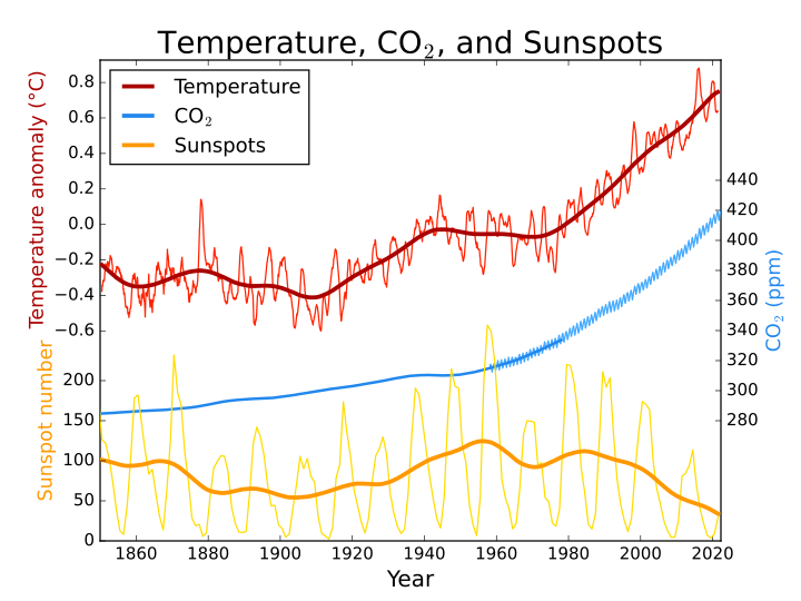
That graph is a perfect example of what I'm talking about. We have two people here looking at the exact same data and drawing two diametrically opposed conclusions. And the truth is, neither of them is wrong.
And layer on top of that the possiblility that the data itself may be less than reliable...
Mani -- you are a master of understatement. The data is absolute crap. It varies from recent data collected being suspect, to data over 50 years old being completely suspect, to data over 100 years old being a steaming pile of crap. Then we have estimates related to ice core samples which might be compared to sausage (you don't wanna see how it's made or what goes into it).
When the "scientists" themselves claim that a variance of as little as ten feet in elevation has statistically significant impact on measuring temperature and then you realize that these sensors have to be replaced, upgraded, relocated or modified over time (especially sensors in place for over 100 years). But, there is no agreement in the scientific community at what level we should be placing the sensors. So, sensors may vary in height when refreshed.
Then there is the canopy problem. There is no agreement on whether sensors should be placed over or under tree canopies. There are changes to the local environment over time where the sensors are located. A once rural sensor could now be above a supermarket parking lot now. How is all this change accounted for in the stats?