- Thread starter
- #121
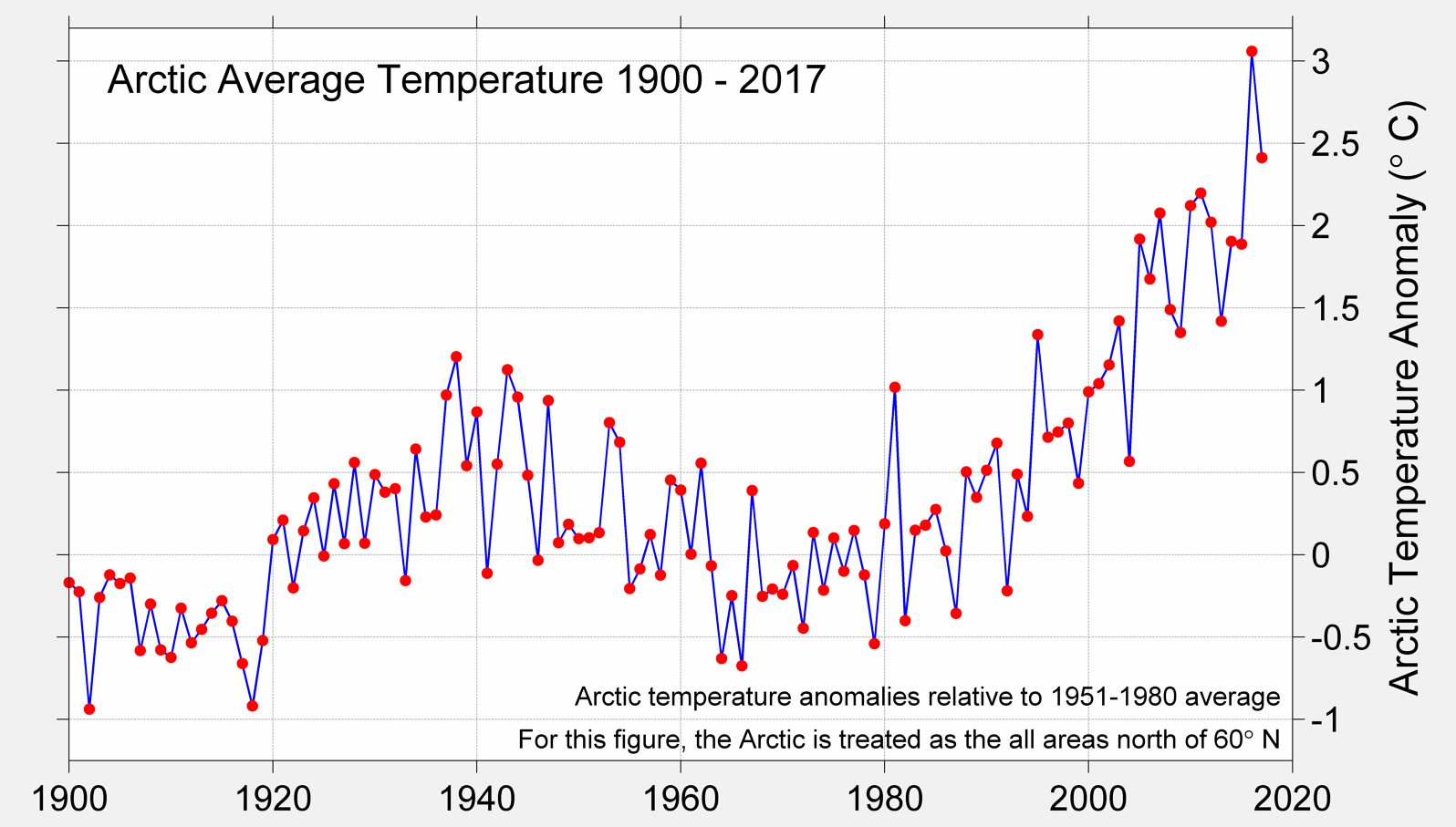
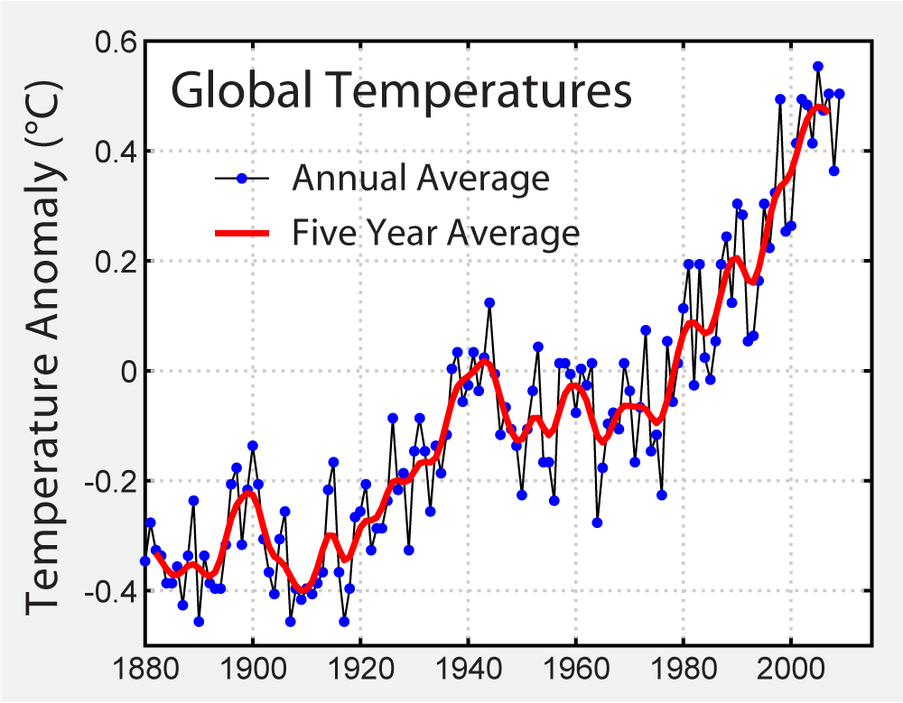
1980 through 1994, zero net loss but what's happened since? If you think you've got enough data to conclude that melting has stopped and the Arctic is expanding again - particularly when Arctic temperature data do NOT support such a conclusion - you're more stupid than I had imagined.