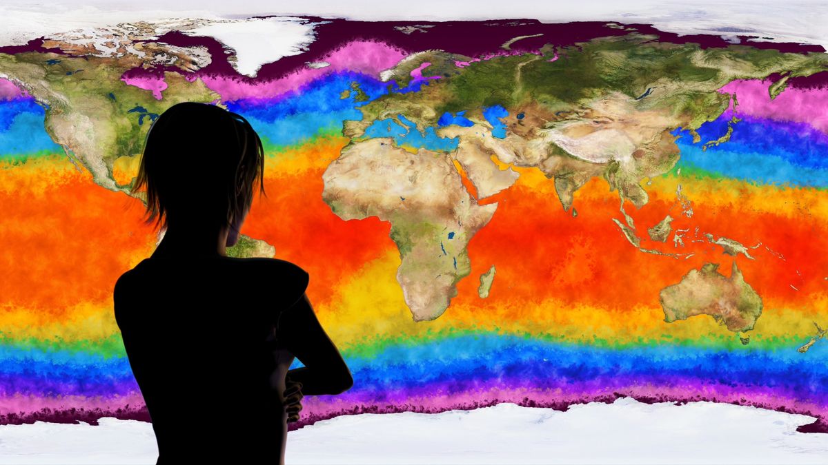
If you think it's unusual to use different colors to indicate different temperatures or that commercial, for-profit media has no interest in increased drama, you've got most of a universe to fix.I remember the good old days where Michael Fish (weather presenter) on the TV used to put magnetic symbols of rain, clouds, lightening, temp etc.. on the map of the UK. Now, it's done electronically where the presenter is Infront of a green background hitting a little slideshow button in their hand. And to show how dangerously hot it is, it goes all red.
Frightening stuff this climate change. But the troubling point I see is, Michael Fish used to clap on higher temperatures with no frightening red colours. Why is that Crick , why have red but cooler temperatures created panic amongst the vulnerable in society?
Which do you think conveys more and more accurate weather information: Micheal Fish's refrigerator magnets or a high res screen filled with near realtime digital data?


 ....2009