To be clear, Frank is lying out of ignorance and prejudice. The IPCC does not set anyone's policies, even their own. Ottmar Edenhofer did NOT say that "AGW is to redistribute wealth" or anything that could be construed to even suggest that idiotic thought. And Frank's understanding of basic physics is absolutely nil.
Navigation
Install the app
How to install the app on iOS
Follow along with the video below to see how to install our site as a web app on your home screen.
Note: This feature may not be available in some browsers.
More options
Style variation
You are using an out of date browser. It may not display this or other websites correctly.
You should upgrade or use an alternative browser.
You should upgrade or use an alternative browser.
Hottest June on record and the hottest 6 months on record..Noaa!
- Thread starter ScienceRocks
- Start date
I criticize Frank here because he knowingly and willfully tells us a complete falsehood about the statements of Ottmar Edenhofer. Where I come from, that is called "A LIE". I don't like lies or the people who put them out. As to ignorance, one only has to review Frank's postings here. His grasp of climate science, global warming or even basic physical science, is demonstrably poor in the extreme. Of course, so is yours, so I'm not surprised to hear such thoughts from you. Did you notice I've been quoting you in my sig Stephanie?
CrusaderFrank
Diamond Member
- May 20, 2009
- 163,709
- 90,307
- 2,645
To be clear, Frank is lying out of ignorance and prejudice. The IPCC does not set anyone's policies, even their own. Ottmar Edenhofer did NOT say that "AGW is to redistribute wealth" or anything that could be construed to even suggest that idiotic thought. And Frank's understanding of basic physics is absolutely nil.
Crick is either a pathological liar or a mental patient, possibly both.
Quoting IPCC is like quoting Bernie Madoffs accountant. Crick knows the IPCC is on record saying they use climate policy to redistribute wealth. First Crick told us it was a low level staffer who made that comment. Next he told us the person was expressing his personal opinion. Now he's telling us Ottmar never said it. Lying or mental, that's our Crick
Last edited:
Stephanie
Diamond Member
- Jul 11, 2004
- 70,230
- 10,905
- 2,040
To be clear, Frank is lying out of ignorance and prejudice. The IPCC does not set anyone's policies, even their own. Ottmar Edenhofer did NOT say that "AGW is to redistribute wealth" or anything that could be construed to even suggest that idiotic thought. And Frank's understanding of basic physics is absolutely nil.
Crick is either a pathological liar or a mental patient, possibly both.
Quoting IPCC is like quoting Bernie Madoffs accountant. Crick knows the ipccis on record saying they use climate policy to redistribute wealth. First Crick told us it was a low level staffer who made that comment. Next he told us the person was expressing his personal opinion. Now he's telling us Ottmar never said it. Lying or mental, that's our Crick
He has to be making money off this scam. He pops up in everyone of the threads on here.
CrusaderFrank
Diamond Member
- May 20, 2009
- 163,709
- 90,307
- 2,645
I criticize Frank here because he knowingly and willfully tells us a complete falsehood about the statements of Ottmar Edenhofer. Where I come from, that is called "A LIE". I don't like lies or the people who put them out. As to ignorance, one only has to review Frank's postings here. His grasp of climate science, global warming or even basic physical science, is demonstrably poor in the extreme. Of course, so is yours, so I'm not surprised to hear such thoughts from you. Did you notice I've been quoting you in my sig Stephanie?
Crick where do you come from? Is it Media Matters? Is it a mental hospital?
You've changed your story on Ottmar's a few times now and you're even telling us he didn't say IPCC is using climate change to redistribute wealth.
Take your meds Crick
CrusaderFrank
Diamond Member
- May 20, 2009
- 163,709
- 90,307
- 2,645
Crick remember when you tried to discount Ottmars quote by telling us he was a low level economist?
CrusaderFrank
Diamond Member
- May 20, 2009
- 163,709
- 90,307
- 2,645
Crick remember when you told us Ottmar wasn't a represtative of IPCC but was expressing his personal opinion
jc456
Diamond Member
- Dec 18, 2013
- 161,004
- 40,429
- 2,180
That's right, the guy needed more time to fudge all that data. hey fudging data is hard work and it takes a lot of time to repopulate all those data points. And it's most likely done by trial and error so he most likely had hundreds of attempts to get his data to look like that. Yep.Did you not see Karl et al?
Possible artifacts of data biases in the recent global surface warming hiatus
The Recent Global Surface Warming Hiatus National Centers for Environmental Information NCEI formerly known as National Climatic Data Center NCDC
NOAA said:A new study published online today in the journal Science finds that the rate of global warming during the last 15 years has been as fast as or faster than that seen during the latter half of the 20th century. The study refutes the notion that there has been a slowdown or “hiatus” in the rate of global warming in recent years.

An FTP link to the data used in the Karl et al analysis: ftp://ftp.ncdc.noaa.gov/pub/data/scpub201506/
The IPCC did not have these data when they wrote and released AR5. It - and an great deal of follow-on work - will make it into AR6.
Stephanie
Diamond Member
- Jul 11, 2004
- 70,230
- 10,905
- 2,040
I Just don't know how anyone take these Globull warmers Serious. Pictures at the site.
SNIP:
A research expedition to study the effects of global warming aboard the Canadian Coast Guard icebreaker Amundsen is on hold as the icebreaker is needed to do it’s primary job — break up ice:
You don’t say…
According to a Coast Guard officer, the icy conditions are the “worst he’s seen in 20 years“:
A carefully planned, 115-day scientific expedition on board the floating research vessel, the CCGS Amundsen, has been derailed as the icebreaker was called to help resupply ships navigate heavy ice in Hudson Bay.
“Obviously it has a large impact on us,” says Martin Fortier, executive director of ArcticNet, which coordinates research on the vessel. “It’s a frustrating situation
all of it here:
Arctic expedition to study global warming put on hold because of too much ice photos Twitchy
CrusaderFrank
Diamond Member
- May 20, 2009
- 163,709
- 90,307
- 2,645
I criticize Frank here because he knowingly and willfully tells us a complete falsehood about the statements of Ottmar Edenhofer. Where I come from, that is called "A LIE". I don't like lies or the people who put them out. As to ignorance, one only has to review Frank's postings here. His grasp of climate science, global warming or even basic physical science, is demonstrably poor in the extreme. Of course, so is yours, so I'm not surprised to hear such thoughts from you. Did you notice I've been quoting you in my sig Stephanie?
"But one must say clearly that we redistribute de facto the world's wealth by climate policy." -- Ottmar Edenhofer, IPCC, Lead author of AR4 and 5
CrusaderFrank
Diamond Member
- May 20, 2009
- 163,709
- 90,307
- 2,645
That is still a fact. Ottmar was NOT speaking for the IPCC and he WAS expressing his personal opinion.
Once I posted Who is Ottmar Edenhofer US Message Board - Political Discussion Forum Crick has to find new and bolder lies to try to explain away that the IPCC is on record using climate change to redistribute wealth.
Is Crick mental or lying -- or both. You decide
Stephanie
Diamond Member
- Jul 11, 2004
- 70,230
- 10,905
- 2,040
I criticize Frank here because he knowingly and willfully tells us a complete falsehood about the statements of Ottmar Edenhofer. Where I come from, that is called "A LIE". I don't like lies or the people who put them out. As to ignorance, one only has to review Frank's postings here. His grasp of climate science, global warming or even basic physical science, is demonstrably poor in the extreme. Of course, so is yours, so I'm not surprised to hear such thoughts from you. Did you notice I've been quoting you in my sig Stephanie?
"But one must say clearly that we redistribute de facto the world's wealth by climate policy." -- Ottmar Edenhofer, IPCC, Lead author of AR4 and 5
yep, I saw that said too. sometime they slip up and tell the truth. Just sickening people. didn't HITLER use the environment for his Agenda?
people need to wake up
CrusaderFrank
Diamond Member
- May 20, 2009
- 163,709
- 90,307
- 2,645
Crick is Ottmar's "personal opinion" on Climate policy contrary to IPCC's?
Can you describe the differences?
Can you describe the differences?
CrusaderFrank
Diamond Member
- May 20, 2009
- 163,709
- 90,307
- 2,645
That is still a fact. Ottmar was NOT speaking for the IPCC and he WAS expressing his personal opinion.
Crick when Ottmar in the same interview talks about the UN Climate Summit in Rio in 1992 and the UN Climate summit in Cancun in 2010, was he really just discussing his favorite vacation spots?
jc456
Diamond Member
- Dec 18, 2013
- 161,004
- 40,429
- 2,180
most probably. Because he has nothing to do with climate studies or reports.That is still a fact. Ottmar was NOT speaking for the IPCC and he WAS expressing his personal opinion.
Crick when Ottmar in the same interview talks about the UN Climate Summit in Rio in 1992 and the UN Climate summit in Cancun in 2010, was he really just discussing his favorite vacation spots?
It would be like the obamacare report, right? You'll be able to keep your current insurance and insurance prices will drop. you know those Obama report lies. It was merely obama's opinion and he didn't actually write it. The dude is out there and funny!!
mamooth
Diamond Member
So, just how many fruitloops believe the "Dread Lord Ottmar has secretly forced socialism upon the entire planet" conspiracy theory?
We know Frank, Steph and jc are such True Believers. Anyone else want to admit to it? I would hope not. Some stuff is so crazy, even deniers won't touch it. Claiming that a guy named Ottmar runs the world is one such example.
We know Frank, Steph and jc are such True Believers. Anyone else want to admit to it? I would hope not. Some stuff is so crazy, even deniers won't touch it. Claiming that a guy named Ottmar runs the world is one such example.
ScienceRocks
Democrat all the way!
- Thread starter
- Banned
- #59
NASA and NOAA
Posted on July 22, 2015 | 37 comments
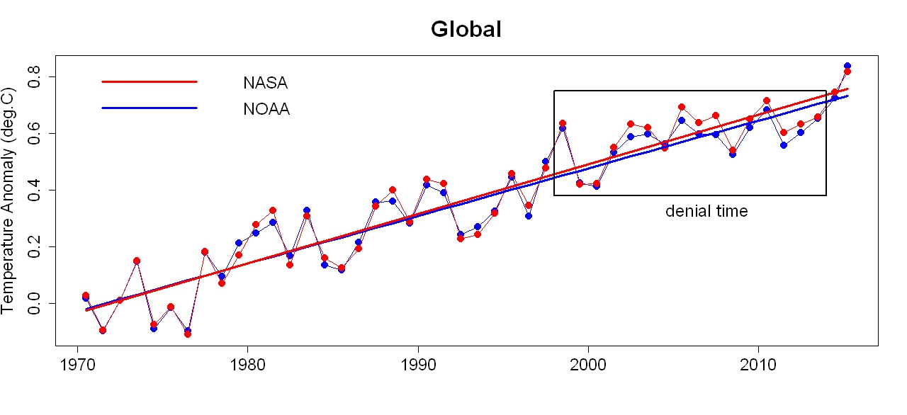
We now have data for global temperature at earth’s surface (which is where we live) through June of this year, from both NASA and NOAA. Graphs are a lot less messy if we convert monthly data to yearly, simply by computing annual averages. This year (2015) isn’t complete yet, but I’ll plot the 2015-so-far averages anyway, to give you an idea of how the year is shaping up compared to previous years. I’ll also put them on the same baseline, more easily to compare the two. Without further ado, here’s the result:

Those in denial of global warming, its human causation, and/or its danger, have been trying their best to convince everyone that global warming has mysteriously “paused” or exhibited some “hiatus.” They do so by turning their focus on an all-too-short time span:

The frailty of their belief is even more obvious if we zoom in on the data since 1970, and add trend lines (by linear regression) estimated from data since that time:

The data during “denial time” continues to follow the trend, plus the same amount of up-and-down fluctuation that global temperature has always shown, and always will. But if you’re in denial, it’s all too easy to see random fluctuation as a meaningful pattern whether true or not. If you have an ideological motive not to believe in global warming, it’s difficult not to do that.
The last two years have made the “pausemaniacs” a bit hot under the collar; 2014 set a new record for hottest year, and — as is clear from the data — 2015 is well on its way to break that record. That leaves “pausemaniacs” only two choices: either ignore what’s happening recently at earth’s surface (where we live), or just refuse to believe the data, usually based on slandering the scientists who provide it. You know, all those scientists from NASA and NOAA who have spent their lives studying climate.
Of course to make that work, it’s not enough to accuse just NASA and NOAA scientists of being lying fraudsters, you also have to believe that of scientists from the meteorological office of Great Britain, and from the Japan meteorological agency, and yet more. Once you start down the slippery slope of making global warming into a giant conspiracy, you can’t stop with just the U.S.
But I digress.
Since 1970 global temperature has marched steadily upward (together with those up-and-down fluctuations that are always happening). The warming rate is, according to NOAA data, 0.0166 +/- 0.0027 deg.C/yr, while using NASA data it’s 0.0174 +/- 0.0027 deg.C/yr. The two estimates are well within each other’s confidence intervals. Applying the same tests used here, where I demonstrated just how non-existent the non-existent “pause” is, we find no evidence that the rate has changed since 1970.
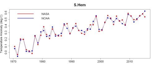
Most land area is in the northern hemisphere while the southern is mainly ocean. The oceans have a much greater heat capacity than land, so it takes more heat energy to raise their temperature. On this basis, scientists predicted quite a while ago that the northern hemisphere would warm faster than the southern.
In addition to global temperature, both NASA and NOAA also provide estimates for earth’s two hemispheres separately, which enables us to check the predicted hemispheric difference in warming rates. Here’s the entire time span for the southern hemisphere:

Notice that it covers less total range than the global data. Here it is since 1970:
NOAA lists the year-so-far as hotter than any previous year, but NASA doesn’t.
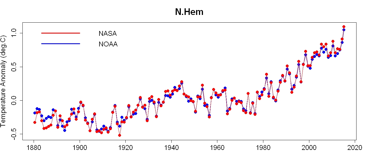
Here’s the data for the northern hemisphere (where most of us live):

Note that it covers more total range the the global data. Here it is since 1970:

Not only do both data sets show this-year-so-far hotter than any previous year, they do so by a large margin.
It turns out that the southern hemisphere is warming at a “mere” 0.0109 +/- 0.0026 deg.C/yr according to NOAA data, 0.0109 +/- 0.0020 deg.C/yr according to that from NASA. The northern hemisphere, however, is warming considerably faster, at 0.0220 +/- 0.0030 using NOAA data, 0.0238 +/- 0.0034 deg.C/yr using NASA data. The larger error ranges for the northern hemisphere are because, dominated by land rather than ocean, it shows larger fluctuations than the southern.
NASA also provides zonal data, to inform about how different latitude bands are heating up. This enables us to check another prediction from long ago, that the Arctic would warm much faster than the globe as a whole. NASA’s zonal data are already annual averages, so they don’t include 2015-so-far data, but here is the data for the Arctic region (latitudes 64N to 90N):
Posted on July 22, 2015 | 37 comments
We now have data for global temperature at earth’s surface (which is where we live) through June of this year, from both NASA and NOAA. Graphs are a lot less messy if we convert monthly data to yearly, simply by computing annual averages. This year (2015) isn’t complete yet, but I’ll plot the 2015-so-far averages anyway, to give you an idea of how the year is shaping up compared to previous years. I’ll also put them on the same baseline, more easily to compare the two. Without further ado, here’s the result:

Those in denial of global warming, its human causation, and/or its danger, have been trying their best to convince everyone that global warming has mysteriously “paused” or exhibited some “hiatus.” They do so by turning their focus on an all-too-short time span:

The frailty of their belief is even more obvious if we zoom in on the data since 1970, and add trend lines (by linear regression) estimated from data since that time:
The data during “denial time” continues to follow the trend, plus the same amount of up-and-down fluctuation that global temperature has always shown, and always will. But if you’re in denial, it’s all too easy to see random fluctuation as a meaningful pattern whether true or not. If you have an ideological motive not to believe in global warming, it’s difficult not to do that.
The last two years have made the “pausemaniacs” a bit hot under the collar; 2014 set a new record for hottest year, and — as is clear from the data — 2015 is well on its way to break that record. That leaves “pausemaniacs” only two choices: either ignore what’s happening recently at earth’s surface (where we live), or just refuse to believe the data, usually based on slandering the scientists who provide it. You know, all those scientists from NASA and NOAA who have spent their lives studying climate.
Of course to make that work, it’s not enough to accuse just NASA and NOAA scientists of being lying fraudsters, you also have to believe that of scientists from the meteorological office of Great Britain, and from the Japan meteorological agency, and yet more. Once you start down the slippery slope of making global warming into a giant conspiracy, you can’t stop with just the U.S.
But I digress.
Since 1970 global temperature has marched steadily upward (together with those up-and-down fluctuations that are always happening). The warming rate is, according to NOAA data, 0.0166 +/- 0.0027 deg.C/yr, while using NASA data it’s 0.0174 +/- 0.0027 deg.C/yr. The two estimates are well within each other’s confidence intervals. Applying the same tests used here, where I demonstrated just how non-existent the non-existent “pause” is, we find no evidence that the rate has changed since 1970.
Most land area is in the northern hemisphere while the southern is mainly ocean. The oceans have a much greater heat capacity than land, so it takes more heat energy to raise their temperature. On this basis, scientists predicted quite a while ago that the northern hemisphere would warm faster than the southern.
In addition to global temperature, both NASA and NOAA also provide estimates for earth’s two hemispheres separately, which enables us to check the predicted hemispheric difference in warming rates. Here’s the entire time span for the southern hemisphere:

Notice that it covers less total range than the global data. Here it is since 1970:

NOAA lists the year-so-far as hotter than any previous year, but NASA doesn’t.
Here’s the data for the northern hemisphere (where most of us live):
Note that it covers more total range the the global data. Here it is since 1970:

Not only do both data sets show this-year-so-far hotter than any previous year, they do so by a large margin.
It turns out that the southern hemisphere is warming at a “mere” 0.0109 +/- 0.0026 deg.C/yr according to NOAA data, 0.0109 +/- 0.0020 deg.C/yr according to that from NASA. The northern hemisphere, however, is warming considerably faster, at 0.0220 +/- 0.0030 using NOAA data, 0.0238 +/- 0.0034 deg.C/yr using NASA data. The larger error ranges for the northern hemisphere are because, dominated by land rather than ocean, it shows larger fluctuations than the southern.
NASA also provides zonal data, to inform about how different latitude bands are heating up. This enables us to check another prediction from long ago, that the Arctic would warm much faster than the globe as a whole. NASA’s zonal data are already annual averages, so they don’t include 2015-so-far data, but here is the data for the Arctic region (latitudes 64N to 90N):
Last edited:
flacaltenn
Diamond Member
Did you not see Karl et al?
Possible artifacts of data biases in the recent global surface warming hiatus
The Recent Global Surface Warming Hiatus National Centers for Environmental Information NCEI formerly known as National Climatic Data Center NCDC
NOAA said:A new study published online today in the journal Science finds that the rate of global warming during the last 15 years has been as fast as or faster than that seen during the latter half of the 20th century. The study refutes the notion that there has been a slowdown or “hiatus” in the rate of global warming in recent years.
An FTP link to the data used in the Karl et al analysis: ftp://ftp.ncdc.noaa.gov/pub/data/scpub201506/
The IPCC did not have these data when they wrote and released AR5. It - and an great deal of follow-on work - will make it into AR6.
You DID NOT answer my questions --- Did YA??
And you're STILL posting the same fakey 150 year graph to discuss a 16 year pause.
No wonder you're soooo confused...
Similar threads
- Replies
- 7
- Views
- 188
- Replies
- 2
- Views
- 169
- Replies
- 17
- Views
- 687
New Topics
-
 Core inflation rate hit 3.4% in May, highest since October 2023, Fed’s preferred gauge shows
- Started by Zincwarrior
- Replies: 6
-

-
-
Support is growing on the right to fully prosecute women seeking abortions.
- Started by Zincwarrior
- Replies: 5
-
