SSDD
Gold Member
- Nov 6, 2012
- 16,672
- 1,966
- 280
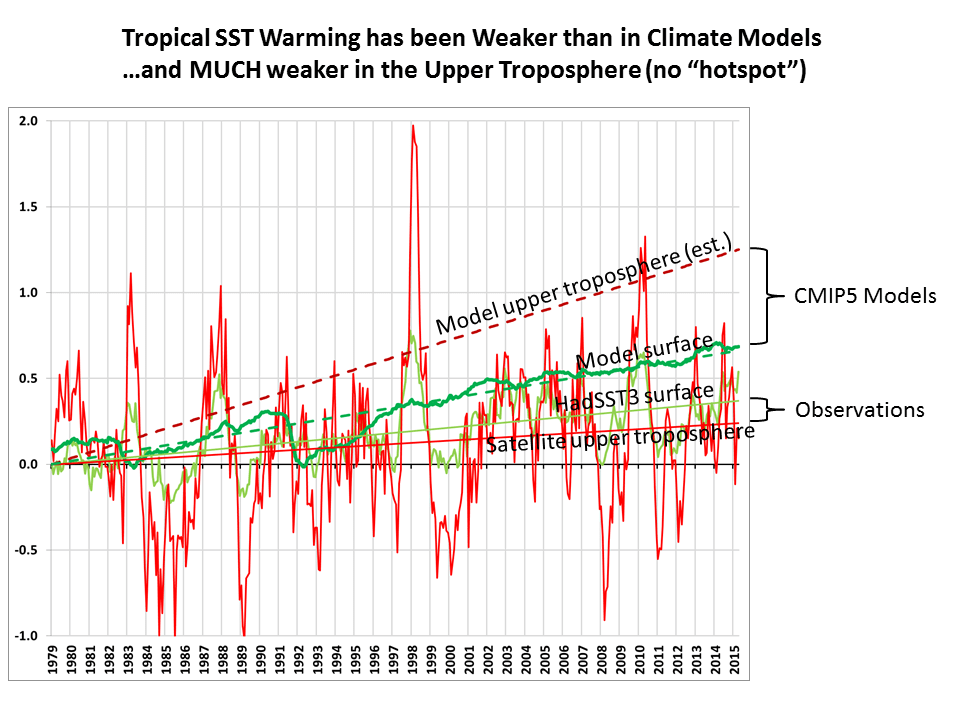
That graph does NOT support your comment. It clearly shows warming of the troposphere and cooling of the lower stratosphere. The latter is commonplace in a world warming for any reason while the latter is produced ONLY by greeenhouse warming. If you think you have some other explanation for those data, let's hear it whizbrain.
You really are an idiot crick...and should stop using graphs immediately...
I said that the troposphere stopped cooling in 1993...look at your top graph...fron 1960 till about 1993...see the steady cooling trend till 1993?...have any idea what that means...now look at 1993 onward...from that point till the present, there is a warming trend.
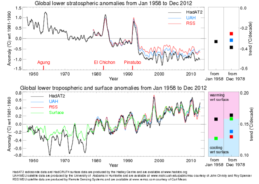
Your stratospheric chart says the same thing as my graph except on a different scale....idiot...Maybe that is because they essentially come from the same satellite and radiosonde data set. The stupidity just never stops with you...does it?