
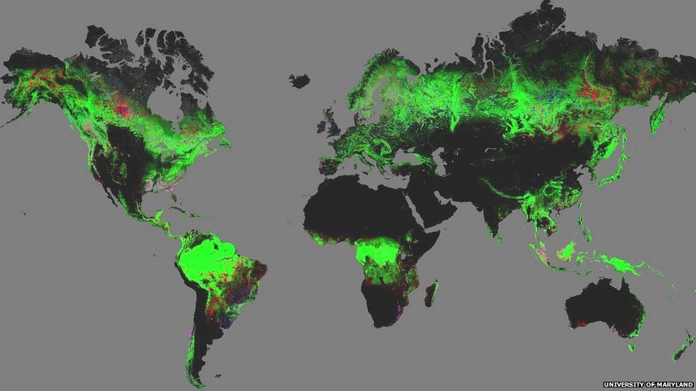
Global map of forest change
The map shows forest change from 2000-12. Green areas are forested; red suffered forest loss; blue showed forest gain; pink experienced both loss and gain.
By James Morgan Science reporter, BBC News
A new high-resolution global map of forest loss and gain has been created with the help of Google Earth.
The interactive online tool is publicly available and zooms in to a remarkably high level of local detail - a resolution of 30m.
Get the map and read the article @ http://newsimg.bbc.co.uk/news/special/2013/newsspec_6310/img/forests.jpg
Wow! There's sure a lot of red in California.