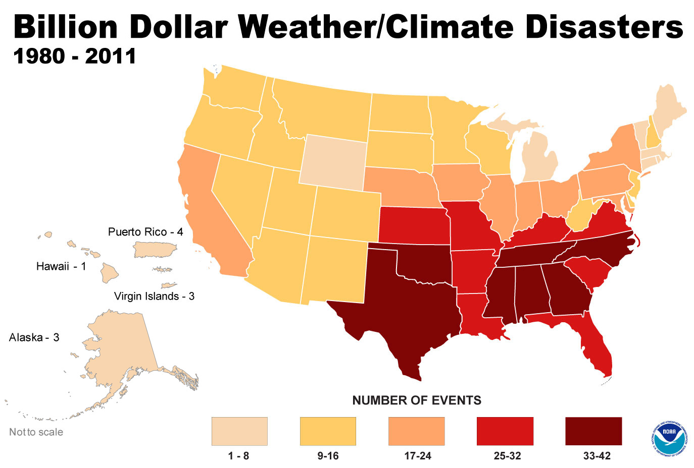
LOL. Inflation? The first graph is number of events. From 1980 to to 2011 graph represents only the billion plus events per state. A comparison of events per state, not the increase in cost. Apparently you never learned to read simple graphs.
Isn't it amazing, the people being hurt most at present are the very people that are in full denial.
No. What's amazing is this graph doesn't take into account inflation. Nor does it take into account the population increases etc. In other words, as a useful piece of information...it isn't.
In 1862 the ENTIRE California Central Valley was a lake (Sacramento was 23 feet below water) thanks to a atmospheric river. Where do you think that would stack up against the puny floods of today?