RollingThunder
Gold Member
- Mar 22, 2010
- 4,818
- 525
- 155
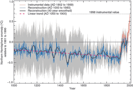
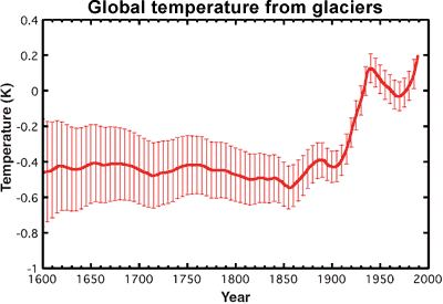
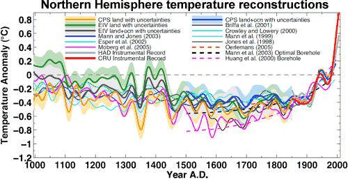
Dr. Mann's original Hockey-Stick Graph showing that global temperatures are rising way faster now than anytime in over a thousand years has been scientifically confirmed many, many times over by now by other teams of scientists all around the world, and it has been extended much farther back in time. It is now clear that late twentieth century and current warming is happening much faster than any previous warming over the entire Holocene period, or at least 11 thousand years.
Here's the science.
Paleoclimate: The End of the Holocene
Dr. Stefan Rahmstorf
RealClimate
16 September 2013
(excerpts)
Recently a group of researchers from Harvard and Oregon State University has published the first global temperature reconstruction for the last 11,000 years – that’s the whole Holocene (Marcott et al. 2013).
A while ago, I discussed here the new, comprehensive climate reconstruction from the PAGES 2k project for the past 2000 years. But what came before that? Does the long-term cooling trend that ruled most of the last two millennia reach even further back into the past?
Over the last decades, numerous researchers have painstakingly collected, analyzed, dated, and calibrated many data series that allow us to reconstruct climate before the age of direct measurements. Such data come e.g. from sediment drilling in the deep sea, from corals, ice cores and other sources. Shaun Marcott and colleagues for the first time assembled 73 such data sets from around the world into a global temperature reconstruction for the Holocene, published in Science. Or strictly speaking, many such reconstructions: they have tried about twenty different averaging methods and also carried out 1,000 Monte Carlo simulations with random errors added to the dating of the individual data series to demonstrate the robustness of their results.
To show the main result straight away, it looks like this:
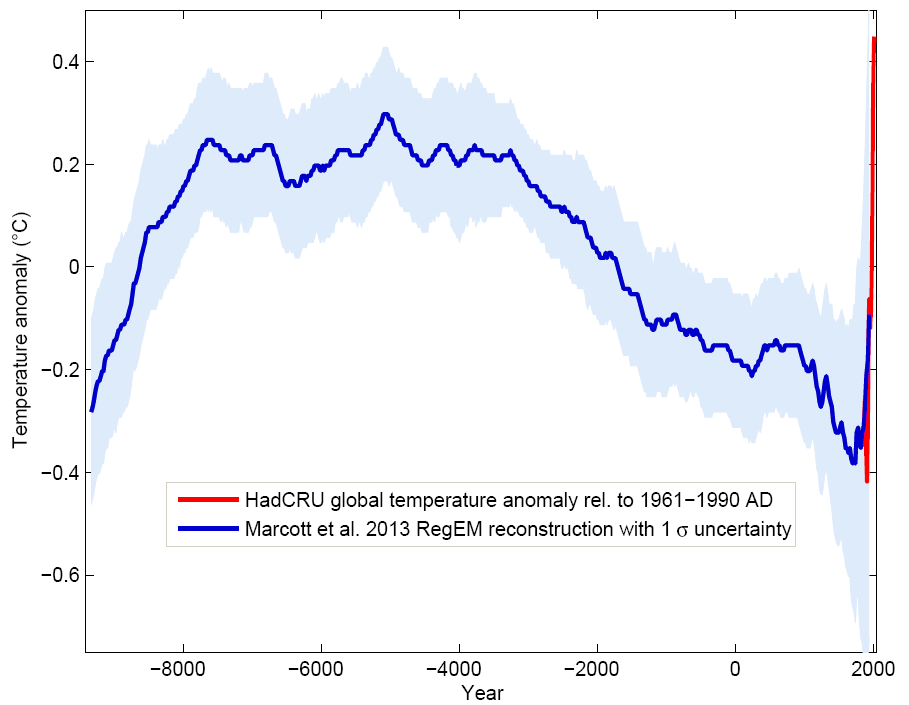
Figure 1 Blue curve: Global temperature reconstruction from proxy data of Marcott et al, Science 2013. Shown here is the RegEM version – significant differences between the variants with different averaging methods arise only towards the end, where the number of proxy series decreases. This does not matter since the recent temperature evolution is well known from instrumental measurements, shown in red (global temperature from the instrumental HadCRU data). Graph: Klaus Bitterman.
The climate curve looks like a “hump”. At the beginning of the Holocene -- after the end of the last Ice Age -- global temperature increased, and subsequently it decreased again by 0.7 ° C over the past 5000 years. The well-known transition from the relatively warm Medieval into the “little ice age” turns out to be part of a much longer-term cooling, which ended abruptly with the rapid warming of the 20th Century. Within a hundred years, the cooling of the previous 5000 years was undone. (One result of this is, for example, that the famous iceman ‘Ötzi’, who disappeared under ice 5000 years ago, reappeared in 1991.)
Comparison with the PAGES 2k reconstruction
The data used by Marcott et al. are different from those of the PAGES 2k project (which used land data only) mainly in that they come to 80% from deep-sea sediments. Sediments reach further back in time (far further than just through the Holocene – but that’s another story). Unlike tree-ring data, which are mainly suitable for the last two thousand years and rarely reach further. However, the sediment data have poorer time resolution and do not extend right up to the present, because the surface of the sediment is disturbed when the sediment core is taken. The methods of temperature reconstruction are very different from those used with the land data. For example, in sediment data the concentration of oxygen isotopes or the ratio of magnesium to calcium in the calcite shells of microscopic plankton are used, both of which show a good correlation with the water temperature. Thus each sediment core can be individually calibrated to obtain a temperature time series for each location.
Overall, the new Marcott reconstruction is largely independent of, and nicely complementary to, the PAGES 2k reconstruction: ocean instead of land, completely different methodology. Therefore, a comparison between the two is interesting:

Figure 3 The last two thousand years from Figure 1, in comparison to the PAGES 2k reconstruction (green), which was recently described here in detail. Graph: Klaus Bitterman.
As we can see, both reconstruction methods give consistent results. That the evolution of the last one thousand years is virtually identical is, by the way, yet another confirmation of the “hockey stick” by Mann et al. 1999, which is practically identical as well (see graph in my PAGES article).
Conclusion
The curve (or better curves) of Marcott et al. will not be the last word on the global temperature history during the Holocene; like Mann et al. in 1998 it is the opening of the scientific discussion. There will certainly be alternative proposals, and here and there some corrections and improvements. However, I believe that (as was the case with Mann et al. for the last millennium) the basic shape will turn out to be robust: a relatively smooth curve with slow cooling trend lasting millennia from the Holocene optimum to the “little ice age”, mainly driven by the orbital cycles. At the end this cooling trend is abruptly reversed by the modern anthropogenic warming.
The following graph shows the Marcott reconstruction complemented by some context: the warming at the end of the last Ice Age (which 20,000 years ago reached its peak) and a medium projection for the expected warming in the 21st Century if humanity does not quickly reduce greenhouse gas emissions.
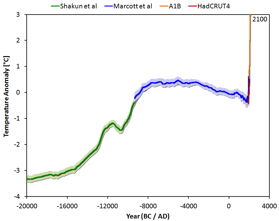
Figure 4 Global temperature variation since the last ice age 20,000 years ago, extended until 2100 for a medium emissions scenario with about 3 degrees of global warming. Graph: Jos Hagelaars.
Marcott et al. dryly state about this future prospect: "By 2100, global average temperatures will probably be 5 to 12 standard deviations above the Holocene temperature mean."
In other words: We are catapulting ourselves way out of the Holocene.
Just looking at the known drivers (climate forcings) and the actual temperature history shows it directly, without need for a climate model: without the increase in greenhouse gases caused by humans, the slow cooling trend would have continued. Thus virtually the entire warming of the 20th Century is due to man. This May, for the first time in at least a million years, the concentration of carbon dioxide in our atmosphere has exceeded the threshold of 400 ppm. If we do not stop this trend very soon, we will not recognize our Earth by the end of this century.
Here's the science.
Paleoclimate: The End of the Holocene
Dr. Stefan Rahmstorf
RealClimate
16 September 2013
(excerpts)
Recently a group of researchers from Harvard and Oregon State University has published the first global temperature reconstruction for the last 11,000 years – that’s the whole Holocene (Marcott et al. 2013).
A while ago, I discussed here the new, comprehensive climate reconstruction from the PAGES 2k project for the past 2000 years. But what came before that? Does the long-term cooling trend that ruled most of the last two millennia reach even further back into the past?
Over the last decades, numerous researchers have painstakingly collected, analyzed, dated, and calibrated many data series that allow us to reconstruct climate before the age of direct measurements. Such data come e.g. from sediment drilling in the deep sea, from corals, ice cores and other sources. Shaun Marcott and colleagues for the first time assembled 73 such data sets from around the world into a global temperature reconstruction for the Holocene, published in Science. Or strictly speaking, many such reconstructions: they have tried about twenty different averaging methods and also carried out 1,000 Monte Carlo simulations with random errors added to the dating of the individual data series to demonstrate the robustness of their results.
To show the main result straight away, it looks like this:

Figure 1 Blue curve: Global temperature reconstruction from proxy data of Marcott et al, Science 2013. Shown here is the RegEM version – significant differences between the variants with different averaging methods arise only towards the end, where the number of proxy series decreases. This does not matter since the recent temperature evolution is well known from instrumental measurements, shown in red (global temperature from the instrumental HadCRU data). Graph: Klaus Bitterman.
The climate curve looks like a “hump”. At the beginning of the Holocene -- after the end of the last Ice Age -- global temperature increased, and subsequently it decreased again by 0.7 ° C over the past 5000 years. The well-known transition from the relatively warm Medieval into the “little ice age” turns out to be part of a much longer-term cooling, which ended abruptly with the rapid warming of the 20th Century. Within a hundred years, the cooling of the previous 5000 years was undone. (One result of this is, for example, that the famous iceman ‘Ötzi’, who disappeared under ice 5000 years ago, reappeared in 1991.)
Comparison with the PAGES 2k reconstruction
The data used by Marcott et al. are different from those of the PAGES 2k project (which used land data only) mainly in that they come to 80% from deep-sea sediments. Sediments reach further back in time (far further than just through the Holocene – but that’s another story). Unlike tree-ring data, which are mainly suitable for the last two thousand years and rarely reach further. However, the sediment data have poorer time resolution and do not extend right up to the present, because the surface of the sediment is disturbed when the sediment core is taken. The methods of temperature reconstruction are very different from those used with the land data. For example, in sediment data the concentration of oxygen isotopes or the ratio of magnesium to calcium in the calcite shells of microscopic plankton are used, both of which show a good correlation with the water temperature. Thus each sediment core can be individually calibrated to obtain a temperature time series for each location.
Overall, the new Marcott reconstruction is largely independent of, and nicely complementary to, the PAGES 2k reconstruction: ocean instead of land, completely different methodology. Therefore, a comparison between the two is interesting:
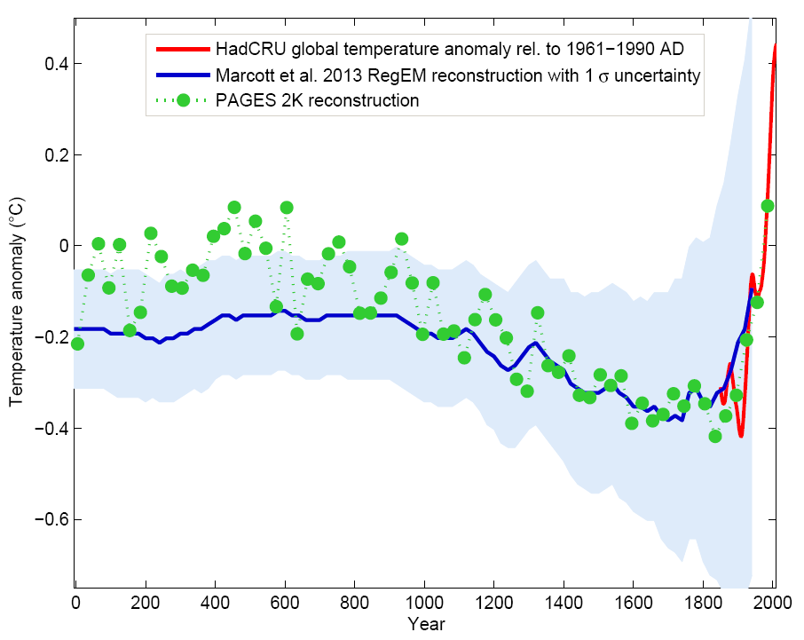
Figure 3 The last two thousand years from Figure 1, in comparison to the PAGES 2k reconstruction (green), which was recently described here in detail. Graph: Klaus Bitterman.
As we can see, both reconstruction methods give consistent results. That the evolution of the last one thousand years is virtually identical is, by the way, yet another confirmation of the “hockey stick” by Mann et al. 1999, which is practically identical as well (see graph in my PAGES article).
Conclusion
The curve (or better curves) of Marcott et al. will not be the last word on the global temperature history during the Holocene; like Mann et al. in 1998 it is the opening of the scientific discussion. There will certainly be alternative proposals, and here and there some corrections and improvements. However, I believe that (as was the case with Mann et al. for the last millennium) the basic shape will turn out to be robust: a relatively smooth curve with slow cooling trend lasting millennia from the Holocene optimum to the “little ice age”, mainly driven by the orbital cycles. At the end this cooling trend is abruptly reversed by the modern anthropogenic warming.
The following graph shows the Marcott reconstruction complemented by some context: the warming at the end of the last Ice Age (which 20,000 years ago reached its peak) and a medium projection for the expected warming in the 21st Century if humanity does not quickly reduce greenhouse gas emissions.

Figure 4 Global temperature variation since the last ice age 20,000 years ago, extended until 2100 for a medium emissions scenario with about 3 degrees of global warming. Graph: Jos Hagelaars.
Marcott et al. dryly state about this future prospect: "By 2100, global average temperatures will probably be 5 to 12 standard deviations above the Holocene temperature mean."
In other words: We are catapulting ourselves way out of the Holocene.
Just looking at the known drivers (climate forcings) and the actual temperature history shows it directly, without need for a climate model: without the increase in greenhouse gases caused by humans, the slow cooling trend would have continued. Thus virtually the entire warming of the 20th Century is due to man. This May, for the first time in at least a million years, the concentration of carbon dioxide in our atmosphere has exceeded the threshold of 400 ppm. If we do not stop this trend very soon, we will not recognize our Earth by the end of this century.