ScienceRocks
Democrat all the way!
- Banned
- #1

Here is the graph for oceanic heat...Appears to be not moving upwards...

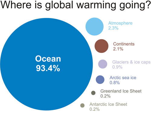
In this says that 93 percent of the heat of the imbalance goes into the ocean.
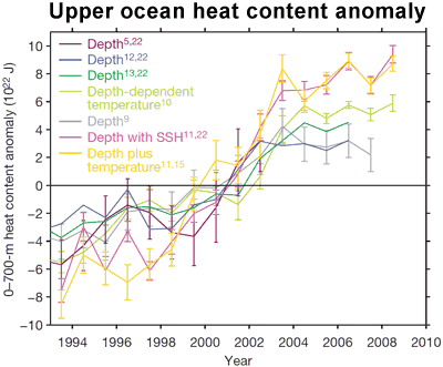
This does show some warming, but not even 1/5th as much as pre 2003. So should we take the pre-2003 data with a grain of fucking sand or not? It was wrong. So lets assume that the warming in this graph is true and that is how it has been the whole time and the pre-2003 was wrong. must take a shit load of energy to heat the ocean.
So the second graph is the one that matters and pre-2003 should be thrown in the trash. That is my opinion.
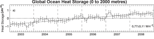
Another graph that supports warming, but how good is it?
The question that needs to be asked is this the warming that 93 percent of the energy that the imbalanced is causing by the co2 should be causing within the oceans?
Last edited:
