
SSDD
Gold Member
- Nov 6, 2012
- 16,672
- 1,965
- 280
There is a new bit of climate propaganda making the rounds these days. The alarmists just keep dumbing it down and making it prettier in order to gather in more weak minds. It is called a stripe graph, and proposed to illustrate man made warming in such a simple way that practically anyone can see how terrible it is. The stripe graph making the rounds looks like this:
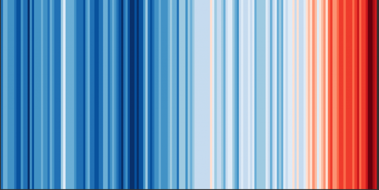
Pretty terrible huh? Any dope should be able to see that this graph is "proof" of mankind effect on the climate... And there are plenty of dopes out there who can see exactly that. The useful idiots who can see that this graph is proof of AGW look like this:

And this:

And this:

But like all climate propaganda...it isn't what it seems. It is smoke and mirrors designed explicitly to trick those poor souls who can't think for themselves...In typical alarmist fashion, the line graph, like all other alarmist graphs aimed at adding to the herd of useful idiots only shows a narrow view of a much larger picture. It starts at a very cold period in time and follows a natural warming trend and offers no explanation of what is is actually showing....they do provide plenty of suggestion of what it shows, and then leave it to the poor dupes to draw what they assume to be a rational conclusion....and that conclusion being...it is time to panic....wave your arms hysterically, and run in circles crying that the end is near.
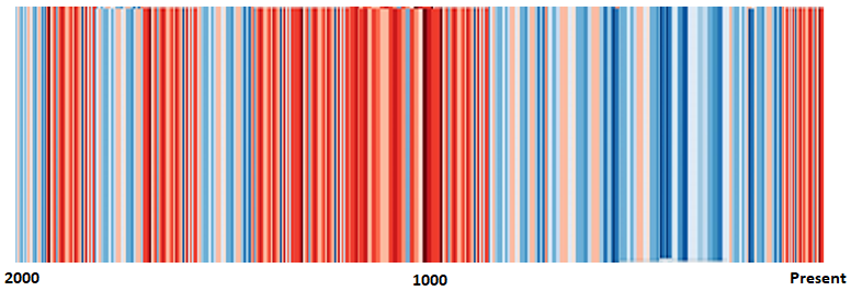
As usual, however, the truth of the matter presents an entirely different picture and brings the stupidity of the duped into sharp relief. Here is what a stripe graph looks like that has no hidden agenda and merely imparts information:
So lets review:
Alarmist propaganda aimed at weak minds:
A stripe graph that simply imparts information with no hidden agenda:
DON'T BE A DUPE
Pretty terrible huh? Any dope should be able to see that this graph is "proof" of mankind effect on the climate... And there are plenty of dopes out there who can see exactly that. The useful idiots who can see that this graph is proof of AGW look like this:
And this:
And this:
But like all climate propaganda...it isn't what it seems. It is smoke and mirrors designed explicitly to trick those poor souls who can't think for themselves...In typical alarmist fashion, the line graph, like all other alarmist graphs aimed at adding to the herd of useful idiots only shows a narrow view of a much larger picture. It starts at a very cold period in time and follows a natural warming trend and offers no explanation of what is is actually showing....they do provide plenty of suggestion of what it shows, and then leave it to the poor dupes to draw what they assume to be a rational conclusion....and that conclusion being...it is time to panic....wave your arms hysterically, and run in circles crying that the end is near.
As usual, however, the truth of the matter presents an entirely different picture and brings the stupidity of the duped into sharp relief. Here is what a stripe graph looks like that has no hidden agenda and merely imparts information:
So lets review:
Alarmist propaganda aimed at weak minds:
A stripe graph that simply imparts information with no hidden agenda:
DON'T BE A DUPE