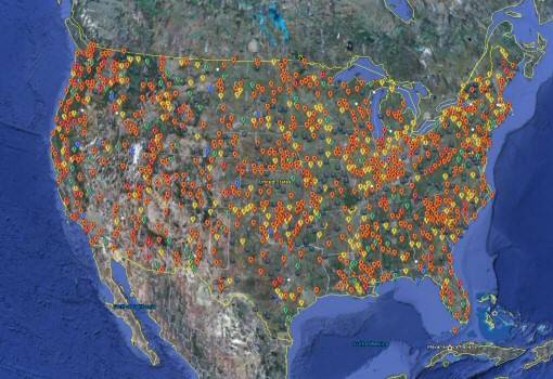
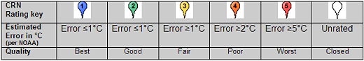
You don't seem to realize just how bad that data is. Half the planet's land mass has no data at all. Even in the US, the best system on the planet, according to NOAA they have 1218 pristine sites. Sites that are free enough of siting issues to be trusted. I did some quick calculations in the area that I live and realized that the area is so large that I can regularly see 5 even 8 degrees C range of temps in that area. So where in my area is the official site? It stinks. Then you have the issue of historical data and how thorough that might have been, or not.I do listen to NOAA. They cannot, will not answer. I do not listen to propaganda. which is why I demand data. NOAA, the IPCC will not provide it. They provide 'homogenized", 'extrapolated" data
The raw data is on online. Go get it. It's not easy to download, being how many gigabytes it all is, but you can find it if you look.
So why did you peddle a fake story about NOAA not providing data? Oh, that's right. You only know what your cult told you, and you cult told you NOAA was hiding data.
I'll ask again, explain to me how the average temperature of the planet Earth is derived.
The short answer -- by averaging data from things called "thermometers". Really high tech stuff here.
The long answer, you can start here.
Data.GISS: GISS Surface Temperature Analysis (GISTEMP v4)
I'm waiting, been waiting for years. No answer, nothing.No one even tries, ever. Not even an attempt, ever. Not once, ever. No one even tries, explain this to me.
You could have just looked it up yourself, you know. Do we have to spoonfeed everything to you?
Remember, when the whole world says you're wrong, it's almost certain that you're wrong. You are not a special snowflake who can see what the rest of the world fails to see. If you're declaring the whole world is part of a conspiracy against you, that paints you as a paranoid conspiracy cultist.
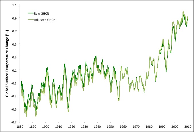
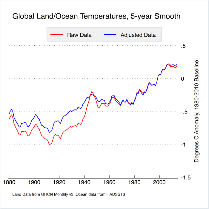
The fact is these people are making claims of certainty that they can't begin to back up. And as others have noted the changing of historical data on a regular basis is just plain beyond the pale. The whole thing just stinks.