
courseofhistory
Rookie
- Aug 7, 2012
- 1,230
- 179
- 0
- Banned
- #1
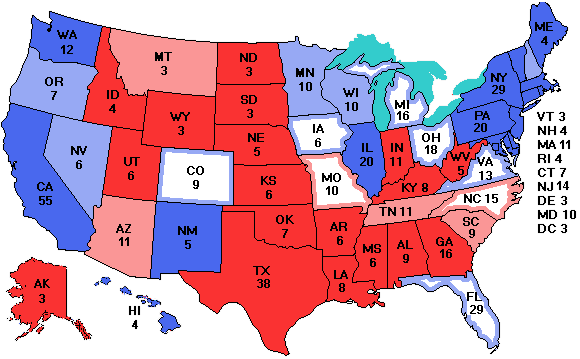
Obama 332 Romney 206
.Map Algorithm Explained
Here is the algorithm for combining polls to make the map.
1. The most recent poll in every state is always used.
2. If no other polls were taken within a week of the most recent one, only the most recent poll counts.
3. If one or more other polls were taken within a week of the most recent, all of them are averaged, weighted equally.
This algorithm smoothes out fluctations better and produces fewer wild swings and gives a better overall result. You can see which polls were used by putting the mouse on a state. The Source field tells which polls are used and gives the final date of the final poll used. If multiple polls were used, the first nine characters of each pollster are listed and the pollsters are separated by a "+" sign.
The EVP average page uses these scores.
A consequence of this algorithm is that in the "News from the Votemaster" section, a new poll may be reported but the map gives a different result. This effect is always due to multiple recent polls being averaged. You will see that this is the case by looking for the "+" sign used to separate multiple pollsters in the Source field of the pop-up box. Another consequence of this algorithm, is that this site may give slightly different results from other polling sites, each of which uses its own algorithm, sometimes a far more complex one.
Why a look-back window of 1 week? It is admittedly arbitrary. If the window is too short, the results gyrate wildly as different polls use different methodologies . If the window is too long, genuine shifts in public opinion take too long to show up. The choice of 1 week is based on my now-extensive experience with examining polling data. Public reaction to news events often takes several days to take effect as people often change their opinions after talking to friends, coworkers, and relatives.
It is worth emphasizing that the margin of error in most state polls is at least 3% for each candidate. Thus if a poll says Smith is beating Jones 52% to 48%, Smith might be as low as 49% and Jones might be as high as 51%. When the difference between two candidates is less than 2x the margin of error, the race is a statistical tie. On the map, the states with a white center are those where the candidates differ by less than 5% and are certainly statistical ties. Even some of the ones in the solid light color may technically be statistical ties, but a lead of 5% or more most likely means the candidate is actually ahead
LINK
Last edited: