Spoonman
Gold Member
- Jul 15, 2010
- 18,163
- 7,661
- 330
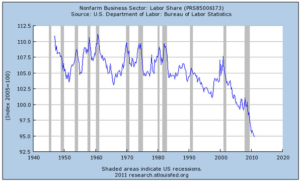
Over the last decade, the share of U.S. national income taken home by workers has plummeted to a record low.
Check out the chart below, compiled by the Labor Department, and posted this week by conservative writer David Frum. It shows that the decline began with the brief recession that followed 9/11 in 2001. But it continued even as the economy picked up again, and got even worse once the Great Recession hit. In the weak recovery since then, workers' share of income just kept on falling.
Workers’ share of national income plummets to record low - Yahoo! News
Best line -
Still, there's little sense that either Obama administration or Congress plan to do much about this growing inequality. Indeed, any serious action to boost the economy and cut unemployment now seems to be off the table.