Steve Hanson
Active Member
- Aug 25, 2010
- 806
- 670
- 28
Expect it to get a lot worse:

Graph is from where?
Maybe the CBO like it says right on the graph

Follow along with the video below to see how to install our site as a web app on your home screen.

Note: This feature currently requires accessing the site using the built-in Safari browser.
Expect it to get a lot worse:
Graph is from where?
This reminds me of how the Warmers point to some weather event on the planet and say "See that! Global Warming!!" Whats the point of the chart? See that! We can have Mo' n Bigga Deficits! So we need a deficit bigger than $1.6 Trillion? What $2 Trillion? $3 Trillion?
Really? Really? That's what you get from this chart?
Gee, maybe I shouldn't scoff at rdean's 6% thing.
What's you point, that we can sustain more spending and bigger deficits because we're a few tick below some meaningless statistic?
Really? Really? That's what you get from this chart?
Gee, maybe I shouldn't scoff at rdean's 6% thing.
What's you point, that we can sustain more spending and bigger deficits because we're a few tick below some meaningless statistic?
No.
But way to extrapolate. Do you do the same thing in the warmer threads too?
You must have had something in mind when you posted it and that was the only thing I could think of.

Humm..we have a 1.5 TRILLION dollar budget DEFICIT any way you slice it it is by FAR the largest in history so what's your point? we're broke thats the point the rest is bull
Well gosh, that tells me receipts must be too low. And there it was right in front of our eyes all along!...
Well gosh, that tells me receipts must be too low. And there it was right in front of our eyes all along!...
Federal receipts to GDP are at their lowest level since ~1950.
I'd find a graph for that too, but I'm too lazy.
I find it interesting that is mostly dipped during Clinton, mostly went up during Bush and is starting to dip again under Obama...Stats don't lie.
I find it interesting that is mostly dipped during Clinton, mostly went up during Bush and is starting to dip again under Obama...Stats don't lie.
No - It went up under Democrat congress & Obama. Since the Republicans took the House the spending to GDP ratio has turned down....Stats don't lie.
Taxes under Eisenhower were above 90% for the richest Americans. Thanks for pointing that out.
This economy is what happens when you throw money at rich people.
Expect it to get a lot worse:
Graph is from where?
Maybe the CBO like it says right on the graph

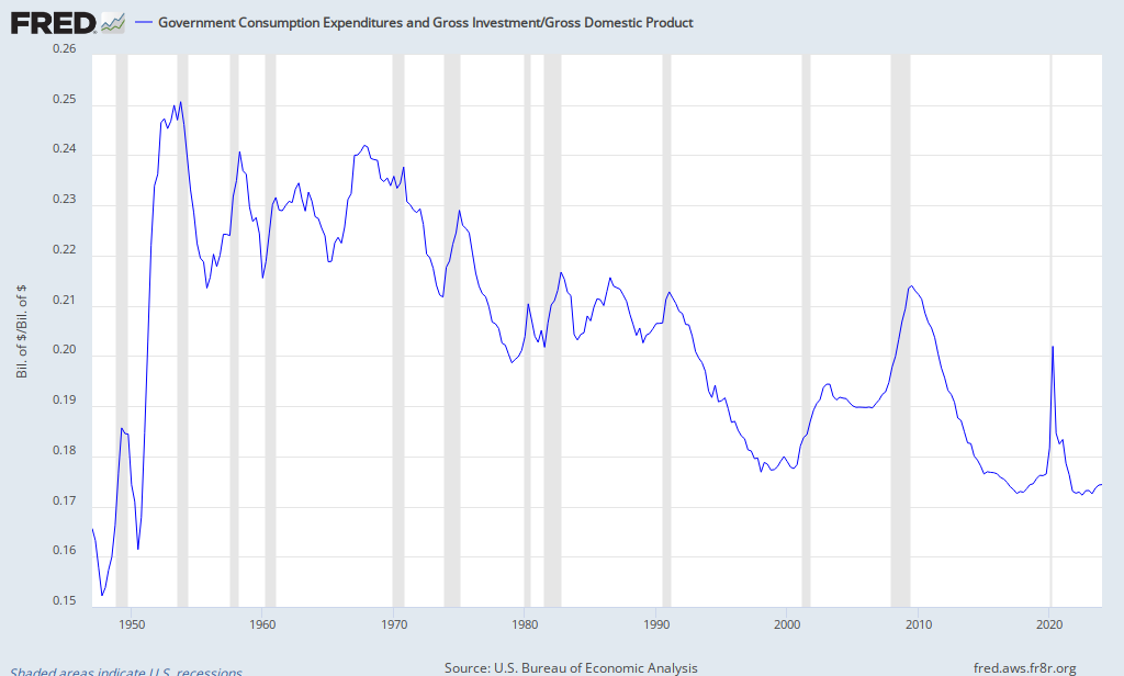
...its telling us spending to gdp in % is lower than the historical average...
The value of services produced by government, measured as the purchases made by government on inputs of labor, intermediate goods and services, and investment expenditures. It is the sum of government consumption expenditures and government gross investment.
...its telling us spending to gdp in % is lower than the historical average...
No it isn't, that's a plot of the GCE not spending. The BEA Economic Analysis Glossary says the GCE is
The value of services produced by government, measured as the purchases made by government on inputs of labor, intermediate goods and services, and investment expenditures. It is the sum of government consumption expenditures and government gross investment.
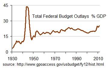
Total outlays budgeted by the federal government also includes everything like debt interest, transfer payments, and it looks like this:
Federal spending is the hightest it's been in over 60 years, up to where it was during WWII. It was at 30 year lows under the previous administration.
Well gosh, that tells me receipts must be too low. And there it was right in front of our eyes all along!...
Federal receipts to GDP are at their lowest level since ~1950.
I'd find a graph for that too, but I'm too lazy.
Naturally. Lowest rates in post-war history; Particularly on top earners. Meanwhile, top earners are making the most disproportionately high earnings compared to their lower wage counterparts EVER... and yet, we have a deficit? How?
...its telling us spending to gdp in % is lower than the historical average...
No it isn't, that's a plot of the GCE not spending. The BEA Economic Analysis Glossary says the GCE is
The value of services produced by government, measured as the purchases made by government on inputs of labor, intermediate goods and services, and investment expenditures. It is the sum of government consumption expenditures and government gross investment.
Total outlays budgeted by the federal government also includes everything like debt interest, transfer payments, and it looks like this:
Federal spending is the hightest it's been in over 60 years, up to where it was during WWII. It was at 30 year lows under the previous administration.