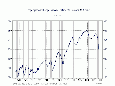
The chart is totally bogus. If one were to use the unemployment counting means of the 1930's the unemployment fall off in 2008-9 has been far greater than 1929. Consider that unemployment now is between 10 and 20 percent. That does not show in the chart. Even the government with all of its lies admits that it is 9.7% NOT THE FIVE PERCENT DEPICTED.
The chart isn't saying unemployment is five percent. It's say employment has declined by five percent from peak.
You realize he's going to ignore you, just like he does anytime anyone points out his misunderstanding/misinterpretation, don't you? If he does respond, it'll be a rant on some other tangent, requiring more explanation. He's still spouting lies I've already corrected him on (with links and evidence).