edthecynic
Censored for Cynicism
- Oct 20, 2008
- 43,044
- 6,883
- 1,830
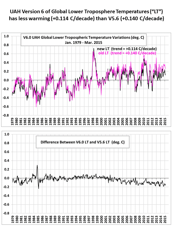
Climate at a Glance | National Centers for Environmental Information (NCEI)In other words, you fudge the data. Satellites do not measure surface temperature, in fact, they do not measure temperature at all..How exactly can you have a "pause" when fourteen of the fifteen hottest years have all been in this century?Cold is right especially in light of the 2 decade pause.
A slow down, yes, but a pause, no.
Easy question. You draw a linear estimation line through the last 15 years of satellite data and it's slope will show close to ZERO warming rate. You set "relative highs" from the top of ANY shape curve. The number of records set by 0.02 or 0.04degC -- don't influence the linear fit..
Year Anomaly Rank
2000 0.42°C 1
2001 0.54°C 2
2008 0.54°C 2
2004 0.57°C 4
2011 0.57°C 4
2002 0.59°C 6
2007 0.61°C 7
2003 0.61°C 9
2006 0.61°C 9
2012 0.62°C 10
2009 0.63°C 11
2005 0.66°C 13
2013 0.66°C 13
2010 0.70°C 14
2014 0.74°C 15
Now there is some Ultra and Fudgey Denial for ya -- right there. A regular Luddite festival of anti-technology and science. SHOOT the satellites down -- spawns of Satan..
Where'd ya get that sketchy data??