Lying with Graphs....

Billy_Bob

Diamond Member
Sep 4, 2014
30,837
20,598
1,945
Top Of The Great Divide
Now this is how the University of Main and others create the graphs that our resident alarmists like to tout here... Its all Fakery all the time... And our so called scientists at NASA and GISS do the dirty deed daily to force the left wing agenda..

Anyone with one functioning brain cell can see the deception when its shown to them... Anthony Watts shows the deception by those who are supposed to be above reproach.. This is why you check everything and trust nothing...

How to lie with maps and smoothing – NASA GISS in Antarctica
 
This sums up the deceptions...
By using a baseline that puts almost all of 2018 natural variability above the zero, you get an entire globe that is “warmer” and orange/red. It’s actually surprising that any of the map on the right is blue. This is the deception of comparing historical data (especially data that compares data 40 years apart) without taking into consideration any natural trend. The result is a graphic that implies man made CO2 is overheating the planet.
 
The illustration shows how one single data point is used where multiples were used just 40 years ago.. The loss of reporting stations has allowed the alarmist to make up data to cover large areas that do not reflect the actual temperatures.


GISS-Antarctica.png


Unless you asked questions and verified the data along with how they are using it you would never know of the deception.

Then to further the slight of hand, they used data containing the cooling of the 70's to create an artificially low zeroing for the creation of the anomaly graph.. This base line along with artificially high anomaly's create the big red graph and lie/deception.. If you were to use a basic temperature graph all of the red disappears..
 
Last edited:
This being an openly political issue now since any pretense at real science has been completely debunked, don't expect the believers to question anything...sheep don't ask questions.
 
Yep...alarmists are brilliant at creating perceptions using fakery with graphs. The vivid colors, the crunched axis stuff, lack of detail in margins.....

Fortunately, people who vote have educated themselves and are now aware of the graphs being rigged to create a false perception. Its waaaaay to obvious the creators are hyping an agenda.

Alarmists gonna need a Plan B because in 2018 their graphs are impressing nobody.:cul2::eusa_dance::eusa_dance:
 
Warmists love GISS Temp crap since it is by far the WORSE of the dataset and the warmest too, even with the KNOWN changes in their data sets made over the years and the large blank areas of the world that is free of temperature data, they just infill it with lies.
 
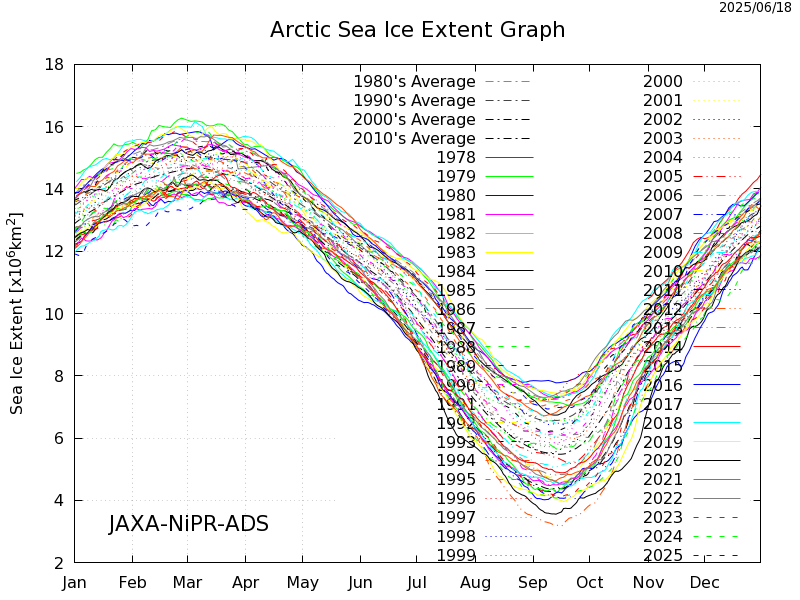
And one more deceptive way graphs are being used...

Got to credit Old Crock for this one... He uses day to day graphing without the long term context trend in an effort to create fear that man is causing something catastrophic. Old Cock uses selective graphing out of context and without proof of causation.

When you actually post up context the fear mongering about arctic sea ice is dispelled..
SIE_seasonal_all_n.png


Everything we have seen is in line with observed natural variation. No emergency here.. And if we go further in long term trends we see the Arctic has been ice free 4-5 times in our current Holocene.
Holecene 2.JPG
 
It appears that warmists are not excited about posting their replies here, gee I wonder why...…
 

Forum List

Back
Top