Koch Brothers funded Climate Research. What they found? Oooh, that's gotta hurt.

Two-thirds showed warming trends, with warm regions more than offsetting cool regions in developing a global average.

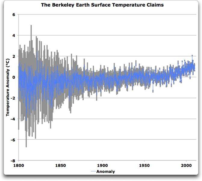
Money for the new study, dubbed the Berkeley Earth Surface Temperature project, came from five foundations, including one established by Microsoft founder Bill Gates and another from the Charles Koch Charitable Foundation, widely seen as a source of money for conservative organizations and initiatives that have fought efforts to curb greenhouse-gas emissions.

Study rebuffs skeptics: global warming is real - US news - Christian Science Monitor - msnbc.com

Right wingers will say, "But you can't prove that adding billions and billions of tons of CO2 to the air every year causes it". Well, ask them if it helps?

These people say, "Clean air and water costs jobs". If those jobs cause our children to have cancer, how much are they worth? Right wingers hate abortion but are willing to give their children cancer and birth defects? I don't get the logic. Do these people ever think farther ahead than the next 10 minutes?

You are the poster child I swear for "useful idiot"

:lol:

I'm a major conservationist and if I ever thought the world was in peril over carbon emmissions I'd be leading the charge.

It's BULLSHIT.

Do you know who came up with carbon credits?

hehehehe When Ken comes up with carbon credits I for one started to sweat it.
 
the BEST study is a wonderful step forward in the right direction of openness. the data is now available and the methodology open to inspection. I cant see how all four of the papers will go through peer review without some changes being made though. especially the UHI paper which claims a negative impact on temperature, which seems at odds to reality.

The BEST papers will be reviewd and the finding and data of the climate scientists will be confirmed. And then you will disavow the results.

well, that depends Old Rocks. my concerns about temperature measurement are mostly based on the adjustments that have been made to them. BEST originally stated that they were going to post the raw data and then make a second data set with their own version of corrections added.

hansen-giss-1940-1980-sml.gif


can you see how GISS has twisted the shape of the graph upwards to show more warming? which set of corrections was the closest to the truth? I would like someone to be able to explain why they have to go back into historical data and change the figures over and over again. I would like to see what trend raw data gives and then start adding the various types of adjustments one-by-one so I can see why the trend has changed so much in the historical part of the graph. if there are reasonable explanations for the adjustments, and the various adjustments explain why the 20'-80's were changed in relationship to each other then I will have no choice but to accept it.
 
It is always curious to me where the warming deniers spend their time? Are they all locked in basements and have never experienced the changes in weather these past ??? years? I ride / commute by bicycle and being out in the weather for many, many years have noticed the changing weather.

At what period in earth's history has the weather not been changing? No one argues that the climate doesn't change; the argument is over whether or not man is responsible and to date, no evidence exists that proves that he is.

Why argue, there's nothing wrong with cleaning up the air. Car smog has improved with little additional costs.

Really? Interesting what you call "little". Personally, I would call 41,600 to 124,800 additional deaths attributable to regulations requiring an increase in the gas mileage of cars quite expensive. What value, exactly would you place on 41,600 - 124,800 lives and the increased suffering of 352,000 and 624,000 who managed to survive accidents in these cars made unsafe by mileage regulations but received serious or crippling injuries beyond what would be expected in a heavier car? In the past 30 years, fuel standards have become a major cause of death and suffering here in the US. And you call that "little additional cost"?
 
Last edited:
by happy coincidence this article just popped up at WUWT

Unadjusted data of long period stations in GISS show a virtually flat century scale trend | Watts Up With That?

Abstract
The GISS dataset includes more than 600 stations within the U.S. that have been
in operation continuously throughout the 20th century. This brief report looks at
the average temperatures reported by those stations. The unadjusted data of both
rural and non-rural stations show a virtually flat trend across the century.

The Goddard Institute for Space Studies provides a surface temperature data set that
covers the entire globe, but for long periods of time contains mostly U.S. stations. For
each station, monthly temperature averages are tabulated, in both raw and adjusted
versions.

One problem with the calculation of long term averages from such data is the occurrence of discontinuities; most station records contain one or more gaps of one or more months. Such gaps could be due to anything from the clerk in charge being a quarter drunkard to instrument failure and replacement or relocation. At least in some examples, such discontinuities have given rise to “adjustments” that introduced spurious trends into the time series where none existed before.

palmer_figure3.png


before someone gets their panties in a knot, these are US data not global. simply because that is where the data is, as explained in the article.

while this is not exactly the type of thing I want to see it certainly brings up a lot of interesting questions about adjustments.
 
a year ago, and again after Muller's congressional statement, I said both sides would be disappointed with the BEST results. I predicted a small decrease in trend (wrong) and a large increase in uncertainty (?wrong?).

here is a plot of BEST monthly data and 95% CI. thanks to Willis

best-monthly-plus-errors.jpg


I must admit that this was the type of graph that I was expecting rather than smoothed and re-smoothed narrow lines that give a totally different picture of what is going on. I am not sure how they got from the monthly unsmoothed data with considerable uncertainty to smoothed 10 year average data with very little uncertainty but I am not a statistician.

Updated_Comparison_10.jpg


lies, damned lies, and statistics. its funny how climate science is so prone to influenceing public opinion simply by the way they present the evidence.
Now, of course, scientists always publish the methodology for their averaging just like they always publish the methodology for any corrections they make to their graphs over the years. Deniers simply ignore these publications to imply that scientists are as dishonest as deniers.

The Berkley Project published a complete and detailed explanation of the methods they used for their 10 year averaging. True to form, it is much easier for deniers to simply ignore it and imply dishonesty when the results do not support their preconceived bias!

Berkeley Earth Temperature Averaging Processhttp://berkeleyearth.org/Resources/Berkeley_Earth_Averaging_Process
 
Last edited:
after thinking some more I realize it is not a fair comparison to mix monthly data with yearly data. and daily data would be even more of a spread both in variation and uncertainty.

that said- is it reasonable to add up the daily high and the low temps, divide by 2 and call it the average? perhaps we should be calculating the high and the low separately because we have pretty much always used binary thermometers. it might just show some interesting effects. this would be for land only, ocean temps dont have the same variation as land temps and they are measured differently as well.
 
It is always curious to me where the warming deniers spend their time? Are they all locked in basements and have never experienced the changes in weather these past ??? years? I ride / commute by bicycle and being out in the weather for many, many years have noticed the changing weather.

At what period in earth's history has the weather not been changing? No one argues that the climate doesn't change; the argument is over whether or not man is responsible and to date, no evidence exists that proves that he is.

Why argue, there's nothing wrong with cleaning up the air. Car smog has improved with little additional costs.

Really? Interesting what you call "little". Personally, I would call 41,600 to 124,800 additional deaths attributable to regulations requiring an increase in the gas mileage of cars quite expensive. What value, exactly would you place on 41,600 - 124,800 lives and the increased suffering of 352,000 and 624,000 who managed to survive accidents in these cars made unsafe by mileage regulations but received serious or crippling injuries beyond what would be expected in a heavier car? In the past 30 years, fuel standards have become a major cause of death and suffering here in the US. And you call that "little additional cost"?

Really? And what credible institution did you get those numbers from, Bent? How about a link to that credible institution? Or are you ashamed to show the billshit site you are quoting? Or did you just pull those numbers out of your ass, as you have done so many times in the past.
 
a year ago, and again after Muller's congressional statement, I said both sides would be disappointed with the BEST results. I predicted a small decrease in trend (wrong) and a large increase in uncertainty (?wrong?).

here is a plot of BEST monthly data and 95% CI. thanks to Willis

best-monthly-plus-errors.jpg


I must admit that this was the type of graph that I was expecting rather than smoothed and re-smoothed narrow lines that give a totally different picture of what is going on. I am not sure how they got from the monthly unsmoothed data with considerable uncertainty to smoothed 10 year average data with very little uncertainty but I am not a statistician.

Updated_Comparison_10.jpg


lies, damned lies, and statistics. its funny how climate science is so prone to influenceing public opinion simply by the way they present the evidence.

NOAA, NASA, Hadcru, and Berkeley, all liars now. Include all the Scientific Societies, all the National Academies of Science, and all the major Universities.

Hmmm.......... Says more about the poster than the institutions.
 
It seems that the less "adjusted" the data is, the less there is to worry about in terms of dramatic climate change. Interesting.

If the case is only supported by data that strays from actual, what may we believe about the case?
 
a year ago, and again after Muller's congressional statement, I said both sides would be disappointed with the BEST results. I predicted a small decrease in trend (wrong) and a large increase in uncertainty (?wrong?).

here is a plot of BEST monthly data and 95% CI. thanks to Willis

best-monthly-plus-errors.jpg


I must admit that this was the type of graph that I was expecting rather than smoothed and re-smoothed narrow lines that give a totally different picture of what is going on. I am not sure how they got from the monthly unsmoothed data with considerable uncertainty to smoothed 10 year average data with very little uncertainty but I am not a statistician.

Updated_Comparison_10.jpg


lies, damned lies, and statistics. its funny how climate science is so prone to influenceing public opinion simply by the way they present the evidence.
Your first chart does not come from Berkley, and does not seem to match the Berkley data. I notice you didn't give the link to your source, probably because it is the dishonest Anthony Watts site.

What the BEST data actually says | Watts Up With That?

Here is the Berkley website with the data at the bottom on the page that was supposedly used;

Berkeley Earth Surface Temperature (© 2011)

Click to download analysis chart data.

Here are a couple of charts and pull quotes from the Anthony Watts site about the BEST data.

uah-and-rss.jpg

Figure 2. UAH and RSS satellite temperature records. Anomaly period 1979-1984 = 0.

Remember what we would expect to find if all of the ground records were correct. They’d all lie on or near the same line, and the satellite temperatures would be rising faster than the ground temperatures. Here are the actual results, showing BEST, satellite, GISS, CRUTEM, and GHCN land temperatures:
best-satellite-and-other-land-temperature.jpg

Figure 3. BEST, average satellite, and other estimates of the global land temperature over the satellite era. Anomaly period 1979-1984 = 0.


Notice how two different anomaly periods are used, one of which is only 5 years!!!!! No honest person would ever use an anomaly period of less than 20 years.

Here is another bit of dishonesty from the Watts site;

Oh, yeah, one more thing. At the top of the BEST dataset there’s a note that says:
Estimated 1950-1980 absolute temperature: 7.11 +/- 0.50
Seven degrees C? The GISS folks don’t even give an average, they just say it’s globally about 14°C.
The HadCRUT data gives a global temperature about the same, 13.9°C, using a gridded absolute temperature dataset. Finally, the Kiehl/Trenberth global budget gives a black-body radiation value of 390 W/m2, which converts to 14.8°. So I figured that was kind of settled, that the earth’s average temperature (an elusive concept to be sure) was around fourteen or fifteen degrees C.
Now, without a single word of comment that I can find, BEST says it’s only 7.1 degrees … say what? Anyone have an explanation for that?


The explanation is obvious to honest people, the Watts site is comparing two different temperature periods. The HadCRUT average temp, for example, is from the period 1961 to 1999, a 40 year average, but the BEST average is from 1950 to 1980, a shorter and earlier temp period. Only someone intent on deception would ever compare the two!!! HadCRUT starts 10 years warmer and extends 20 years warmer than the BEST average ... say Watts? Anyone have an explanation for that?
 
Last edited:
a year ago, and again after Muller's congressional statement, I said both sides would be disappointed with the BEST results. I predicted a small decrease in trend (wrong) and a large increase in uncertainty (?wrong?).

here is a plot of BEST monthly data and 95% CI. thanks to Willis

best-monthly-plus-errors.jpg


I must admit that this was the type of graph that I was expecting rather than smoothed and re-smoothed narrow lines that give a totally different picture of what is going on. I am not sure how they got from the monthly unsmoothed data with considerable uncertainty to smoothed 10 year average data with very little uncertainty but I am not a statistician.

Updated_Comparison_10.jpg


lies, damned lies, and statistics. its funny how climate science is so prone to influenceing public opinion simply by the way they present the evidence.
Now, of course, scientists always publish the methodology for their averaging just like they always publish the methodology for any corrections they make to their graphs over the years. Deniers simply ignore these publications to imply that scientists are as dishonest as deniers.

The Berkley Project published a complete and detailed explanation of the methods they used for their 10 year averaging. True to form, it is much easier for deniers to simply ignore it and imply dishonesty when the results do not support their preconceived bias!

Berkeley Earth Temperature Averaging Processhttp://berkeleyearth.org/Resources/Berkeley_Earth_Averaging_Process

The Berkley project is a science front for a PR firm... Thats already been proven..
 
a year ago, and again after Muller's congressional statement, I said both sides would be disappointed with the BEST results. I predicted a small decrease in trend (wrong) and a large increase in uncertainty (?wrong?).

here is a plot of BEST monthly data and 95% CI. thanks to Willis

best-monthly-plus-errors.jpg


I must admit that this was the type of graph that I was expecting rather than smoothed and re-smoothed narrow lines that give a totally different picture of what is going on. I am not sure how they got from the monthly unsmoothed data with considerable uncertainty to smoothed 10 year average data with very little uncertainty but I am not a statistician.

Updated_Comparison_10.jpg


lies, damned lies, and statistics. its funny how climate science is so prone to influenceing public opinion simply by the way they present the evidence.
Now, of course, scientists always publish the methodology for their averaging just like they always publish the methodology for any corrections they make to their graphs over the years. Deniers simply ignore these publications to imply that scientists are as dishonest as deniers.

The Berkley Project published a complete and detailed explanation of the methods they used for their 10 year averaging. True to form, it is much easier for deniers to simply ignore it and imply dishonesty when the results do not support their preconceived bias!

Berkeley Earth Temperature Averaging Process

The Berkley project is a science front for a PR firm... Thats already been proven..
Don't you just love how CON$ call their pontifications "proof." :cuckoo:
The only thing that has been "proven" is your stupidity.

No the head scientist at that project and most of the staff with him are on the board of an ECO-PR firm... I already showed this earlier.. The entire study is a concocted bit of pseudo-science...

You care to try and deny hes not the head of a Eco consulting firm??? Come on please deny it.... I dare you...:lol:
 
a year ago, and again after Muller's congressional statement, I said both sides would be disappointed with the BEST results. I predicted a small decrease in trend (wrong) and a large increase in uncertainty (?wrong?).

here is a plot of BEST monthly data and 95% CI. thanks to Willis

best-monthly-plus-errors.jpg


I must admit that this was the type of graph that I was expecting rather than smoothed and re-smoothed narrow lines that give a totally different picture of what is going on. I am not sure how they got from the monthly unsmoothed data with considerable uncertainty to smoothed 10 year average data with very little uncertainty but I am not a statistician.

Updated_Comparison_10.jpg


lies, damned lies, and statistics. its funny how climate science is so prone to influenceing public opinion simply by the way they present the evidence.
Your first chart does not come from Berkley, and does not seem to match the Berkley data. I notice you didn't give the link to your source, probably because it is the dishonest Anthony Watts site.

What the BEST data actually says | Watts Up With That?

Here is the Berkley website with the data at the bottom on the page that was supposedly used;

Berkeley Earth Surface Temperature (© 2011)

Click to download analysis chart data.

Here are a couple of charts and pull quotes from the Anthony Watts site about the BEST data.

uah-and-rss.jpg

Figure 2. UAH and RSS satellite temperature records. Anomaly period 1979-1984 = 0.

Remember what we would expect to find if all of the ground records were correct. They’d all lie on or near the same line, and the satellite temperatures would be rising faster than the ground temperatures. Here are the actual results, showing BEST, satellite, GISS, CRUTEM, and GHCN land temperatures:
best-satellite-and-other-land-temperature.jpg

Figure 3. BEST, average satellite, and other estimates of the global land temperature over the satellite era. Anomaly period 1979-1984 = 0.


Notice how two different anomaly periods are used, one of which is only 5 years!!!!! No honest person would ever use an anomaly period of less than 20 years.

Here is another bit of dishonesty from the Watts site;

Oh, yeah, one more thing. At the top of the BEST dataset there’s a note that says:
Estimated 1950-1980 absolute temperature: 7.11 +/- 0.50
Seven degrees C? The GISS folks don’t even give an average, they just say it’s globally about 14°C.
The HadCRUT data gives a global temperature about the same, 13.9°C, using a gridded absolute temperature dataset. Finally, the Kiehl/Trenberth global budget gives a black-body radiation value of 390 W/m2, which converts to 14.8°. So I figured that was kind of settled, that the earth’s average temperature (an elusive concept to be sure) was around fourteen or fifteen degrees C.
Now, without a single word of comment that I can find, BEST says it’s only 7.1 degrees … say what? Anyone have an explanation for that?


The explanation is obvious to honest people, the Watts site is comparing two different temperature periods. The HadCRUT average temp, for example, is from the period 1961 to 1999, a 40 year average, but the BEST average is from 1950 to 1980, a shorter and earlier temp period. Only someone intent on deception would ever compare the two!!! HadCRUT starts 10 years warmer and extends 20 years warmer than the BEST average ... say Watts? Anyone have an explanation for that?

first off, this article is not written by Anthony Watts it is written by Willis Eschenbach.

second point- the graph with land based temps compared to satellite temps has an anomaly period of 1979-84 for a specific reason, to start all the data lines at the same value so that we can see how they vary versus each other with respect to time. the other chart with both satellite records is only there to show that the results would be the same with either set of satellite records.

dont you ever try to figure out what is being shown to you?

your issue with BEST declaring a specific and overly precise figure for global temperature needs you to be more specific. are you arguing that you would prefer that they add an offset to their particular version of calculating 'global temperature' to match other people's calculated values by their own versions of defining 'global temperature'? obviously average global temperature is only a made up term that is calculated by some sort of definition chosen by the group doing the calculations.
 
Now, of course, scientists always publish the methodology for their averaging just like they always publish the methodology for any corrections they make to their graphs over the years. Deniers simply ignore these publications to imply that scientists are as dishonest as deniers.

The Berkley Project published a complete and detailed explanation of the methods they used for their 10 year averaging. True to form, it is much easier for deniers to simply ignore it and imply dishonesty when the results do not support their preconceived bias!

Berkeley Earth Temperature Averaging Process

The Berkley project is a science front for a PR firm... Thats already been proven..
Don't you just love how CON$ call their pontifications "proof." :cuckoo:
The only thing that has been "proven" is your stupidity.

Hey edthecynic, just keep in mind that you are arguing with someone who doesn't believe even pollution is harmful to human, fish or foul.
 
Fascinating!

A study that hasn't been published and peer reviewed is provided as proof of global warming. Oh excuse me, you warmists call it "climate change" now.


Fascinating!

FALSE!

Over the last two years, the Berkeley Earth Surface Temperature Project has looked deeply at all the issues raised above. I chaired our group, which just submitted four detailed papers on our results to peer-reviewed journals. We have now posted these papers online at Berkeley Earth Surface Temperature (© 2011) to solicit even more scrutiny.

More @ The Wall Street Journal
 
Fascinating!

A study that hasn't been published and peer reviewed is provided as proof of global warming. Oh excuse me, you warmists call it "climate change" now.


Fascinating!

FALSE!

Over the last two years, the Berkeley Earth Surface Temperature Project has looked deeply at all the issues raised above. I chaired our group, which just submitted four detailed papers on our results to peer-reviewed journals. We have now posted these papers online at Berkeley Earth Surface Temperature (© 2011) to solicit even more scrutiny.

More @ The Wall Street Journal

no, the papers havent gone through peer review yet.

I think web review may be a very good addition to the vetting of scientific papers. lots of people, lots of ideas, lots of eyes to catch little errors that often get overlooked before actual peer review starts.
 
...Really? Interesting what you call "little". Personally, I would call 41,600 to 124,800 additional deaths attributable to regulations requiring an increase in the gas mileage of cars quite expensive. What value, exactly would you place on 41,600 - 124,800 lives and the increased suffering of 352,000 and 624,000 who managed to survive accidents in these cars made unsafe by mileage regulations but received serious or crippling injuries beyond what would be expected in a heavier car? In the past 30 years, fuel standards have become a major cause of death and suffering here in the US. And you call that "little additional cost"?

Normally I don't respond to outright stupidity but you have to be kidding? My bike is very light and motorcycles ain't too heavy either. Life isn't a cocoon and each of us has the freedom to choose our method of transportation. Thought you winguts were all for freedom and individual choice? And catalytic converters was the correct answer, oh and add unleaded gas.
 

Forum List

Back
Top