Hockey Stick 30 years of junk science

This is what it should (approximately) look like, properly pointed at 250 year resolution.

View attachment 190193

Edits in yellow highlight are mine
No, that's what it looks like when you simply photoshop the real graph!
Here is a little lesson for the fucktard...

here is a daily plot.
View attachment 190375

Here is that same plot with 1 month plots..

View attachment 190388

now this is the 10 year plot..

View attachment 190379

here is a 100 year plot

View attachment 190380

This is what would occur if the Spatial Resolution's were contextual... Your whole warming....GONE...

THIS IS WHY HANSEN AND HIS ILK ARE LIARS...
All your graphs show a hockey stick except the last, which is clearly not a 100 year plot, which shows 5 year steps from 1830 to 1870. You are caught lying yet again.
Why don't you give it up?
And your incapable of reading anything...

A waste of my time and your parents time to boot...

Yeah he doesn't realize that he makes a fool of himself showing his massive inability to understand your dated plots. I am amazed that he can't see the obvious point you are making.
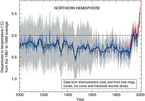
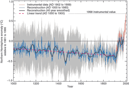
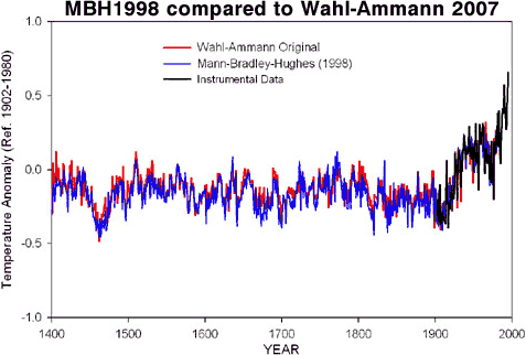
The fact the DATA POINT is in the middle of the plotted period (LIKE IT SHOULD BE) is shown by 5 year spans is not wrong... But he is incapable of figuring it out.. Go figure..
 
This is what it should (approximately) look like, properly pointed at 250 year resolution.

View attachment 190193

Edits in yellow highlight are mine
No, that's what it looks like when you simply photoshop the real graph!
Here is a little lesson for the fucktard...

here is a daily plot.
View attachment 190375

Here is that same plot with 1 month plots..

View attachment 190388

now this is the 10 year plot..

View attachment 190379

here is a 100 year plot

View attachment 190380

This is what would occur if the Spatial Resolution's were contextual... Your whole warming....GONE...

THIS IS WHY HANSEN AND HIS ILK ARE LIARS...
All your graphs show a hockey stick except the last, which is clearly not a 100 year plot, which shows 5 year steps from 1830 to 1870. You are caught lying yet again.
Why don't you give it up?

Wow!

You are that dumb, he shows that his last chart is indeed a 100 year plot, and the values change more slowly as resolution get
worse at far left edge of each successive chart.

Sure, a 100 year plot on a 40 year graph, and you deniers say I'm dumb!!!!! :cuckoo:

HA HA HA,

you just make clear you have no idea what the last chart showed. It is plotted from 1800 to 2019, with negligible change in the resolution at the left edge. There is a reason why it has only ONE data point left on it, you are way over your head on this.

You are looking VERY ignorant right now!

It is YOU who is DUMB!
 
Sure, a 100 year plot on a 40 year graph, and you deniers say I'm dumb!!!!! :cuckoo:
HA HA HA,
you just make clear you have no idea what the last chart showed. It is plotted from 1800 to 2019, with negligible change in the resolution at the left edge. There is a reason why it has only ONE data point left on it, you are way over your head on this.
You are looking VERY ignorant right now!
It is YOU who is DUMB!
1800 to 2019 is 1,219 years, and using a 100 year plot there should have been 12 data points.
Just admit it you are a premeditated liar or you are too stupid to do simple arithmetic.
 
Ed....on substance, you're getting pwnd..

Anybody ( except a member of the religion ) can see very clearly only a negligible change for that time period. The clutter you are adding is making you look bad.... and as I have said many times in this forum you are the only climate crusader who brings a measure of credibility in here.

But not on this one s0n.... Sunset is schooling you.

12 points or one point.... negligible is what it is.:backpedal:
 
Sure, a 100 year plot on a 40 year graph, and you deniers say I'm dumb!!!!! :cuckoo:
HA HA HA,
you just make clear you have no idea what the last chart showed. It is plotted from 1800 to 2019, with negligible change in the resolution at the left edge. There is a reason why it has only ONE data point left on it, you are way over your head on this.
You are looking VERY ignorant right now!
It is YOU who is DUMB!
1800 to 2019 is 1,219 years, and using a 100 year plot there should have been 12 data points.
Just admit it you are a premeditated liar or you are too stupid to do simple arithmetic.
lol

Again, compressing the data from 12 months and then again to years... I'm wasting my time with you... Your math ability sucks by the way..
 
Sure, a 100 year plot on a 40 year graph, and you deniers say I'm dumb!!!!! :cuckoo:
HA HA HA,
you just make clear you have no idea what the last chart showed. It is plotted from 1800 to 2019, with negligible change in the resolution at the left edge. There is a reason why it has only ONE data point left on it, you are way over your head on this.
You are looking VERY ignorant right now!
It is YOU who is DUMB!
1800 to 2019 is 1,219 years, and using a 100 year plot there should have been 12 data points.
Just admit it you are a premeditated liar or you are too stupid to do simple arithmetic.
200 years dumbass... not 2000 years..

:auiqs.jpg::auiqs.jpg::auiqs.jpg::auiqs.jpg::auiqs.jpg::auiqs.jpg::auiqs.jpg:

And as there is only 178 years of data only one point is displayed, the current one.
 
Sure, a 100 year plot on a 40 year graph, and you deniers say I'm dumb!!!!! :cuckoo:
HA HA HA,
you just make clear you have no idea what the last chart showed. It is plotted from 1800 to 2019, with negligible change in the resolution at the left edge. There is a reason why it has only ONE data point left on it, you are way over your head on this.
You are looking VERY ignorant right now!
It is YOU who is DUMB!
1800 to 2019 is 1,219 years, and using a 100 year plot there should have been 12 data points.
Just admit it you are a premeditated liar or you are too stupid to do simple arithmetic.

1800 to 2019 is only 218 + years.

You have yet to realize that resolution goes DOWN with each successive chart in his link, it make that clear on left edge of the chart.

Think man, THINK!
 
Last edited:
Sunset Tommy and Billy Boy,

please explain why you think these various "hockey stick" graphs are unrepresentative, why, and what you think an accurate graph of the temperature trend over the last thousand years would look like.
 
hockey-stick-mann-crutem3v.JPG

All from : Residual Analysis: DIY - Very Simple "Hockey Stick"

DIY - Very Simple "Hockey Stick"

A while back, when I analyzed raw data from Mann & Jones (2003), I came up with my own "hockey stick" graph. I didn't post it then, but I thought it might be interesting now, in light of the CRU incident.

AGW "skeptics" are pushing the idea that Phil Jones' "trick to hide the decline", and the VERY ARTIFICIAL correction I discussed in a prior post are essentially evidence of tampering with the "hockey stick" reconstruction.

In reality, the artificial correction refers to rudimentary, probably temporary code (apparently marked with all-caps comments to caution CRU researchers not to use it as final code) that corrects temperatures derived from tree-ring widths, due to a problem known as "tree-ring divergence." It's highly improbable the artificial correction was ever used in any published paper.


This "hockey stick" does not require you to write any algorithms. The only "tricks" involved in producing it are the following:

  1. Temperature data up to 1980 comes from Mann & Jones (2003)(data made available by NOAA.)
  2. Temperature from 1981 onwards comes from the CRUTEM3vglobal data set.
  3. The red line is a 25-year central moving average of the temperature series.


You can try this yourself with different data sets. It's not very difficult. If you don't trust CRU temperature data, use GISSTemp. If you don't think the Mann & Jones (2003) reconstruction should be used, there are plenty of other historical reconstructions that use methods other than tree-rings. Do report back if it doesn't work. Comment moderation is never enabled here.
And Crick shows his ignorance by posting up empirical daily plots on the end of a PROXY! The same deception Mann does..

He also didn't bother to realize how absurd the 2,000 year reconstruction is since they actually go to THREE decimal places as shown as a sample here:

DATA:
1. Global decadally-resolved reconstructed temperature series

Year T-anom
200 -0.261
201 -0.292
202 -0.312
203 -0.317
204 -0.304
205 -0.279
206 -0.249
207 -0.225
208 -0.213
209 -0.214
210 -0.228
=========================
Yes that is year 200 AD, go look in the link.

They also claim they have a resolution of a yearly basis, which is impossible that far back in time.

This alone convinces me that this is a junk paper since Multi-Proxy data NEVER have that level of resolution that far back in time. Here is the "error bars", from the link.

"DESCRIPTION: Two hemispheric multi-proxy temperature reconstructions
(based on local-correlation weighting, and areal weighting as described
in Mann and Jones 2003). The global mean shown in the paper is the
average of the two hemispheric reconstructions, while the interhemispheric
difference is just NH-SH. The estimated uncertainties are constant and
the one standard error uncertainties are:

NH: +/- 0.16
SH: +/- 0.19
GLB: +/- 0.18
DIFF: +/- 0.25

All series are anomalies based on 1961-1990 instrumental reference period.
Data are presented as both decadally-resolved series (added to this file 12/2004)
and 40 year smoothed versions of the decadally-resolved reconstrucitons
(as shown in Figure 2 of Mann and Jones)."

I feel faint from reading this BULLSHIT!
 
Last edited:
Here is some background of that junk paper, from Climate Audit:

Re-scaling the Mann and Jones 2003 PC1
"Mann archived the Mann and Jones PC1 in the Jones and Mann 2004 archive here. They state that they used 6 chronologies, but do not state which ones. Within the MBH99 network, there are exactly 6 series that start in AD200 or earlier. I then calculated the (erroneous) Mannomatic PC1 and compared it to the archived PC1 – it was a pretty close match, but not exact. By experimenting with it – and I hate to say how much time these experiments take – I deduced that there was a correlation of more than 0.9999 between values up to 1700 and a much lower correlation after that. This confirmed that I’d spotted the correct 6 chronologies and that the JM04 PC1 was a re-scaled re-centered version of the Mannomatic PC1 up to 1700 and was a splice of some other series after 1700.

Needless to say, there’s no account of the splicing in Mann and Jones 2003, but by now I can sometimes anticipate Mannian ad hockeries. I tried the MBH99 “fixed” PC1 in the AD1000 network (“fixed” implies a rational process; let’s use the term “adjusted” instead) since there is no evidence that the PC1 is in any sense “fixed”. The “adjusted” and raw AD1000 PC1 were formerly available at Virginia Mann’s FTP site, but with the evolution of PennState Mann, this archive is no longer available. I saved it in Nov 2003 when it was first made public and I’ve posted up the PC1s from that network here. Experimenting some more, I determined that the correlation of the AD1000 PC1 fixed adjusted had a correlation of more than 0.999 with the JM04 archived PC1 for the period after 1700, showing that it had been re-scaled and re-centered somehow to yield the JM04 version.

There was some evidence on the re-scaling and re-centering of the AD1000 fixed adjusted PC1. Jones and Mann 2004 (though not Mann and Jones 2003) Figure 4 caption said that the series had been standardized on 1750-1950. This yielded an emulation of the archived PC1 that was pretty close – it was a bit more than rounding but not a lot more. See the top panel of Figure 1 below showing the discrepancies between the trial rescaling of the AD1000 fixed adjusted PC1 and the JM04 archived version – there is a relatively good match after 1700 and poor match prior to 1700.. So far so good.

Now another problem arose – and this is one that I’ve not been able to figure out at all. One’s first assumption is that the AD200 PC1 would be rescaled and recentered in the same way (on 1750-1950). This proved not to be the case as shown in the graphic below -see the middle panel. The second panel shows the discrepancies between the AD200 PC1 re-scaled in the same way and the archived PC1. Neither the centering nor the scaling match."

================================
What a mess!
 
The warmist morons don't even notice what the main data Dr. Mann used for his 1998 paper is. It is mentioned in post 1, but somehow they don't realize that the Bristlecone Pine Tree data is NOT a temperature database at all. Quoting this for as SECOND time.

McKitrick
"A very brief summary of the problems of the hockey stick would go like this. Mann’s algorithm, applied to a large proxy data set, extracted the shape associated with one small and controversial subset of the tree rings records, namely the bristlecone pine cores from high and arid mountains in the US Southwest. The trees are extremely long-lived, but grow in highly contorted shapes as bark dies back to a single twisted strip. The scientists who published the data (Graybill and Idso 1993) had specifically warned that the ring widths should not be used for temperature reconstruction, and in particular their 20th century portion is unlike the climatic history of the region, and is probably biased by other factors."
 
Sunset Tommy and Billy Boy,

please explain why you think these various "hockey stick" graphs are unrepresentative, why, and what you think an accurate graph of the temperature trend over the last thousand years would look like.
LOL

One Word....

CONTEXT

I know you don't understand context because if you did you would understand why placing two different contexts, in a single diagram, that are not equal and then not explain it is FRAUD!
 
Sure, a 100 year plot on a 40 year graph, and you deniers say I'm dumb!!!!! :cuckoo:
HA HA HA,
you just make clear you have no idea what the last chart showed. It is plotted from 1800 to 2019, with negligible change in the resolution at the left edge. There is a reason why it has only ONE data point left on it, you are way over your head on this.
You are looking VERY ignorant right now!
It is YOU who is DUMB!
1800 to 2019 is 1,219 years, and using a 100 year plot there should have been 12 data points.
Just admit it you are a premeditated liar or you are too stupid to do simple arithmetic.

1800 to 2019 is only 218 + years.

You have yet to realize that resolution goes DOWN with each successive chart in his link, it make that clear on left edge of the chart.

Think man, THINK!
Some of the graphs I posted cover 1,000 years, so any argument about 200 years is just a diversion.
Here is a 1,000 year graph with a 50 year smoothing plot.

p200108c0g15001.jpg

Multiproxy reconstruction of Northern Hemisphere surface temperature variations over the past millennium (blue), along with 50-year average (black), a measure of the statistical uncertainty associated with the reconstruction (gray), and instrumental surface temperature data for the last 150 years (red)
 
Trying to get any of the alarmists here to understand spatial resolution is a errand in futility. I've been trying for several years here now to teach some to no avail. They simply can not understand how placing today going backwards into a 500 year average (the average of most long term proxies) would wipe out their little warming blip, unlike Mann's deception.
By alarmists you mean people who aren’t science deniers, right?

:cuckoo:
 
Sure, a 100 year plot on a 40 year graph, and you deniers say I'm dumb!!!!! :cuckoo:
HA HA HA,
you just make clear you have no idea what the last chart showed. It is plotted from 1800 to 2019, with negligible change in the resolution at the left edge. There is a reason why it has only ONE data point left on it, you are way over your head on this.
You are looking VERY ignorant right now!
It is YOU who is DUMB!
1800 to 2019 is 1,219 years, and using a 100 year plot there should have been 12 data points.
Just admit it you are a premeditated liar or you are too stupid to do simple arithmetic.
200 years dumbass... not 2000 years..

:auiqs.jpg::auiqs.jpg::auiqs.jpg::auiqs.jpg::auiqs.jpg::auiqs.jpg::auiqs.jpg:

And as there is only 178 years of data only one point is displayed, the current one.
Yeah 200 years, but using 100 years smoothing does not mean there is only 1 point, it means each yearly point is an average of the previous 100 years. You have to be pretty stupid to plot 178 years on a graph using only one point.
 
The warmist morons don't even notice what the main data Dr. Mann used for his 1998 paper is. It is mentioned in post 1, but somehow they don't realize that the Bristlecone Pine Tree data is NOT a temperature database at all. Quoting this for as SECOND time.

McKitrick
"A very brief summary of the problems of the hockey stick would go like this. Mann’s algorithm, applied to a large proxy data set, extracted the shape associated with one small and controversial subset of the tree rings records, namely the bristlecone pine cores from high and arid mountains in the US Southwest. The trees are extremely long-lived, but grow in highly contorted shapes as bark dies back to a single twisted strip. The scientists who published the data (Graybill and Idso 1993) had specifically warned that the ring widths should not be used for temperature reconstruction, and in particular their 20th century portion is unlike the climatic history of the region, and is probably biased by other factors."
Of course there is a GOOD reason that subset was used, namely trees from higher arid mountains are known to more accurately reflect temperature than precipitation. The LAST thing deniers want is accurate data.

New Research on Tree Rings as Indicators of Past Climate


We have shown that approximately 60–80 m of vertical elevation can be sufficient to create a change in the climate response of bristlecone pine. Trees below this elevation are not as effective temperature recorders as trees at treeline. Such fine-scale sensitivity, if present at other treeline sites around the world, would have important implications for chronology development and inferences of past climate variability. Treeline site chronologies should be constructed with this vertical heterogeneity in mind. Samples from upper treeline and from trees below treeline should not be mixed to avoid a ‘diluted’ or ‘mixed-signal’ site chronology, particularly at treeline sites that occur in relatively dry environments such as the White Mountains of California. Similarly, treeline samples from differing aspects should not be mixed to avoid problems and uncertainties related to potential ‘divergences’ and to ‘dilution’. Interpretations of existing bristlecone chronologies need to take this into account, particularly when these ring width chronologies are used in climate reconstructions.

I asked Malcolm Hughes and Matt Salzer, two of the study authors, how to best characterize this study. They told me that this paper is, for the most part, “…an ecological study. There are no climate reconstructions, rather mostly comparisons of growth from trees growing in different spots on the landscape. There are paleoclimate implications. We still find temperature sensitive bristlecone pine trees at upper treeline; they simply don’t extend down the mountain as far as we used to think. In addition, some of the treeline south-facing trees seem to be less influenced by temperature in recent years than they used to be. The location of the trees, and understanding what environmental variable is limiting growth at that location, is the key to developing accurate paleoclimatic reconstructions from tree rings. Science is a continuous process of improvement.”

Earlier research by an overlapping team also looked at topography. In “Topographically modified tree-ring chronologies as a potential means to improve paleoclimate inference” by Andrew Bunn, Malcolm Huges, and Matthew Salzer (2011) it is noted that

…a mean ring-width chronology from a particular site may be composed of trees from highly varied topographic positions. Such a “topographically-mixed” chronology can be confounded in terms of its climate signal. For example, ring widths of trees that are primarily recording summer temperature might be averaged with ring widths of trees that are primarily precipitation recorders.

That paper details how researchers can use topographic setting to separate different growth series to produce a cleaner sample for developing a temperature proxy. Like the more recent paper discussed here, Bunn et al is an effort to improve the methodology of using tree rings as a proxy.
 
Never underestimate the stupidity of the deniers. That is their specialty. The fact that they are still arguing the Mann graph after it has been verified multiple times demonstrates their basic dishonesty and idiocy.
 
Don't you deniers ever get tired of posting the same debunked lies????

Mann's hockey stick has been confirmed over and over again by many different proxies as well as direct instrument measurement.

hockey_stick_TAR.gif


MBH1999_Wahl_2007.gif


Hockey_Stick_borehole.gif


Hockey_Stick_Stalagmite.gif


NH_Temp_Reconstruction.gif

So you did not understand a word I said about the TIME (temporal) resolution of global proxy studies.

You cannot make deductions about temperature excursions or variance within a couple hundred period when all of the high frequency variance is ABSENT from the processed data. The ONLY thing you're looking at in the WHOLE LOT of ancient global proxy temperature studies is a highly filtered mean WITH NO REAL VARIANCE over a couple hundred year span of time. If our little 80 year long temperature blip had occurred in 1450 -- it would BARELY show if at all using those methods.

A LOT of that filtering is due to trying to merge tree rings, ice cores, mud bug shells with different time resolutions into one finished product. So if you just look at INDIVIDUAL proxies from ONE site -- often you see more accurate depictions of the Med Warm Period, Litttle Ice age.

These show CLEARLY in Greenland high resolution ice cores but not in the "famous" Vostok cores from Antarctica. There are reasons for that.
 
Sure, a 100 year plot on a 40 year graph, and you deniers say I'm dumb!!!!! :cuckoo:
HA HA HA,
you just make clear you have no idea what the last chart showed. It is plotted from 1800 to 2019, with negligible change in the resolution at the left edge. There is a reason why it has only ONE data point left on it, you are way over your head on this.
You are looking VERY ignorant right now!
It is YOU who is DUMB!
1800 to 2019 is 1,219 years, and using a 100 year plot there should have been 12 data points.
Just admit it you are a premeditated liar or you are too stupid to do simple arithmetic.
200 years dumbass... not 2000 years..

:auiqs.jpg::auiqs.jpg::auiqs.jpg::auiqs.jpg::auiqs.jpg::auiqs.jpg::auiqs.jpg:

And as there is only 178 years of data only one point is displayed, the current one.
Yeah 200 years, but using 100 years smoothing does not mean there is only 1 point, it means each yearly point is an average of the previous 100 years. You have to be pretty stupid to plot 178 years on a graph using only one point.
its not smoothing you idiot!...

Its called data compression...

And you haven't got a damn clue..
 
You also have SPATIAL sampling resolution problems with proxy studies as well. Since ICE and OLD growth forests are only present MOSTLY in the higher latitudes. And much of the world is NOT represented. And if it IS -- it's represented by vastly DIFFERENT (mostly under water proxies) that do not measure AIR temperature and are subject to very POOR time resolution because of sediment mixing and the nature of the borrowing little buggers that they are studying. Those mud bugs can BURROW deep enough to travel thru 200 years or more of sediment depth which is the TIME axis of a sediment core.
 

Forum List

Back
Top