Greenland Ice Sensitivity

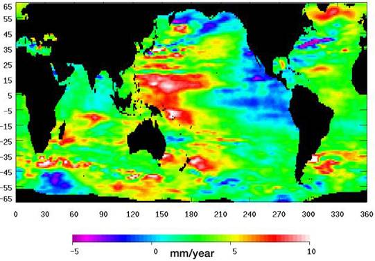
the university of Colorado graph is just fine. the bravenewclimate blog is irrelevent as the graph was found during a google image search.

Well that graph says University of Colorado, but it is from the BraveNewClimate blog site. I don't mean to doubt the blog's reliability, but I would really prefer to see a graph directly from and on a legitimate and authentic science site. I ran a cursory search at the Sea Level Research Group site (CU Sea Level Research Group | University of Colorado) and didn't see the graphic, but I haven't really spent any time in a more detailed search, I wanted to check and see if you had a better link first (sorry I wasn't more specific in what I was looking for last post).

satellite altimetry produces maps that show different sea level rise in different places. eg the south pacific seas show ~10mm/yr increase. the map states this is data for the last 20 years. are we to believe that the sea level is 200mm higher there and still rising? what is stopping the water from spreading out? I cant help but think that this is an artifact of volcanic and seismic activity that is distorting the gravity field.if that is the case then perhaps the altimetry results for the west peninsula of antarctica are similarly being affected by the volcanoes there. etc.

Until we can track down the actual graphic representation, and more importantly the data and methodologies from which the graphic is derived, it is difficult to do much beyond speculation. Remember, the crust, and the mantle it floats upon, are only semi-rigid in and of themselves. In most cases, it isn't the volcanoes which cause the mascon gravitational anomalies, it is the piling-up of crustal plates behind and ahead of a deep subduction area. This piling up causes a general geological uplift (think the early stages of a "buckling"). This gives us two mechanisms of local sea level rise beyond any that might be attributable to global average sea level rise (you see similar potentials in areas of negative sea level rise): 1) the local sea is actually being pushed up by a rising sea floor, 2) the mascon of the bulging crust is actually attracting sea water to pile up over top of the rising sea floor. The surface of the oceans subtly mirror the contours of the seafloor below them. The crucial point is whether or not this graphic, and more importantly, the data and the analysis understood and accounted for this variable. It is entirely possible that the satisfaction of our curiosity may lie in the paper and corresponding data from which this graphic was extracted.

((oh, and btw, pardon my ignorance but "CAGW"?))

CAGW is catastrophic anthropogenic global warming.

"Catastrophic" is a relative term and more often used in hyperbole than measured consideration.

Im not doing a scientific paper, or even a high school project. if I see the same type of map or graphic from different sources I assume that the overall basic idea is accepted in the scientific community.

I did not intend to convey any other meaning, what I am talking about, is that until we can see the actual study from which this particular graphic was derived we have no way of knowing if this was a gross data plotting which entails a composite of factors and influences many of which have nothing at all to do with climate change issues.

I dont go to the SIs of scientific papers and run R code to check their methodologies and illustrations. nor do 99.9% of the public. if blogs and such did not reprint graphics from universities and govt institutions then they would often simply disappear. eg. a link to a temp graph from GISS will typically break within a day or two, and GISS has made it impossible for information caching programs like 'the wayback machine' to capture past data sets.

The point isn't what the pretty pictures look like, the point lies in the data and the analysis from which the graphic is derived. As these are composite measurements averaged over such a long period there are many things that could contribute to such regional rises and falls.
 
Well, we still have tidal gauges, and can compare the data of the satellites against those.

http://academics.eckerd.edu/instructor/hastindw/MS1410-001_FA08/handouts/2008SLRSustain.pdf

As the Pacific atolls slip under water does that REALLY mean the sea level is higher? Perhaps the atoll has sunk or the wind has eroded it away? Maybe ithas suffered a coral decompression? Maybe the moon has gotten closer and the water is due to the higher tides?

We should study this for another 60 years so we don't go off half cocked.

We've been actively studying ancient and modern climate at the intersection of most natural sciences for the better part of a century and a half now. This isn't to say that we know everything there is to know about the subject, but neither are we blindly flailing about in the darkness. Momentum works against us, the longer we wait the more energy, time and effort (read as money) it is going to take to yeild an acceptable result, and if we get to far behind the curve, all the money there is won't stop what we've unleashed.

"Tickling the Tail of the Dragon", indeed.
 
Well that graph says University of Colorado, but it is from the BraveNewClimate blog site. I don't mean to doubt the blog's reliability, but I would really prefer to see a graph directly from and on a legitimate and authentic science site. I ran a cursory search at the Sea Level Research Group site (CU Sea Level Research Group | University of Colorado) and didn't see the graphic, but I haven't really spent any time in a more detailed search, I wanted to check and see if you had a better link first (sorry I wasn't more specific in what I was looking for last post).


Until we can track down the actual graphic representation, and more importantly the data and methodologies from which the graphic is derived, it is difficult to do much beyond speculation. Remember, the crust, and the mantle it floats upon, are only semi-rigid in and of themselves. In most cases, it isn't the volcanoes which cause the mascon gravitational anomalies, it is the piling-up of crustal plates behind and ahead of a deep subduction area. This piling up causes a general geological uplift (think the early stages of a "buckling"). This gives us two mechanisms of local sea level rise beyond any that might be attributable to global average sea level rise (you see similar potentials in areas of negative sea level rise): 1) the local sea is actually being pushed up by a rising sea floor, 2) the mascon of the bulging crust is actually attracting sea water to pile up over top of the rising sea floor. The surface of the oceans subtly mirror the contours of the seafloor below them. The crucial point is whether or not this graphic, and more importantly, the data and the analysis understood and accounted for this variable. It is entirely possible that the satisfaction of our curiosity may lie in the paper and corresponding data from which this graphic was extracted.

((oh, and btw, pardon my ignorance but "CAGW"?))

CAGW is catastrophic anthropogenic global warming.

"Catastrophic" is a relative term and more often used in hyperbole than measured consideration.

Im not doing a scientific paper, or even a high school project. if I see the same type of map or graphic from different sources I assume that the overall basic idea is accepted in the scientific community.

I did not intend to convey any other meaning, what I am talking about, is that until we can see the actual study from which this particular graphic was derived we have no way of knowing if this was a gross data plotting which entails a composite of factors and influences many of which have nothing at all to do with climate change issues.

I dont go to the SIs of scientific papers and run R code to check their methodologies and illustrations. nor do 99.9% of the public. if blogs and such did not reprint graphics from universities and govt institutions then they would often simply disappear. eg. a link to a temp graph from GISS will typically break within a day or two, and GISS has made it impossible for information caching programs like 'the wayback machine' to capture past data sets.

The point isn't what the pretty pictures look like, the point lies in the data and the analysis from which the graphic is derived. As these are composite measurements averaged over such a long period there are many things that could contribute to such regional rises and falls.

NASA and others have produce SLR graphs and connected them with GW. The public sees this and makes assumptions, just like the hockey stick graph or many other examples. I say it is misdirection to let the public make those faulty assumptions even if there is plausible deniability. Eg. Govt websites talking about acidity in one sentence then describing H+ concentration going up 30% in the next and allowing the layman audience to assume that acidity has gone up 30%.

global warming has little influence on regional differences of SLR. Producing scary graphics with large red hotspots is manipulating the unsuspecting public who depend on the experts to keep them informed. It is propaganda which is depleting the banked trust that the public has in science.
 
All the many articles on the current East Coast US SLR anomaly came out, June 24 or 25, 2012.

The NASA graphic Ian found is likely obsolete, but it does show a trend, for SLR to intensify, toward east-facing shorelines. Maybe the now evident Atlantic trade current phenomenon hadn't ripened, by the time the un-dated graphic was formulated, so the rampant alarm bells didn't show up, and journalists, from dozens of publications didn't spring onto the story, before June 2012.

The NOAA has a lot of up-to-the-minute SLR data, from a lot of stations. NASA takes a lot longer, to load, but they have something.

Some of the studies done, cited by June 24 or 25 articles may be like those, in the NatGeo, which I linked, but then it crashed, before I posted, so let me assure you, some guys are claiming we can keep temperature rise, to 1.5 C, by 2300, so SLR will only go up about 3 m. NatGeo said MAYBE the East Coast anomaly is due, to Greenland melt, when Greenland temps were in the 70s, in May.

Do you think?!

The NatGeo seems to blow dogs, in a shitstorm, but they did report the SLR anomaly. Other reports link, to other websites, with more relevant studies and reports, so dig 'em up, or wait, but suffice to say, some people are stonewalling, what happens.

If you believe minimal SLR will happen, without radical re-greening, let's go look at the bridge I have, to sell you.

Mainly, the Arctic and Greenland ice will fail, northern ice albedo will fail, warming currents will continue to attack Antarctic ice, and then ice from East Antarctica will FLOW, toward those warming currents, to be calved and melted. SLR can happen more easily happen FASTER, rather than according to any fanciful, slower prognosis.


NASA - Search Results
 
newsPage-16.jpg


NASA site.

this graphic seems to undercut the paper published this year that said parts of the US Atlantic Seaboard were rising at twice or three times the global average. Salinger2012 I think

Nasa newsite, which means that this graphic was connected to some study or paper discussed somewhere in a NASA website news story, but without knowing what study it comes from and the methodolgies that study applied as it performed its data analysis, all we can do is is speculate about what thinking might have went into its considerations.

does that mean that you agree that NASA is being manipulative by posting this graphic on their website without fully explaining it? and leaving the public to assume it is connected with global warming?
 
Dr. Jeff Masters' WunderBlog : Record warmth at the top of the Greenland Ice Sheet | Weather Underground

Record heat leads to major flooding in Greenland
The record heat has triggered significant melting of Greenland's Ice Sheet. According to the Arctic Sea Ice Blog, on July 11, glacier melt water from the Russell Glacier flooded the Watson River, smashing two bridges connecting the north and south of Kangerlussuaq (Sønder Strømfjord), a small settlement in southwestern Greenland. The flow rate of 3.5 million liters/sec was almost double the previous record flow rate.The latest forecast for Summit calls for cooler conditions over the coming week, with no more above-freezing temperatures at Summit.
 
Why in the world does a message, "forbidden" come up, when I cut to "images," from:

http://climate.nasa.gov/images/newsPage-16.jpg :asshole:

There is another graphic up:


Global Climate Change: Sea Level Viewer


It seems NASA posts all kinds of graphics, but the IanCrapforbrains graphic is on page 16, of some area, which the server won't lead to, anymore. Since you have crapforbrains, Ian, you seem to be spamming an old graph and ranting, page after page. At least the batshit-crazy sucksassandballs fetches fresh smilies and gag pictures, for most of his rants.
 
Last edited:
does that mean that you agree that NASA is being manipulative by posting this graphic on their website without fully explaining it? and leaving the public to assume it is connected with global warming?

I'm afraid I'd need more than an apparently orphaned photo link before I lept to the conclusion of NASA conspiracies.

I'll look around a bit more and see what I can find, let me know if you locate the actual report or study this graphic came from.
 
Glaciers the size of NYC break off every day, right? No big deal.:D
 
NASA Lying about ocean acidification

"Closest to the atmospheric source of excess carbon dioxide, the ocean’s surface waters are the first to show the effects of acidification. Since the beginning of the industrial era, the pH of surface waters has decreased slightly but significantly from 8.2 to 8.1, and it continues to decrease. Scientists project the pH of surface water will decrease by the year 2100 to a level not seen on Earth over the past 20 million years, if not longer."

http://www.nasa.gov/topics/earth/features/climate_acidocean.html

^

NASA lying.


True story
 
Really? Now why is it that I would put more weight on the opinion of a real scientist working for NASA or NOAA than some internet poster that beleives the moon is hollow?
 
Really? Now why is it that I would put more weight on the opinion of a real scientist working for NASA or NOAA than some internet poster that beleives the moon is hollow?

Reminds me of an old Chinese Parable:

A water bearer in China had two large pots, each hung on the ends of a pole which he carried across his neck. One of the pots had a crack in it, while the other pot was perfect and always delivered a full portion of water. At the end of the long walk from the stream to the house, the cracked pot arrived only half full. For a full two years this went on daily, with the bearer delivering only one and a half pots full of water to his house. Of course, the perfect pot was proud of its accomplishments, perfect for which it was made. But the poor cracked pot was ashamed of its own imperfection, and miserable that it was able to accomplish only half of what it had been made to do. After 2 years of what it perceived to be a bitter failure, it spoke to the water bearer one day by the stream. "I am ashamed of myself because this crack in my side causes water to leak all the way back to your house."

The bearer said to the pot, "Did you notice that there were flowers only on your side of the path, but not on the other pot's side? That's because I have always known about your flaw, and I planted flower seeds on your side of the path, and every day while we walk back, you've watered them. For two years I have been able to pick these beautiful flowers to decorate the table. Without you being just the way you are, there would not be this beauty to grace the house."

Moral: Each of us has our own unique flaws. We're all cracked pots. But it's the cracks and flaws we each have that make our lives together so very interesting and rewarding. You've just got to take each person for what they are, and look for the good in them.

Without all the muddied and confused ramblings of those without better uses for their time, we'd have little reason to share and inform more reasoned and supported understandings.
 
Glaciers the size of NYC break off every day, right? No big deal.:D

?

Iceberg Twice The Size Of Manhattan Breaks Off Greenland Glacier | Inhabitat - Sustainable Design Innovation, Eco Architecture, Green Building

A massive chunk of ice twice the size of Manhattan just broke off from Greenland’s Petermann Glacier, which is one of the two largest glaciers left in the country. The ice island was part of a major ice shelf (connecting the great Greenland ice sheet with the ocean) that has waned in past years due to the region’s warming climate. The event was reported by Andreas Muenchow, associate professor of physical ocean science and engineering at UD’s College of Earth, Ocean, and Environment in his “Icy Seas” blog.
 
Really? Now why is it that I would put more weight on the opinion of a real scientist working for NASA or NOAA than some internet poster that beleives the moon is hollow?

They're lying. Surely even you can see that!
 
Really? Now why is it that I would put more weight on the opinion of a real scientist working for NASA or NOAA than some internet poster that beleives the moon is hollow?

Reminds me of an old Chinese Parable:

A water bearer in China had two large pots, each hung on the ends of a pole which he carried across his neck. One of the pots had a crack in it, while the other pot was perfect and always delivered a full portion of water. At the end of the long walk from the stream to the house, the cracked pot arrived only half full. For a full two years this went on daily, with the bearer delivering only one and a half pots full of water to his house. Of course, the perfect pot was proud of its accomplishments, perfect for which it was made. But the poor cracked pot was ashamed of its own imperfection, and miserable that it was able to accomplish only half of what it had been made to do. After 2 years of what it perceived to be a bitter failure, it spoke to the water bearer one day by the stream. "I am ashamed of myself because this crack in my side causes water to leak all the way back to your house."

The bearer said to the pot, "Did you notice that there were flowers only on your side of the path, but not on the other pot's side? That's because I have always known about your flaw, and I planted flower seeds on your side of the path, and every day while we walk back, you've watered them. For two years I have been able to pick these beautiful flowers to decorate the table. Without you being just the way you are, there would not be this beauty to grace the house."

Moral: Each of us has our own unique flaws. We're all cracked pots. But it's the cracks and flaws we each have that make our lives together so very interesting and rewarding. You've just got to take each person for what they are, and look for the good in them.

Without all the muddied and confused ramblings of those without better uses for their time, we'd have little reason to share and inform more reasoned and supported understandings.

Remind me of Jim Jones. Drink the AGW Kool-Aid

So the oceans are 30% more acidic like the NASA Article says?

kool-aid.jpg
 
Glaciers the size of NYC break off every day, right? No big deal.:D

?

Iceberg Twice The Size Of Manhattan Breaks Off Greenland Glacier | Inhabitat - Sustainable Design Innovation, Eco Architecture, Green Building

A massive chunk of ice twice the size of Manhattan just broke off from Greenland’s Petermann Glacier, which is one of the two largest glaciers left in the country. The ice island was part of a major ice shelf (connecting the great Greenland ice sheet with the ocean) that has waned in past years due to the region’s warming climate. The event was reported by Andreas Muenchow, associate professor of physical ocean science and engineering at UD’s College of Earth, Ocean, and Environment in his “Icy Seas” blog.

I figured something like that, but I never know for sure on this board.
Rough summer for Greenland, glacier melt surge took out some bridges and cut off some towns last week.

[ame=http://www.youtube.com/watch?v=v5h3AdiJT8A&feature=related]Watson River Kangerlussuaq oversvømmer bro - YouTube[/ame]
 
Keepin' tabs on icebergs...
:cool:
Who, What, Why: How do you track an iceberg?
19 July 2012 - A large iceberg has broken off a glacier in northern Greenland. Where will it go - and how do you track an iceberg?
At twice the size of Manhattan, the iceberg that has just calved from the Petermann Glacier, is not hard to miss. It can easily be seen on satellite images and is nestled within the glacial fjord. But once it gets out to open sea, it will drift and start to break up into smaller pieces, in a way that is virtually impossible to predict, says Trudy Wohlleben, senior ice forecaster with the Canadian Ice Service. She tracks satellite data for icebergs, and was the first to spot this new iceberg, as well as a previous one - twice the size - which calved from the same glacier in 2010.

Water currents and the wind are two of the main forces at play in determining where an iceberg goes. Most of the tracking is done by satellites, but as the iceberg breaks up into smaller and smaller pieces, they become hard to see. "Icebergs drift and melt until they're eventually impossible to detect by satellite because they are so small," says Eric Rignot, senior research scientist at Nasa's Jet Propulsion Laboratory. Small icebergs are called bergy bits (around the size of a grand piano) or growlers (about the size of a small house). And anything growler-sized or smaller, is tricky for a satellite to pick up.

But these small icebergs pose a big threat to ships. "Large icebergs are reasonably visible - it's the smaller pieces that become a problem for shipping," says Captain David Snider, an ice pilot and navigator, who help ships chart a safe passage through icy waters. "They can be quite hidden by rough seas, and what you can't see is harder to avoid." One technique to get around this problem is to drop satellite tracking beacons onto the icebergs, which send a signal showing their location, much like a GPS system.

They are positioned either by landing on the iceberg in a helicopter, says Trudy Wohlleben, or by dropping the beacon - attached to its own mini-parachute - from an airplane. But there are logistical problems: "The batteries only last around one year, and then you need to replace them." Two years after the first big iceberg calved from Petermann Glacier, Wohlleben and her team are still tracking it. "There's quite a bit left," she says. It took about one month to "manoeuvre its way out of the narrow space" of the fjord, says Wohlleben.

More BBC News - Who, What, Why: How do you track an iceberg?
 

Forum List

Back
Top