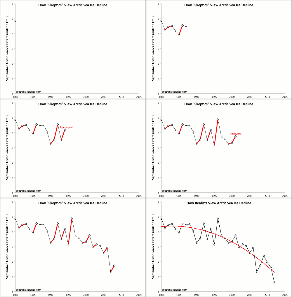
Global Warming Actually Still Accelerating - no "lull"

It's amazing the energy that conservatives invest in dragging the conversation away from the basic physics of AGW. They know that it is indisputable science. That’s standing in the way of imposing their will on the rest of the world. They were raised on dirty politics. It's all that they know.


The only thing indisputable is the climate alarmists don't have a clue what they're talking about. The only thing indisputable is the alarmists data sets have been screwed with in a vain attempt to lie about the actual temp status of the world.

The only other indisputable thing is that PMZIFITZMEOLTRAKARTROLLINGBLUNDERFRAUD is a propagandist of the first order.
 
I've got another idea.. Why CHANGE the baseline? If you're trying to show historical trend, you should use the OLDEST 30 average that you got..

In reality -- sliding the baseline average masks the descent of current data just as much as it ignores the older negative period pre-1981..
 
Just out of curiosity, why did your graphic end at 1990, 23 years ago. Was there something someone didn't want us to see?

?????

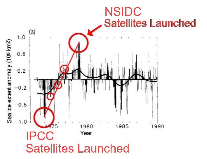
You do realize that this is a graphic from an IPCC report? It stops in 1990 because it was made in ~ 1990.

The last time I showed this figure I compared it to a more recent graphic showing a steady drop in ice extent during the 80s and 90s.

This is yet another case of revisionist history where data published in earlier times looks nothing like the 'corrected version' published now.

I've seen maps that say things like "Here there be sea serpents". Is that the sort of thing you're talking about?

I did not realize it was an IPCC graphic. Perhaps that was because WestWall posted no link to the graph's origin. You say you've used this specific graphic before. Do you have such a link?

Can I take it that you agree with the accusation that these organizations picked their baseline starting points to maximize the apparent drop in ice extent? You know, of course, that the original baseline was the average of a 20 year span and that it is now that of a 30 year span. How far would the baseline have changed had its start point been pushed back to where you think it should have been? Do you have that information?
 
Ian

This is from AR4 at https://www.ipcc.ch/publications_and_data/ar4/wg1/en/faq-4-1-figure-1.html

Do you believe the ice extent data sets shown here are artificially truncated at their starts? That the data could have been extended further back and would have reduced the apparent ice loss?

2md2zyf.jpg
 
Just out of curiosity, why did your graphic end at 1990, 23 years ago. Was there something someone didn't want us to see?

?????

You do realize that this is a graphic from an IPCC report? It stops in 1990 because it was made in ~ 1990.

The last time I showed this figure I compared it to a more recent graphic showing a steady drop in ice extent during the 80s and 90s.

This is yet another case of revisionist history where data published in earlier times looks nothing like the 'corrected version' published now.

I've seen maps that say things like "Here there be sea serpents". Is that the sort of thing you're talking about?

I did not realize it was an IPCC graphic. Perhaps that was because WestWall posted no link to the graph's origin. You say you've used this specific graphic before. Do you have such a link?

Can I take it that you agree with the accusation that these organizations picked their baseline starting points to maximize the apparent drop in ice extent? You know, of course, that the original baseline was the average of a 20 year span and that it is now that of a 30 year span. How far would the baseline have changed had its start point been pushed back to where you think it should have been? Do you have that information?


Baseline should be all data that is known to be factual. The satellite data extends 20 years into the past that the warmers ignore because if they include it none of their scary tales are scary. They rely on the ignorance of people in general and especially the willfull ignorance
of champions such as yourself.

Instead of trying to defend the indefensible, you should ask yourself why did they choose to start there? What benefit did it get them? Why did they need that benefit? All simple questions that the unthinking and the willfull ignore.
 
The reality.... The satellite record is far longer than the graph that is used. I wonder why they started the graph when they did? I woooonder why????

I wonder why Westwall posted a trunctated data set. He appears to be deliberately hiding data. Here, I'll post all the data, instead doing a Westwall-style cherrypick. This is from NSIDC.

SOTC: Sea Ice

mean_anomaly_1953-2012.png


Could it possibly be that the actual historical record doesn't support their BS?

Yep. that's exactly what it is. The historical record flatly contradicts Westwall's crazy fiction. I imagine that's why he discarded all the data except for a select cherrypicked 1975-1990 interval.

Westwall, you got some 'splainin to do. You implied that omitting data makes someone a fraud, but you were just caught omitting data. That means, by your own standards, you're a fraud.

Now, you could just admit you were mindlessly parroting again, and that you weren't being deliberately dishonest, just gullible. However, that also requires you to admit that your leaders lied to you, not to mention that I was right, so we know that's not going to happen. Thus, we'll get to watch you rage and dig in deeper. Please proceed.
 
The denialists have a simple political strategy. Everything that denies their religion of avoiding problems, must be wrong. Must be part of the global conspiracy by diabolical scientists in the pay of communist dictators.

Because the only other possibility is that they are, and have been for quite a while, simply and lavishly wrong. Clearly not possible.

What they will ultimately learn, is that their egoes have done in their entire movement. They have thorough trashed their credibility in all issues.

Frankly, that's why I keep them stirred up. It compels them to expose their weak underbelly. Their inability to learn and adapt except from the Fox boobs and boobies and their cult leaders.

They certainly aren't the first cult to self destruct. Nor the last. They sowed the seeds of their own destruction.

But, the world will move on now unencumbered by their nonsense.
 

Statistics has emerged in these data intensive times as an essential tool of everyday life. Those who haven't been pretty thoroughly educated in it are severely handicapped in even reading the news every day. And of course the nefarious among us have field days misleading those ill equipped to defend themselves.

Your little animation is a good example. Thanks for posting it.
 
?????

You do realize that this is a graphic from an IPCC report? It stops in 1990 because it was made in ~ 1990.

The last time I showed this figure I compared it to a more recent graphic showing a steady drop in ice extent during the 80s and 90s.

This is yet another case of revisionist history where data published in earlier times looks nothing like the 'corrected version' published now.

I've seen maps that say things like "Here there be sea serpents". Is that the sort of thing you're talking about?

I did not realize it was an IPCC graphic. Perhaps that was because WestWall posted no link to the graph's origin. You say you've used this specific graphic before. Do you have such a link?

Can I take it that you agree with the accusation that these organizations picked their baseline starting points to maximize the apparent drop in ice extent? You know, of course, that the original baseline was the average of a 20 year span and that it is now that of a 30 year span. How far would the baseline have changed had its start point been pushed back to where you think it should have been? Do you have that information?


Baseline should be all data that is known to be factual. The satellite data extends 20 years into the past that the warmers ignore because if they include it none of their scary tales are scary. They rely on the ignorance of people in general and especially the willfull ignorance
of champions such as yourself.

Instead of trying to defend the indefensible, you should ask yourself why did they choose to start there? What benefit did it get them? Why did they need that benefit? All simple questions that the unthinking and the willfull ignore.

Seeing as 1+1=2 is so difficult, I bumped these.

Ian
This is from AR4 at https://www.ipcc.ch/publications_and_data/ar4/wg1/en/faq-4-1-figure-1.html
Do you believe the ice extent data sets shown here are artificially truncated at their starts? That the data could have been extended further back and would have reduced the apparent ice loss?

2md2zyf.jpg

So how is the second inconsistent with the first?

The answer is, it isn't.

"why did they choose to start there?"

Because that is when it started.

"What benefit did it get them?"

None.

" Why did they need that benefit? "

There is none.


Could it possibly be that the actual historical record doesn't support their BS? Here's the real graph....you tell us...
screenhunter_707-apr-25-06-06.jpg


So what is the answer regarding the one you posted, which doesn't include all available data? What is that data for? NH? SH? Where'd it come from?

A "simple questions that the unthinking and the willfull ignore".

My impression is that it simply isn't "the real graph". It certainly isn't satellite data, it starts before both satellites were launched. The time scale isn't noted. The meaning of the light gray vs dark isn't noted. The meaning of what I assume is a smoothed data line isn't noted.

How is it that the smoothed line manages to begin at the point that the point data begins? A averaging line must begin after some averaging period has passed. Same question for any graph with a smoothing line.
 
Last edited:

Forum List

Back
Top