Explain this, Mr. Obama

fredgraph4.png

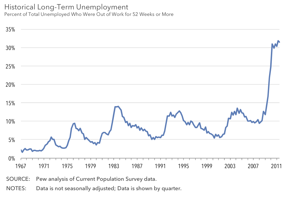
As you can see, the decline began in the late 90s. During Bush's 8 years in office, only 3 million jobs were created, until the recession, upon which all those gains were lost and then some.

During Clinton's 8 years, 25 million jobs were created.

Obama's pretty much had zero job growth in three years.

While domestic policy has some part in this, I think the larger part has to do with the collapse of the Soviet Union which led to India and China seeing the writing on the wall for central planning, which caused them to start moving toward free market economies. Suddenly, the world labor market was flooded with 2 billion additional workers competing to build your lava lamps, iPads, big screen TVs, and so forth.

Our labor force is puny in the face of this labor tidal wave. That we would be drowned by it was predicted many years ago.

Domestic wage and job suppression are to be expected as a result. And until these 2 billion laborers catch up with us in wages and benefits, the damper effect will be with us.

There are signs their standards of living are moving upward. The Foxcomm workers revolt is one example.


This is not excusing Obama. In fact, I have never even heard Obama mention this cause and effect. He's clueless, actually.

But it does go a long way toward explaing Bush's weak job growth and Obama's almost non-existent recovery. Our labor force's immune system was extremely weakened by cheap labor competition, so it could not battle the kind of recessionary blow it took in 2008. Thus the slow climb back.

Trade inbalance, ie; deficit, is the main reason for job losses in the past decade, and the reason for devaluation of the dollar.
So really it was not just bush's or Obama's fault. It is you the consumers also.
No.

There has been no correlation between unemployment and trade deficit recently.

$trade-deficit-v-unemployment.jpg
 
Now to reverse spin this obvious conservative inquisition.

Graph 1:
fredgraph4.png


This shows that there were 11 recessions since 1949 in which previous gains were reduced drastically - some reduced completely, some wiped out gains made since the last recession. The lines look mean, but the corrections have been about the same percentage. Don't forget that this last correction began with a ratio of just under 63% - the larger this number gets, the more precipitous the corresponding drop. I would file this under "interesting, but not extremely relevant".

The next graph we're asked to consider:
Obama%20v%20Bush%20debt.jpg


Let's see - what happened in 2009 that would cause such a HUGE spike in public debt? Seems like a long time ago, but I seem to remember a problem with our banking system about to (once again) cause the house of cards to tumble into a depression. $700B was asked for initially, and then another $350B. And, while they were at it, they infused Detroit with even more cash to float Chrysler and GM.

Everyone knew (at the time, anyway) that we didn't have the cash "in the bank" to pay for any of this. But we all knew without a doubt that failing to INCREASE spending (and hence raising public debt) would have meant a really bad domino effect spreading out across the face of the planet. Even Dubya understood this one.

Kudos go to the current administration for reducing the debt shown in the graph by over $1T in 4 years - something I don't think I've seen any other administration do... ever.

This graph is very misleading:
long-term.jpg


It clearly reflects the same large scale spike as in our 1st graph, but conveys pretty much the same thing - once we lose our jobs due to a recession, it tends to take a long time to get them back again. This is shown historically in the graph.

Now, it will likely be argued that the point of graphs 1 and 3 isn't the historic similarities but the magnitude of the current problem. Twice as much long-term unemployment in 2011 as in 1983. But, graph 1 shows us that there were also more people working in 2011 than in 1983. The REAL information in graph 3 isn't at the peaks, but in the valleys. The graph shows that the current administration has not been tested yet.

Not content with this, our intelligence is questioned again with THIS:
20068d1342670256t-explain-this-mr-obama-g7_unemployment.jpg


Graph 4 shows us data which was published Feb 16, 2009 (just 1 month after Obama was sworn into office). You can find the link to the article it was taken from here - be prepared to do a lot of scrolling. The general point of this graph was to show a trend toward tighter lending in the US and UK - in hindsight, maybe tighter lending practices could have been begun 2 - 4 years earlier and saved a few million jobs later on.

Graph 4 is just being used to pin something on the current administration - doesn't have to be true, just has to "look bad".

Graph 5 was intended to show that there was no real correlation between unemployment and the current trade deficit:
20070d1342673399t-explain-this-mr-obama-trade-deficit-v-unemployment.jpg


Perhaps more enlightening is the cycles themselves. The graph starts at the peak of the recession that began 1991 (unemployment at 8%). It took 9 years for unemployment to fall back to 4%. The 2001 recession caused another perturbation that took 7 years to get under control (a low of 4.6%). And finally, here we are in year 3 after the 2009 recession. Again, the current administration hasn't been tested.

I guess it all depends on how you look at the numbers.
 
Do you want intelligence and fairness or blind ideology and greedy W clone?

Show us Democrat that is running now that exhibits these qualities, because all I see is a liar who is pitting races and classes against each other.
 
Lmao this morning @ its all Boooosh's fault :lol: waaaaaaaa waaaaaa
You don't need to be Dick Tracy to figure out Obama is a disaster, and probably worse then Carter in some aspects which was thought impossible to do but Obama's the champ at being the worst.
 

Forum List

Back
Top