Arctic Ice


Figure 4 : Processed data from Nov 16 – Dec 31, 2014

clip_image010_thumb.jpg


Figure 5 : Processed data from Jan 1 – Feb 15, 2015

clip_image012_thumb.jpg


Figure 6 : Processed data from Feb 16 – Mar 31, 2015

clip_image014_thumb.jpg


Figure 7 : Processed data from Apr 1 – May 15, 2015
clip_image016_thumb.jpg


Figure 8 : Processed data from May 16 – Jun 30, 2015

clip_image018_thumb.jpg


Figure 9 : Processed data from Jul 1 – Aug 15, 2015

Also, reader “edimbukvarevic” provides this map of anthropogenic CO2 emissions for comparison:

co2_map_global_anthro-emissions.png


Finally: visualized OCO2 satellite data showing global carbon dioxide concentrations

A lie by misdirection is still a lie, Mr. Westwall, and you again stand branded a liar by your own posts.
 
Satellite sees "lumpy" layer of CO2


tl-vertical_stack.jpg

An instrument aboard a seven-year-old satellite designed to help weather forecasters is proving to be a powerful new tool in climate monitoring by detecting the distribution of carbon dioxide in the atmosphere.

And it turns out, NASA scientists say - contrary to conventional thinking that the greenhouse gas is spread uniformly over the planet in a well mixed layer - the Atmospheric Infrared Sounder instrument detects a distinctly "lumpy" pattern of CO2 in the mid-troposphere some 3-7 miles up.

Scientists reported their findings this week at the annual meeting of the American Geophysical Union in San Francisco.

This NASA image shows the the monthly average of carbon dioxide in the middle of the troposphere made from data acquired by the infrared sounder during July 2009. These maps are the first-ever depictions of the global distribution of CO2 based solely on observations.​


NASA Satellite Sends Back Most Detailed View of CO2
  • Published: December 18th, 2014
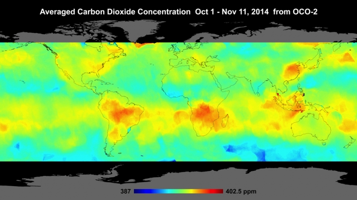
SAN FRANCISCO — It’s been a busy five months for NASA’s newest carbon dioxide-monitoring satellite, snapping up to 1 million measurements a day of how carbon dioxide moves across the planet. Now NASA scientists have shared the first global maps created using that data, showing one of the most detailed views of CO2 ever created.

CO2 concentrations around the world in early November.
Click image to enlarge. Credit: NASA Jet Propulsion Laboratory

The satellite — known as OCO-2 — has been in orbit since July. While it’s returned some preliminary data, NASA showed off its global reach for the first time on Thursday at the annual American Geophysical Union meeting.

According to deputy project science Annmarie Eldering, previous CO2-monitoring satellites were returning just 1-2 percent of the data that OCO-2 is sending back to Earth. And while the satellite can’t peer through clouds, it has still provided scientists with a staggering amount of information to create comprehensive maps of CO2 and plant growth.

“Measuring an atmospheric gas to a fraction of a percent makes OCO-2 one of the most challenging remote sensing missions that have ever been attempted,” Paul Wennberg, a professor at Caltech, said.

And yet all systems appear to be go and if preliminary results are anything to judge by, the data should be fascinating. NASA showed off two maps that are an amalgamation of 600,000 measurements taken over 12 days from the end of October.

The first map shows CO2 concentrations in the atmosphere. Hot spots over the Eastern Seaboard and parts of China are clearly visible, a sign of the heavy industry on the ground. South America and parts of Africa also show high CO2 levels, which scientists said is most likely due to burning fields and forest to clear them for agriculture.​

Different years, different times of the year, different instruments, different measurements (atmosphere vs. middle of the troposphere).

Staggering.


Figure 4 : Processed data from Nov 16 – Dec 31, 2014

clip_image010_thumb.jpg


Figure 5 : Processed data from Jan 1 – Feb 15, 2015

clip_image012_thumb.jpg


Figure 6 : Processed data from Feb 16 – Mar 31, 2015

clip_image014_thumb.jpg


Figure 7 : Processed data from Apr 1 – May 15, 2015
clip_image016_thumb.jpg


Figure 8 : Processed data from May 16 – Jun 30, 2015

clip_image018_thumb.jpg


Figure 9 : Processed data from Jul 1 – Aug 15, 2015

Also, reader “edimbukvarevic” provides this map of anthropogenic CO2 emissions for comparison:

co2_map_global_anthro-emissions.png


Finally: visualized OCO2 satellite data showing global carbon dioxide concentrations

A lie by misdirection is still a lie, Mr. Westwall, and you again stand branded a liar by your own posts.


Indeed it is. Which is why i find it amusing that you can post these "processed" images and not realize they are fake. It takes a special breed of stupid to not figure that one out.


Figure 4 : Processed data from Nov 16 – Dec 31, 2014

clip_image010_thumb.jpg


Figure 5 : Processed data from Jan 1 – Feb 15, 2015

clip_image012_thumb.jpg


Figure 6 : Processed data from Feb 16 – Mar 31, 2015

clip_image014_thumb.jpg


Figure 7 : Processed data from Apr 1 – May 15, 2015
clip_image016_thumb.jpg


Figure 8 : Processed data from May 16 – Jun 30, 2015

clip_image018_thumb.jpg


Figure 9 : Processed data from Jul 1 – Aug 15, 2015

Also, reader “edimbukvarevic” provides this map of anthropogenic CO2 emissions for comparison:

co2_map_global_anthro-emissions.png


Finally: visualized OCO2 satellite data showing global carbon dioxide concentrations

A lie by misdirection is still a lie, Mr. Westwall, and you again stand branded a liar by your own posts.
Indeed it is. Which is why i find it amusing that you can post these "processed" images and not realize they are fake. It takes a special breed of stupid to not figure that one out.

Actually, in the real world......"it takes a special breed of" utterly insane crackpots to dive so deep into pathologically crazy conspiracy theory ideation that you actually seriously imagine that there is a world wide conspiracy by almost all of the scientists on the planet to "fake" ALL of the evidence supporting human caused, CO2 driven global warming. Plus the obvious insanity of your unspoken background assumption that you are an omniscient super-genius who can spot this omni-present scientific fakery that passes peer-review because you are way smarter than everybody else. LOLOLOLOLOL........too bad you are so crazy, walleyed, on top of such severe retardation.
 
Back-to-back big northeasters, and increased calving off of Greenland due to warming, and what do you get? More icebergs pushed by the wind into the shipping lanes.

Huge fleet of icebergs hits North Atlantic shipping lanes
---
More than 400 icebergs have drifted into the North Atlantic shipping lanes over the past week in an unusually large swarm for this early in the season, forcing vessels to slow to a crawl or take detours of hundreds of kilometres.
---
There would be even more calving if the ice uphill were more massive than it is. A large mass of ice is not solid rock.
Journal of Glaciology, Vol. 56, No. 200, 2010
Creep and plasticity of glacier ice: a material science perspective.

Your usual meaningless, ignorant, reality-free twaddle, poop4brains.

In the real world....a sudden dramatic increase in the number of icebergs compared to previous years indicates that the glaciers on the coast of Greenland are moving faster than before....and they are moving faster because the planet is heating up.

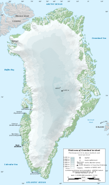
The Greenland ice sheet is a vast body of ice covering 1,710,000 square kilometres (660,000 sq mi), roughly 80% of the surface of Greenland. It is the second largest ice body in the world, after the Antarctic ice sheet. The ice sheet is almost 2,400 kilometres (1,500 mi) long in a north-south direction, and its greatest width is 1,100 kilometres (680 mi) at a latitude of 77°N, near its northern margin. The mean altitude of the ice is 2,135 metres (7,005 ft).[1] The thickness is generally more than 2 km (1.2 mi) and over 3 km (1.9 mi) at its thickest point. It is not the only ice mass of Greenland – isolated glaciers and small ice caps cover between 76,000 and 100,000 square kilometres (29,000 and 39,000 sq mi) around the periphery. If the entire 2,850,000 cubic kilometres (684,000 cu mi) of ice were to melt, it would let ad to a global [sea level rise of 7.2 m (24 ft).[2] The Greenland Ice Sheet is sometimes referred to under the term inland ice. It is also sometimes referred to as an ice cap.


Outline map of Greenland with ice sheet depths.

Many scientists who study the ice melt in Greenland consider that a two or three °C temperature rise would result in a complete melting of Greenland’s ice.[5] Positioned in the Arctic, the Greenland ice sheet is especially vulnerable to climate change. Arctic climate is believed to be now rapidly warming and much larger Arctic shrinkage changes are projected.[6] The Greenland Ice Sheet has experienced record melting in recent years since detailed records have been kept and is likely to contribute substantially to sea level rise as well as to possible changes in ocean circulation in the future if this is sustained. The area of the sheet that experiences melting has been argued to have increased by about 16% between 1979 (when measurements started) and 2002 (most recent data). The area of melting in 2002 broke all previous records.[6] The number of glacial earthquakes at the Helheim Glacier and the northwest Greenland glaciers increased substantially between 1993 and 2005.[7] In 2006, estimated monthly changes in the mass of Greenland's ice sheet suggest that it is melting at a rate of about 239 cubic kilometers (57 cu mi) per year. A more recent study, based on reprocessed and improved data between 2003 and 2008, reports an average trend of 195 cubic kilometers (47 cu mi) per year.[8] These measurements came from the US space agency's GRACE (Gravity Recovery and Climate Experiment) satellite, launched in 2002, as reported by BBC.[9] Using data from two ground-observing satellites, ICESAT and ASTER, a study published in Geophysical Research Letters (September 2008) shows that nearly 75 percent of the loss of Greenland's ice can be traced back to small coastal glaciers.[10]

If the entire 2,850,000 km3 (684,000 cu mi) of ice were to melt, global sea levels would rise 7.2 m (24 ft).[2] Recently, fears have grown that continued climate change will make the Greenland Ice Sheet cross a threshold where long-term melting of the ice sheet is inevitable. Climate models project that local warming in Greenland will be 3 °C (5 °F) to 9 °C (16 °F) during this century. Ice sheet models project that such a warming would initiate the long-term melting of the ice sheet, leading to a complete melting of the ice sheet (over centuries), resulting in a global sea level rise of about 7 metres (23 ft).[6] Such a rise would inundate almost every major coastal city in the world. How fast the melt would eventually occur is a matter of discussion. According to the IPCC 2001 report,[2] such warming would, if kept from rising further after the 21st Century, result in 1 to 5 meter sea level rise over the next millennium due to Greenland ice sheet melting. Some scientists have cautioned that these rates of melting are overly optimistic as they assume a linear, rather than erratic, progression. James E. Hansen has argued that multiple positive feedbacks could lead to nonlinear ice sheet disintegration much faster than claimed by the IPCC. According to a 2007 paper, "we find no evidence of millennial lags between forcing and ice sheet response in paleoclimate data. An ice sheet response time of centuries seems probable, and we cannot rule out large changes on decadal time-scales once wide-scale surface melt is underway."[11]
 

Forum List

Back
Top